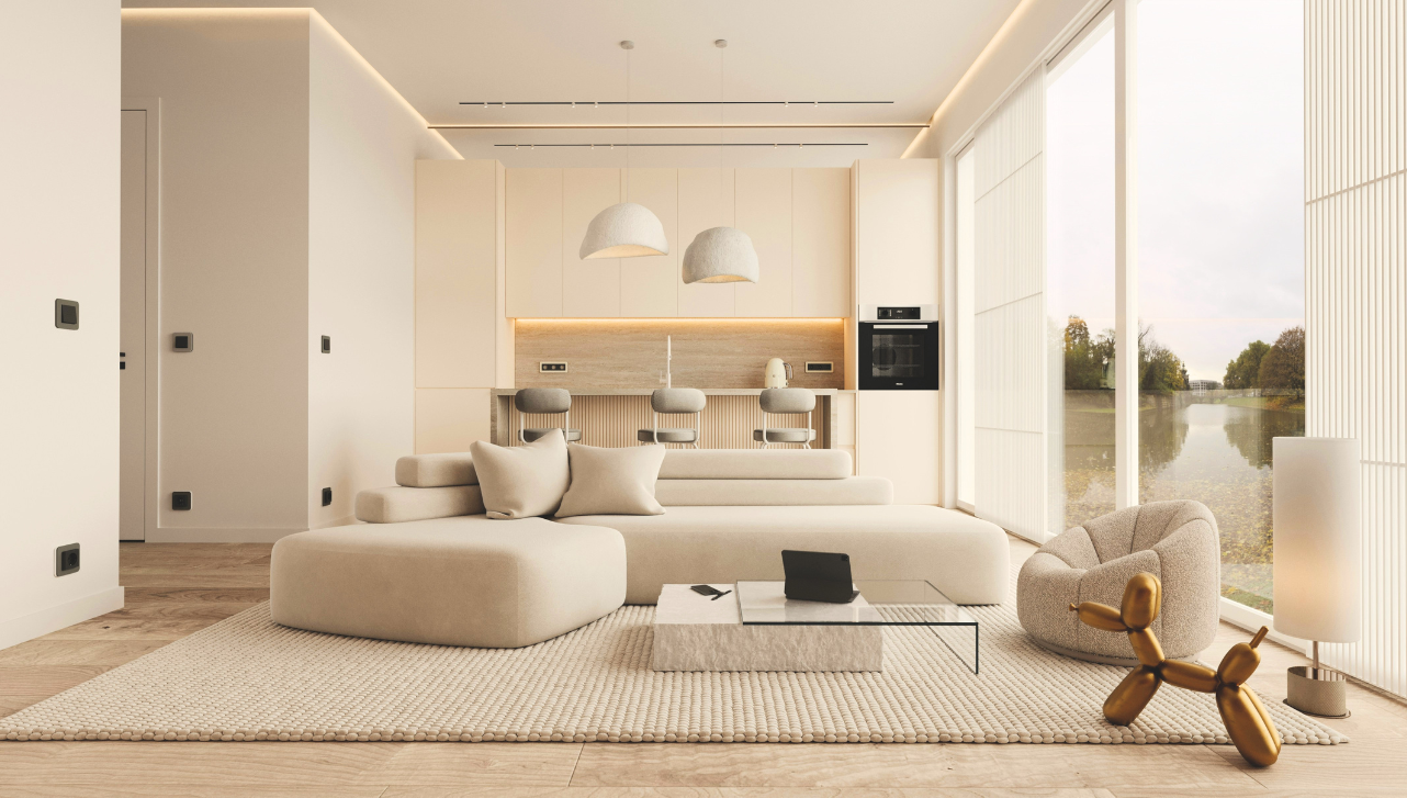
Cool gray had a long run. Respectfully, it is time for a nap.
The mood now is warmer: beige, taupe, sand, oat and soft greige tones that make a room feel calmer, gentler and a lot less like a waiting room with under-cabinet lighting.
Think less icy showroom, more deep exhale. Softer walls. Sunnier floors. Backsplashes with a little glow instead of a little attitude problem.
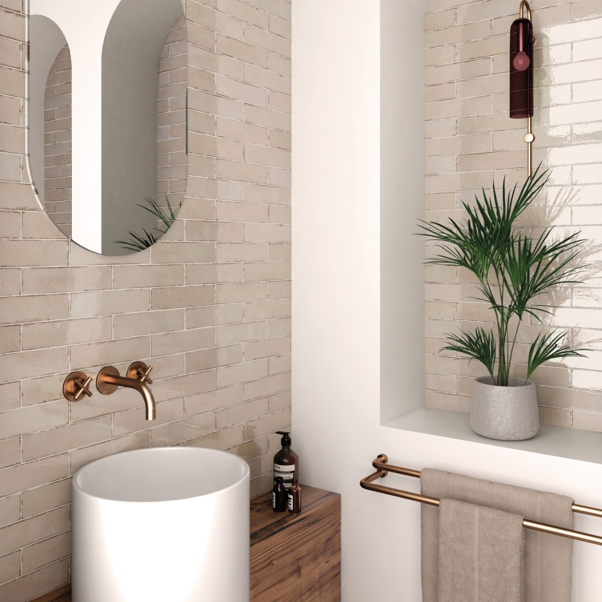
Warm neutral gloss tile proves beige can still have a pulse.
Tile shown: Tribeca Oatmeal 2.5×10 Glazed Porcelain Tile
This is the kind of warm neutral that is winning right now: light-catching, softly varied and just polished enough to make a bathroom feel expensive without slipping into spa-brochure territory.
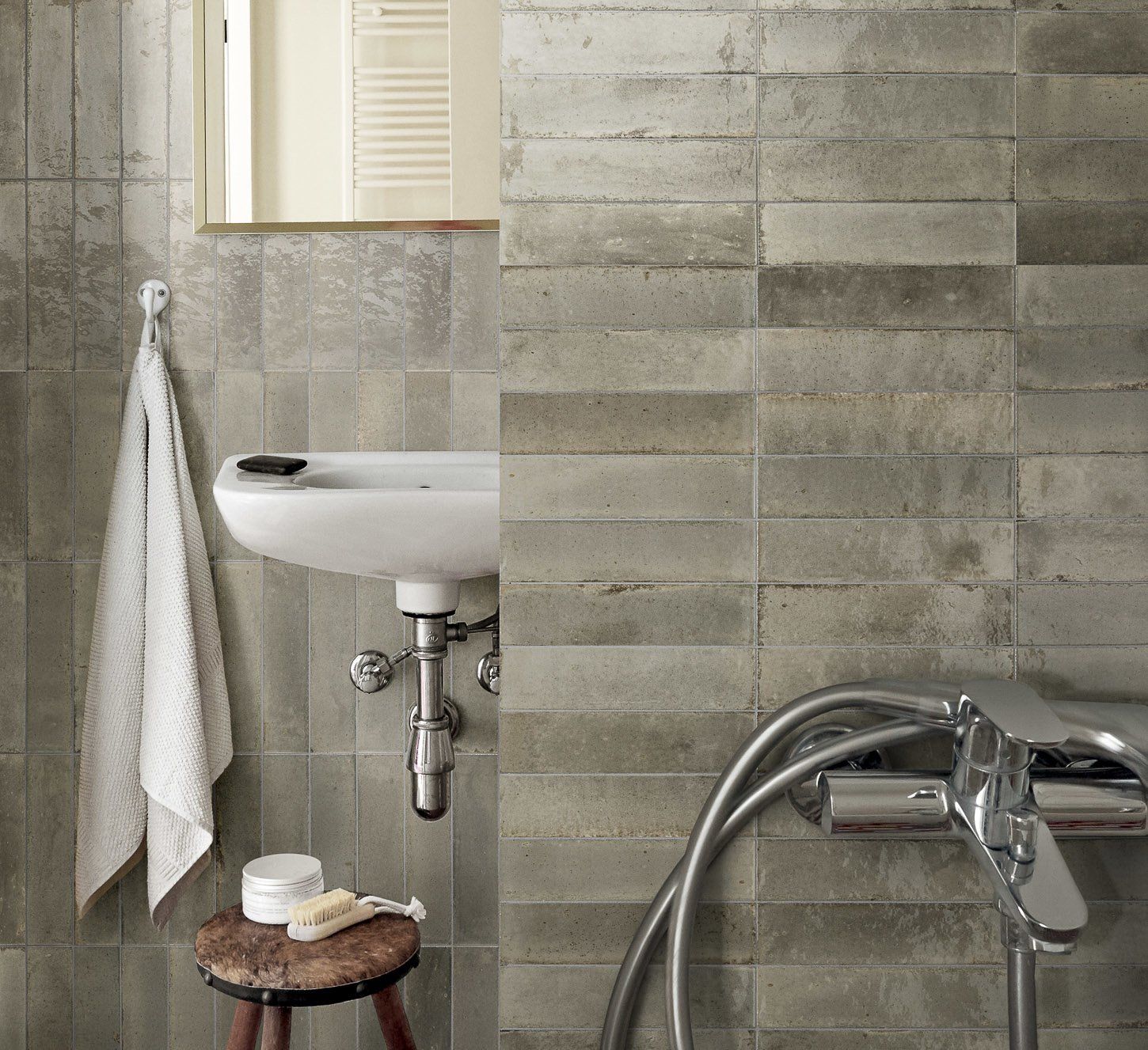
A weathered greige wall tile adds mood without making the room feel cold.
Tile shown: Lume Greige 2.25×9.375 Gloss Glazed Porcelain Subway Tile
The weathered look here is what makes the room feel grounded. It is neutral, yes, but it is not blank. It has just enough movement to keep the wall alive.
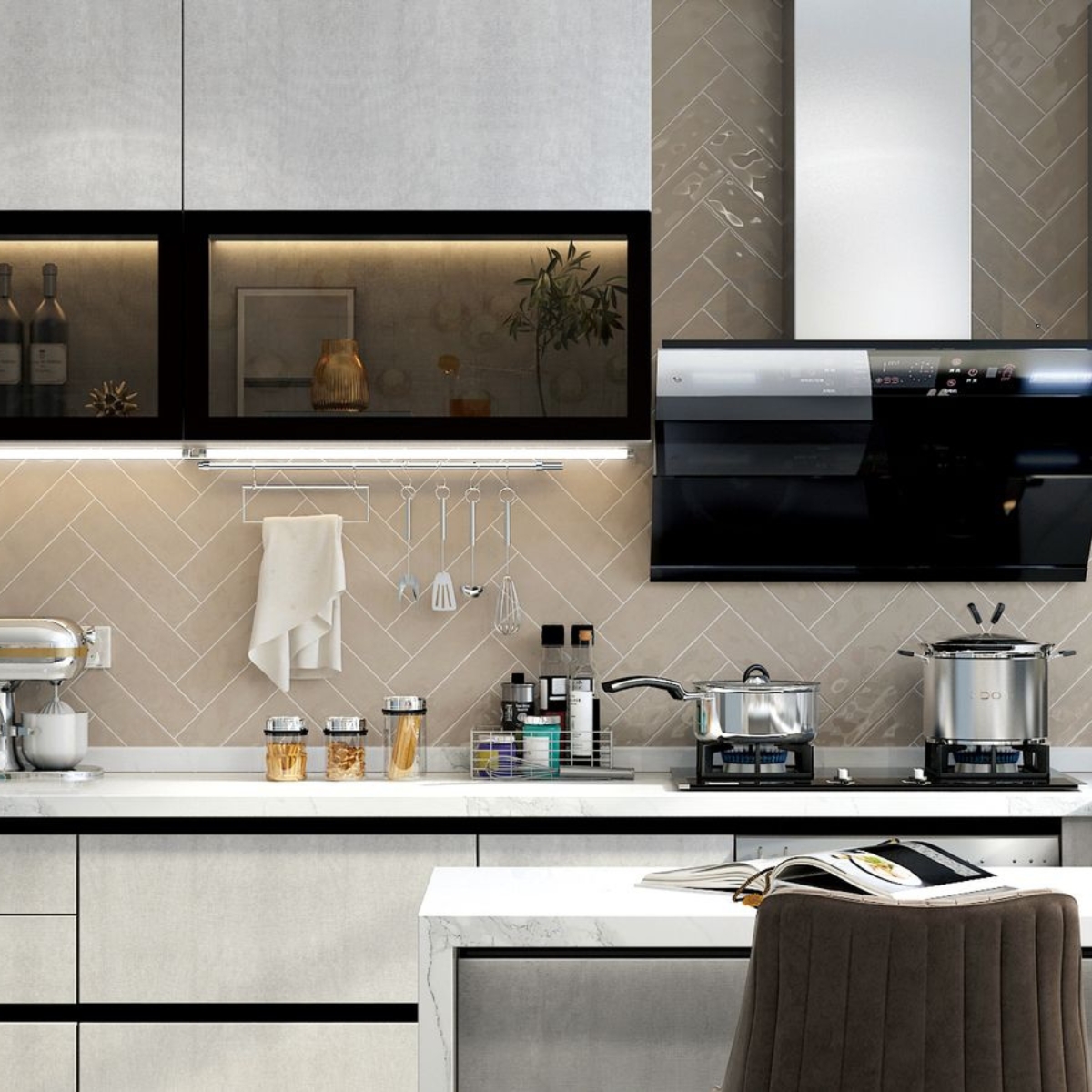
A warm herringbone backsplash softens a kitchen fast.
Tile shown: Boulevard Latte Gloss 3×12 Glazed Ceramic Tile
Warm neutrals also do a lot with very little. Here, the herringbone layout adds movement, but the soft taupe keeps it calm. The kitchen looks sharper because the backsplash is not trying to outshine everything else.
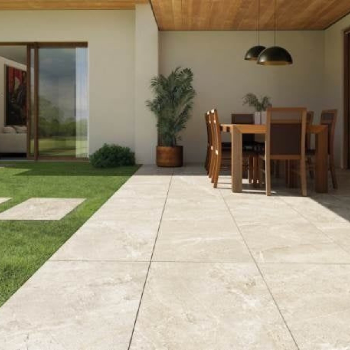
Outdoors counts too. Warm stone-look pavers keep a patio bright, relaxed and easy on the eyes.
Tile shown: Wonder Dunes 12×24 Glazed Porcelain Tile
Warm neutrals are not just for kitchens and bathrooms. Outdoors, they read sun-washed and calm, which is exactly what you want from a patio instead of corporate plaza, but make it residential.
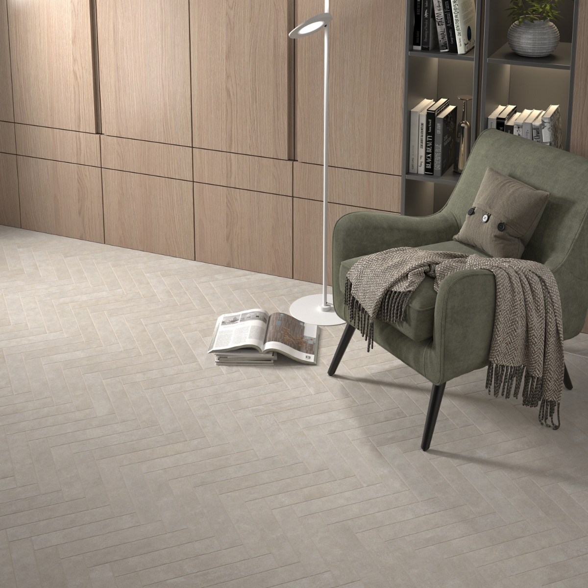
A pale herringbone floor brings subtle rhythm to a room and makes the whole space feel warmer.
Tile shown: Stage Taupe 2.5×12 Glazed Porcelain Tile
This is the quieter side of the trend. A soft sand floor in herringbone does a surprising amount of work: it adds texture, keeps the room warm and still lets the furniture have a life.
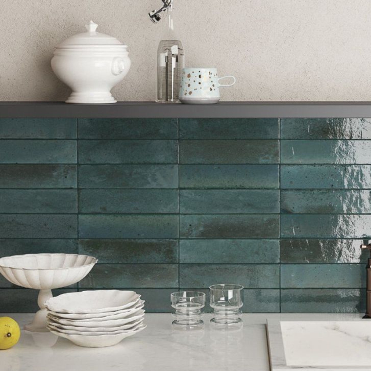
Warm neutrals make a richer accent tile look even better.
Tile shown: Lume Blue 2.25×9.375 Gloss Glazed Porcelain Subway Tile
And this is why warm neutrals are such a good base. Once the bigger surfaces feel softer, you have room to bring in a moodier accent without the whole space turning into a design monologue.
That is really why cool gray is losing ground. Warmer tones are easier to live with. They flatter wood, brass, black accents and richer colour. They make a room feel layered without making it feel busy. And they give you a much better starting point if you want to add one moodier note later on.
Want to test the look first? Try TileTown’s Room Visualizer and see how these warmer tones behave in your own light before you commit.
Shop the tiles in these images