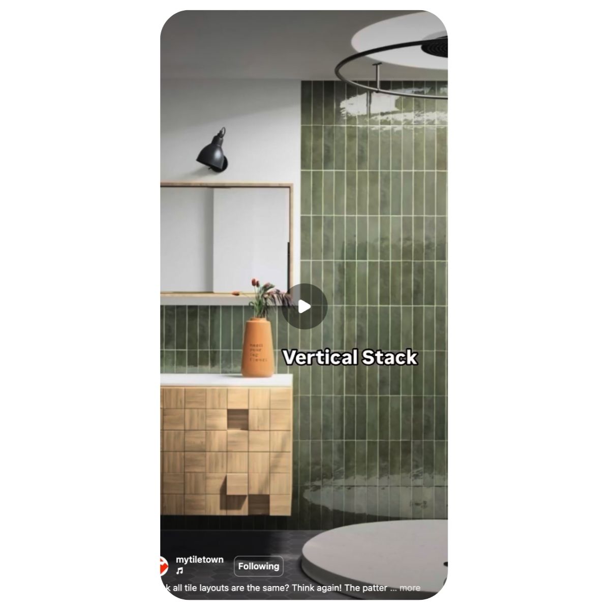
Featured

Unwrapped: Top 5 Tiles of 2024 (According to You)

It’s that time of year again! We’re looking back at the design hits that stole the show and defined home renos in 2024. Welcome to your TileTown Unwrapped Playlist—the best, boldest and most-loved tiles of the year. These are the tiles you couldn’t get enough of—showing up in renovations, feature walls and design dreams across the board. Who snagged the top spot? (Think: the Taylor Swift of tiles.) Spoiler alert: This year’s star tiles all share one standout quality—timeless, organic beauty. Let’s unwrap the hits!


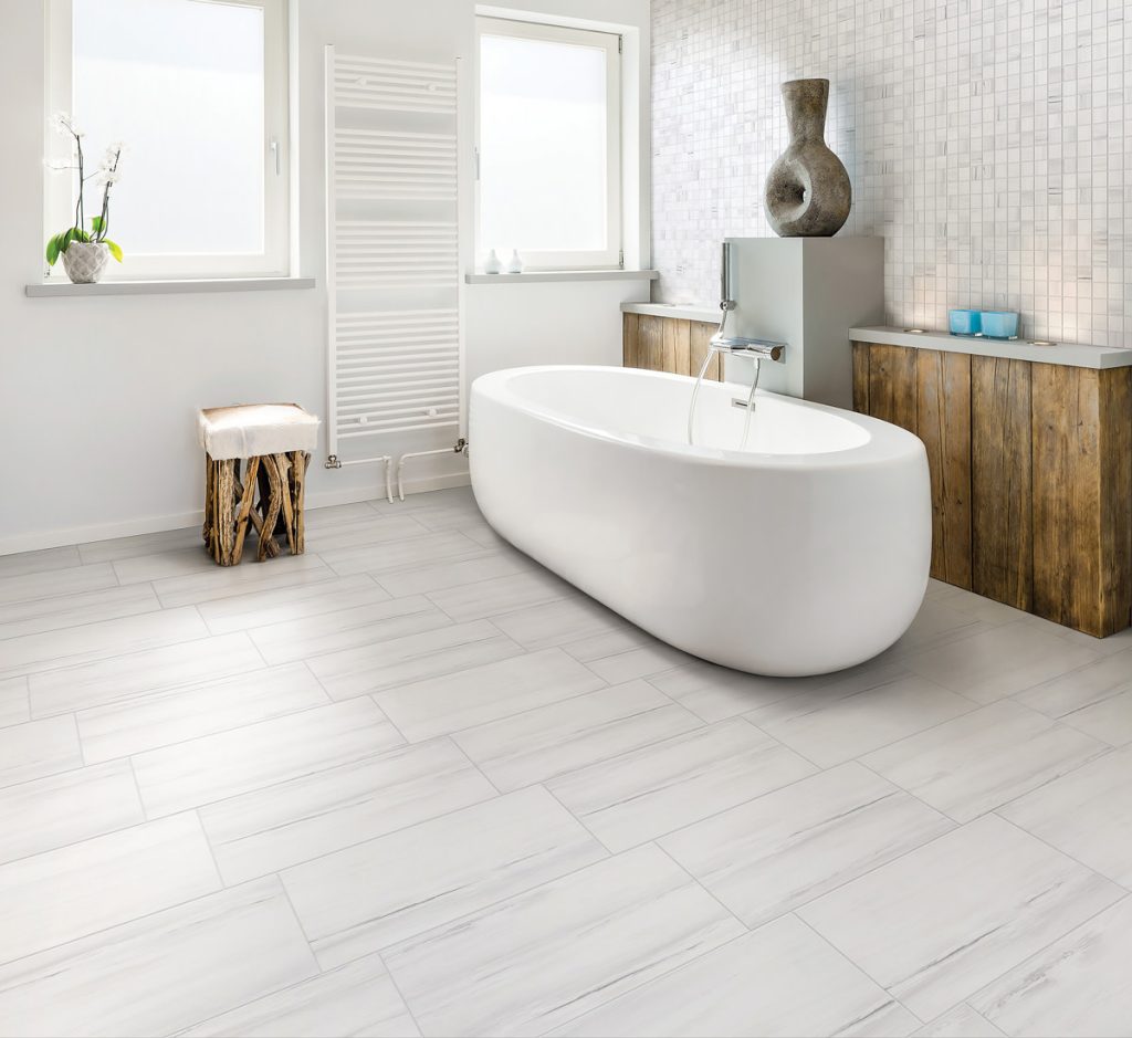
5th. Subtle Sophistication: Goya Polished 12×24

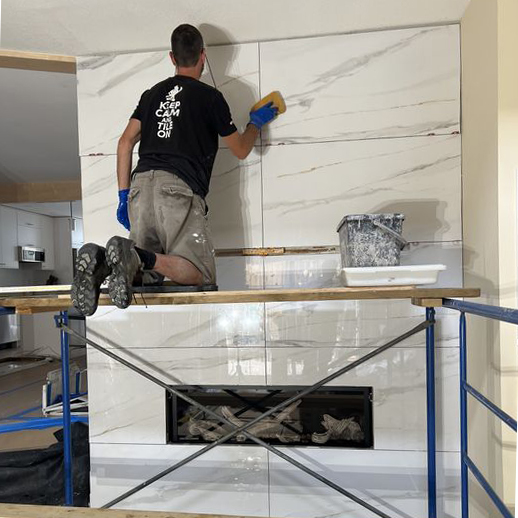
Rounding out our top five is our Goya porcelain in a polished finish. Its luxe, faux-marble surface brings elegance and natural beauty to any space. Whether featured in a grand entryway or a spa-like bathroom, this tile guarantees a refined, timeless look.

CREDIT: Facebook: The Micromason (repping our shirt too!)


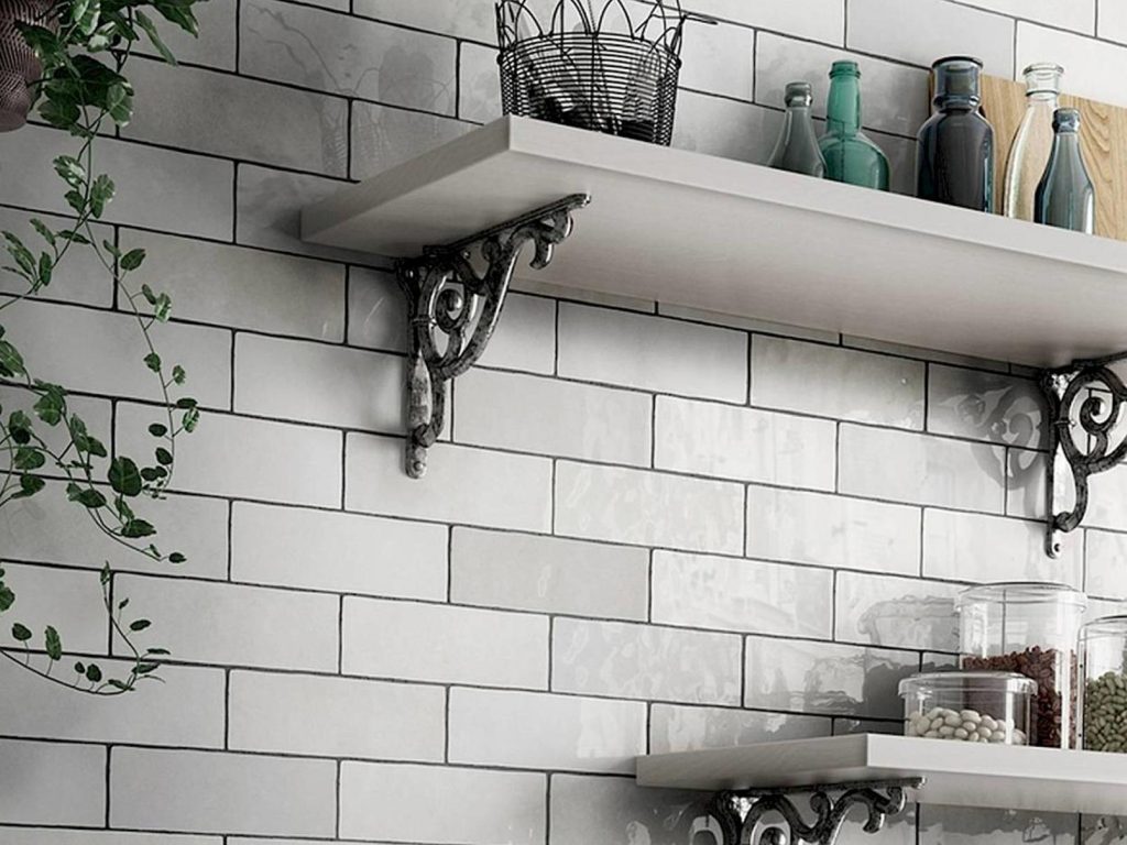
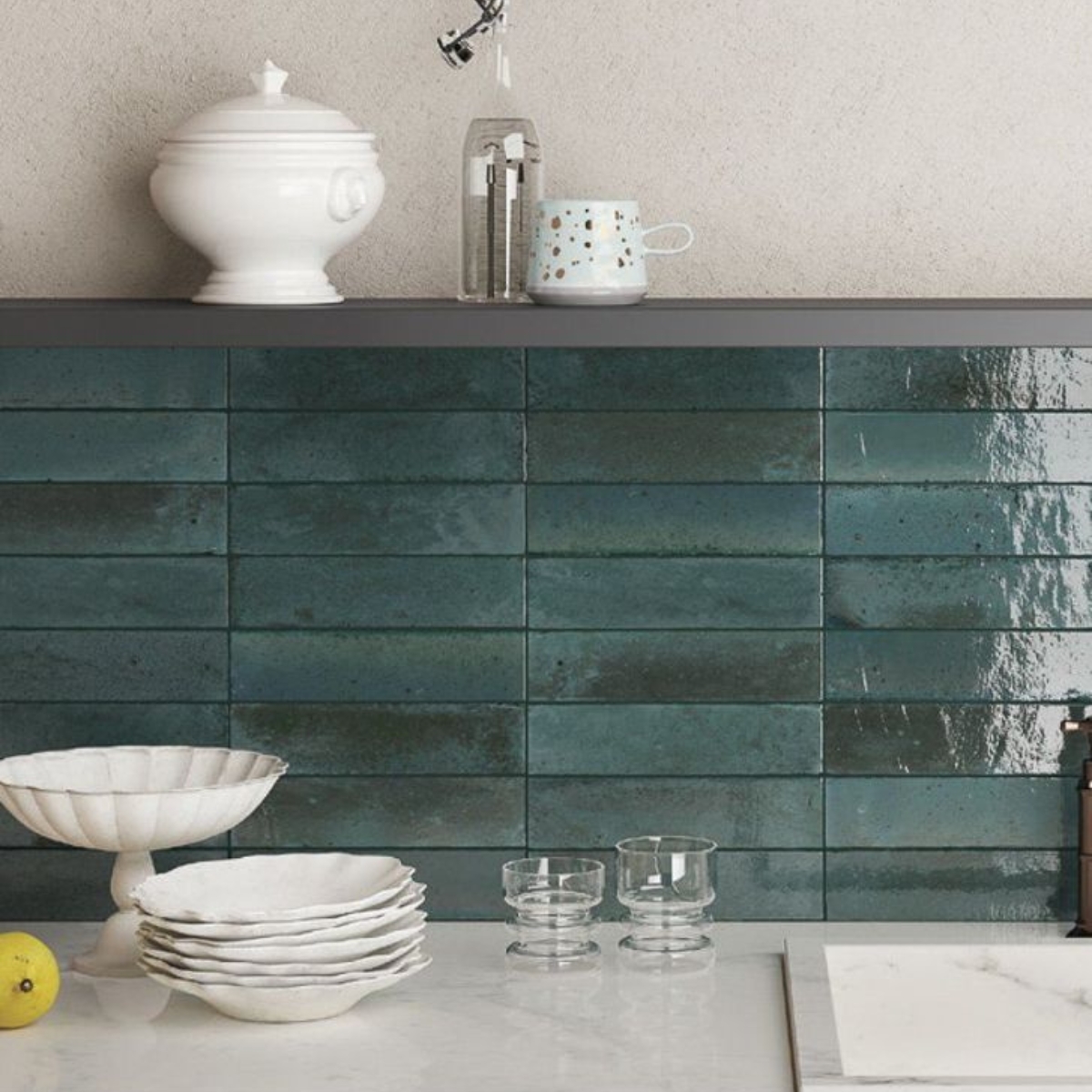
4th. Light Bright: Tribeca Gypsum White 2.5×10

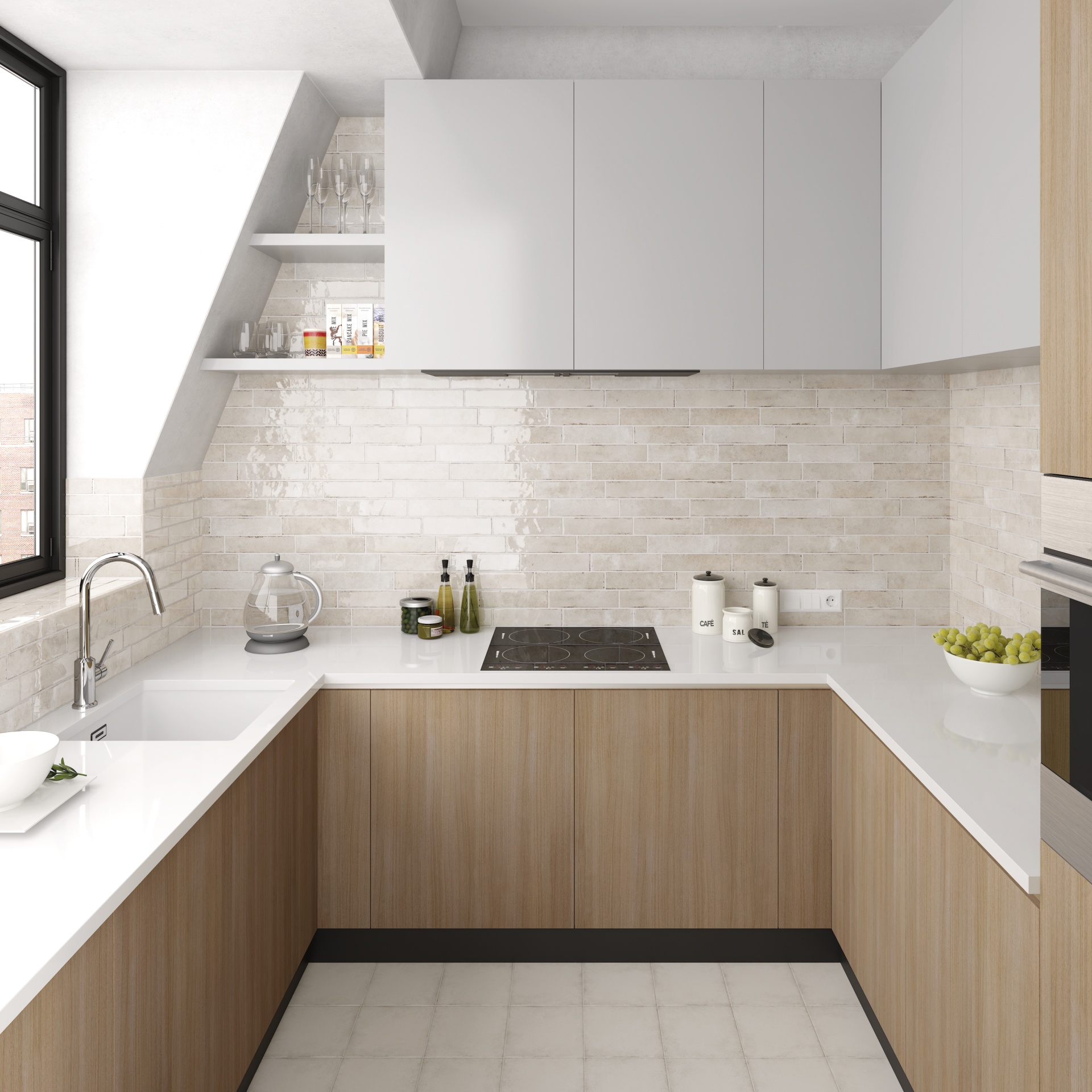
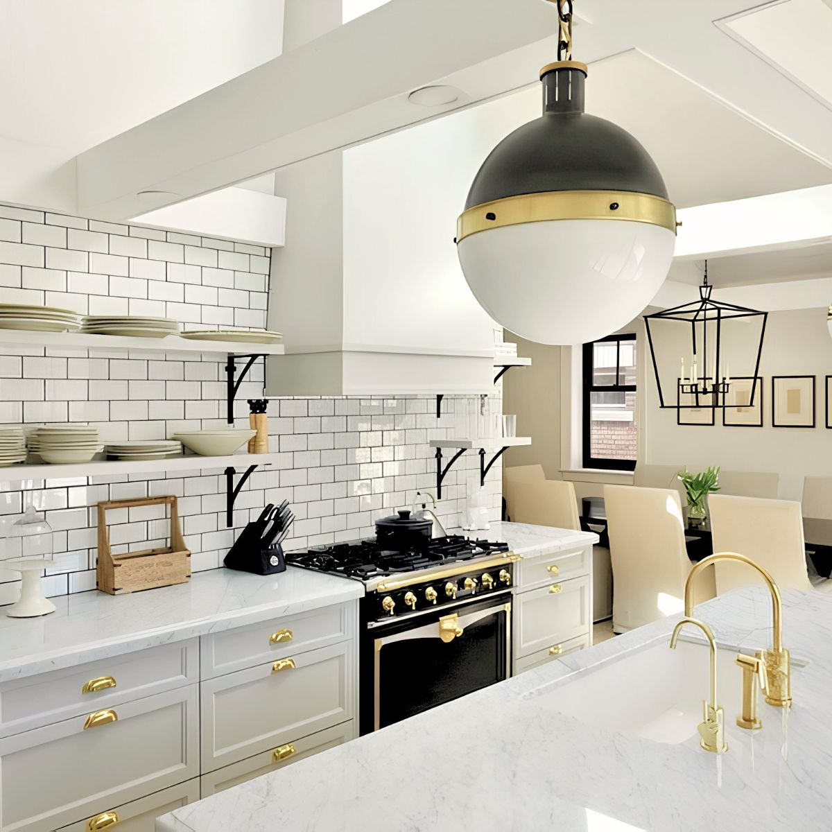
This glossy porcelain subway tile shone bright in 2024, lending its artisanal charm to everything from mid-century modern kitchens to eclectic bathrooms. With its worn edges, tonal variation and radiant surface, it’s like inviting the perfect amount of sunlight into your space—warm, bright and effortlessly stylish.


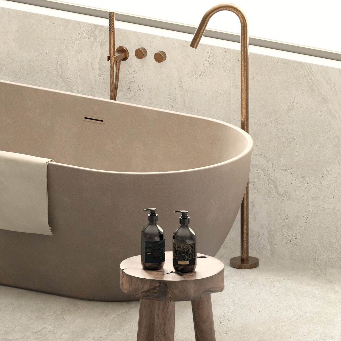
3rd. Faux and Fierce: Goya Matte 12×24

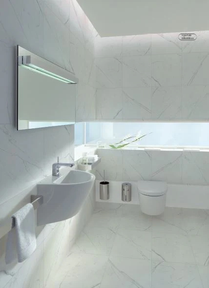
Simple. Elegant. Versatile. The Goya Matte tile delivers the look of marble without the fuss. Its natural matte finish pairs beautifully with just about any design style, adding understated sophistication to walls and floors alike. It’s no wonder this one stayed at the top of your playlists all year long.


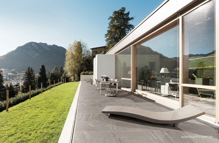
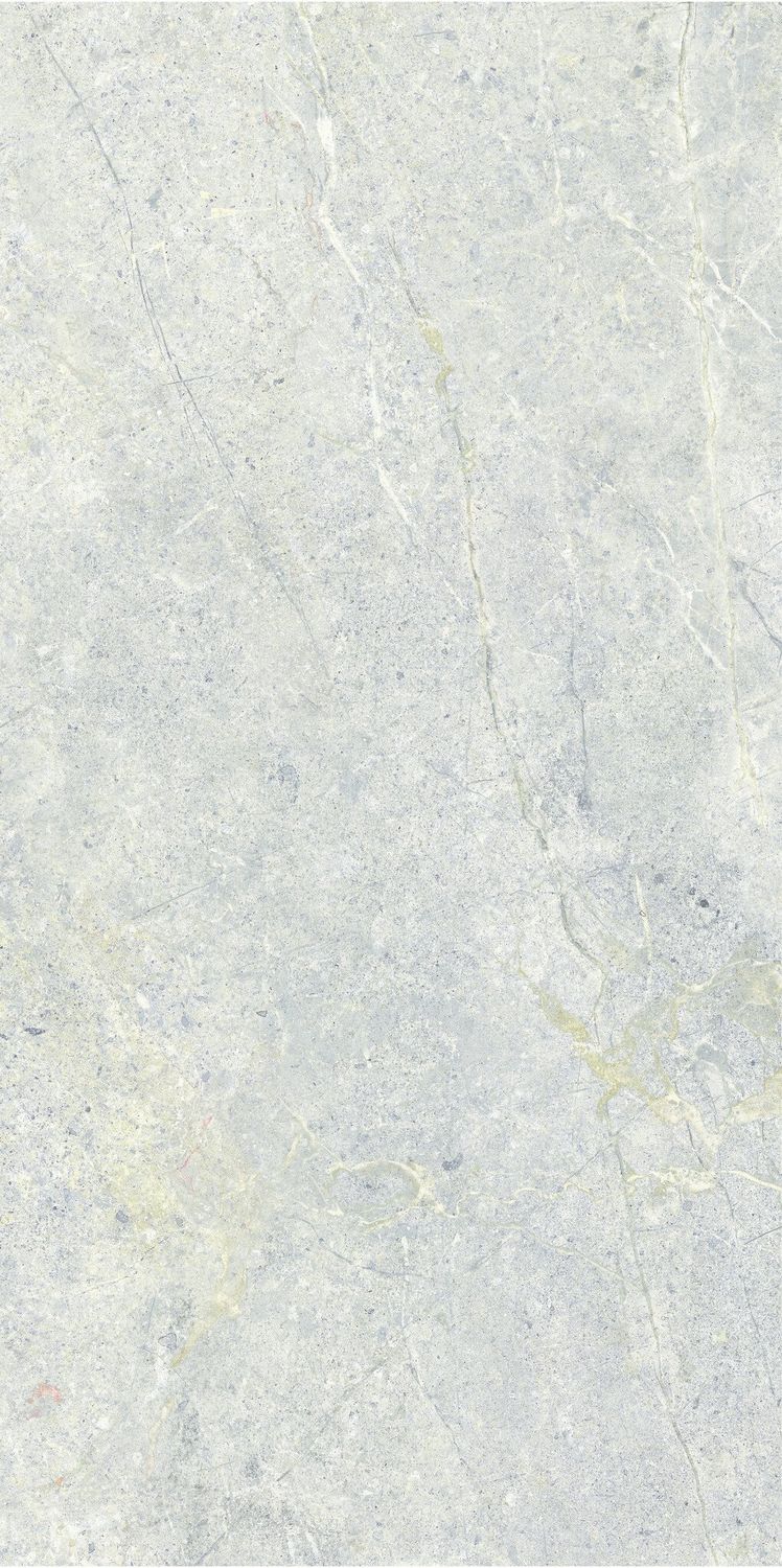
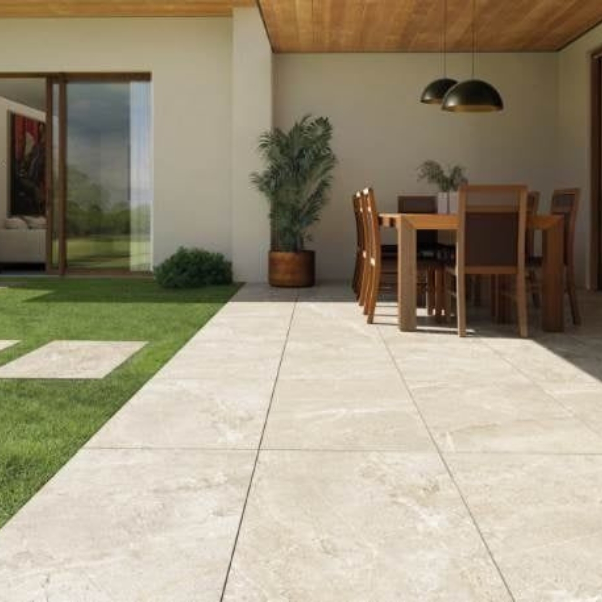
2nd. You’re So Vein: Utah Glacier 12×24

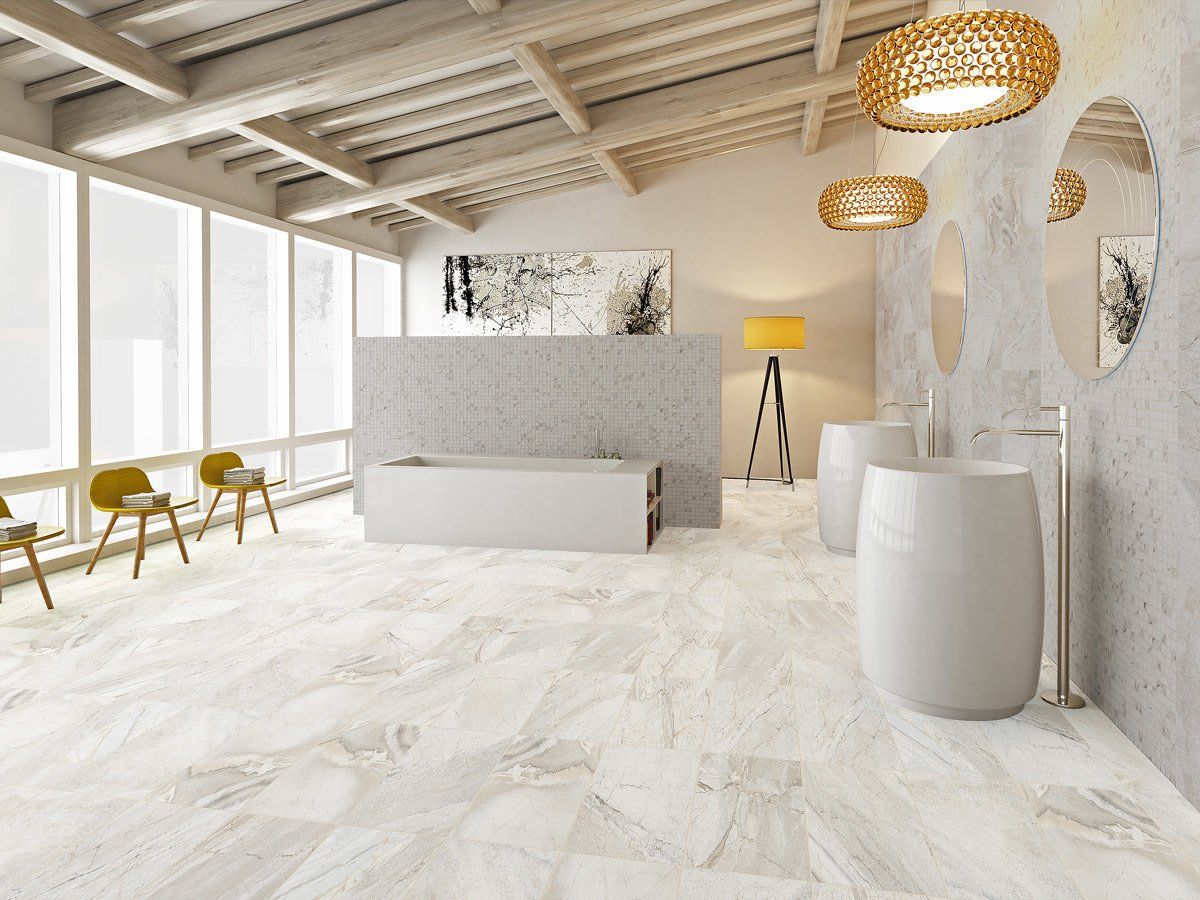
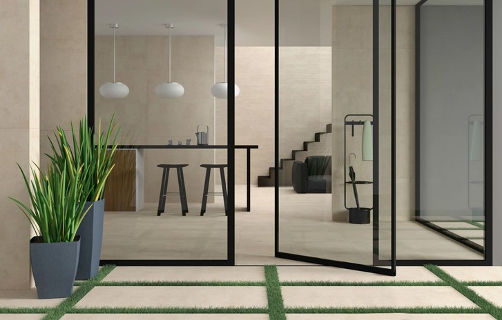
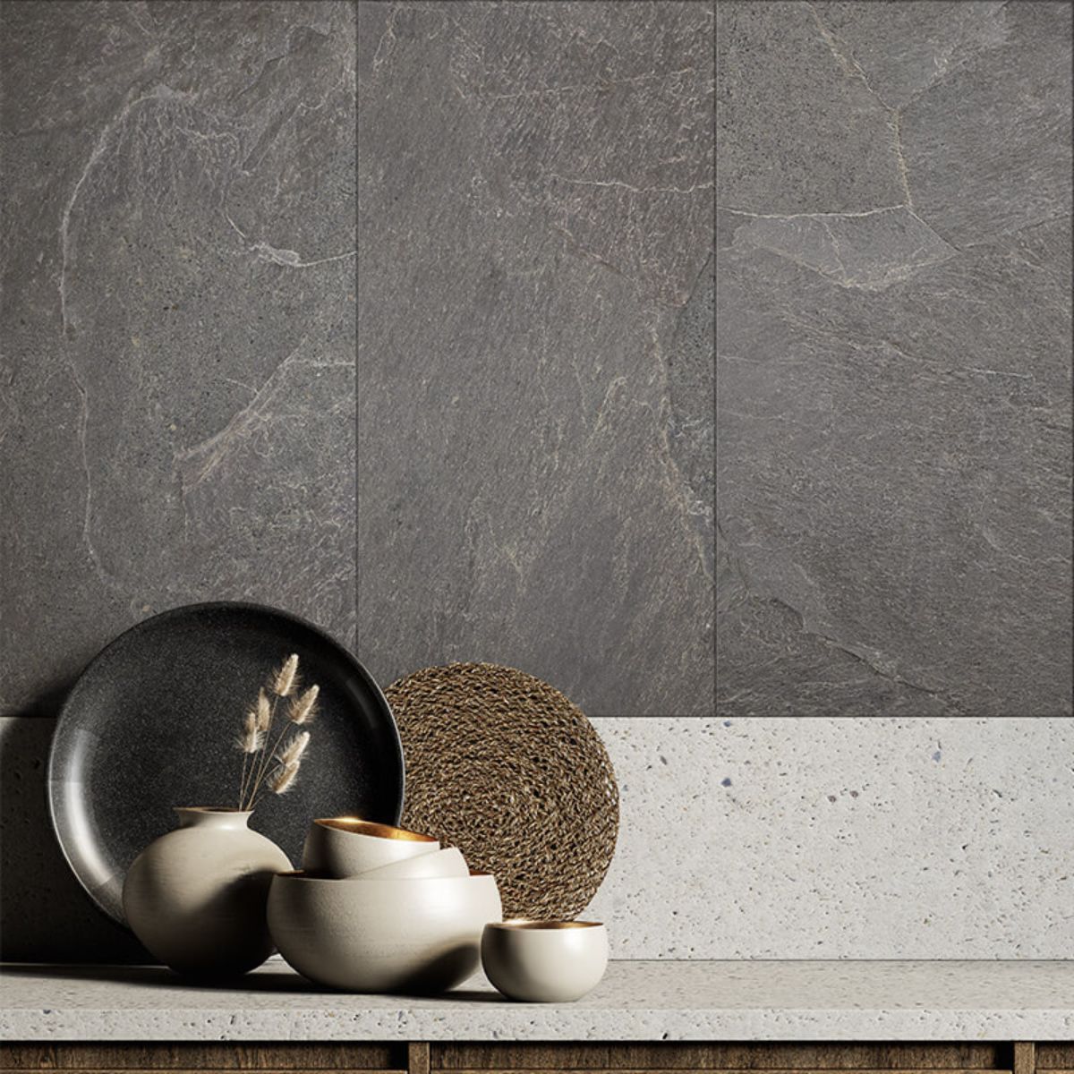
Coming in hot (or cool?) is the Utah Glacier 12×24 glazed porcelain tile. Think of it as bringing Utah’s stunning landscape indoors: soft greys, whites and desert beiges that echo rugged canyons and glacial rock formations. Its stone-like texture and natural veining create a perfect balance of rustic and refined, making it an undeniable fan favourite for both indoor and outdoor spaces.


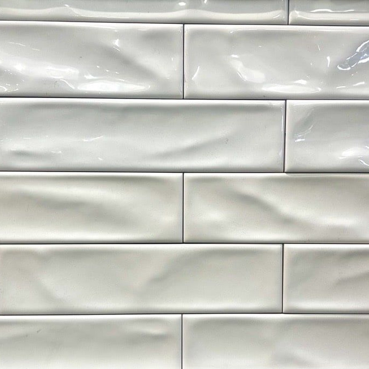
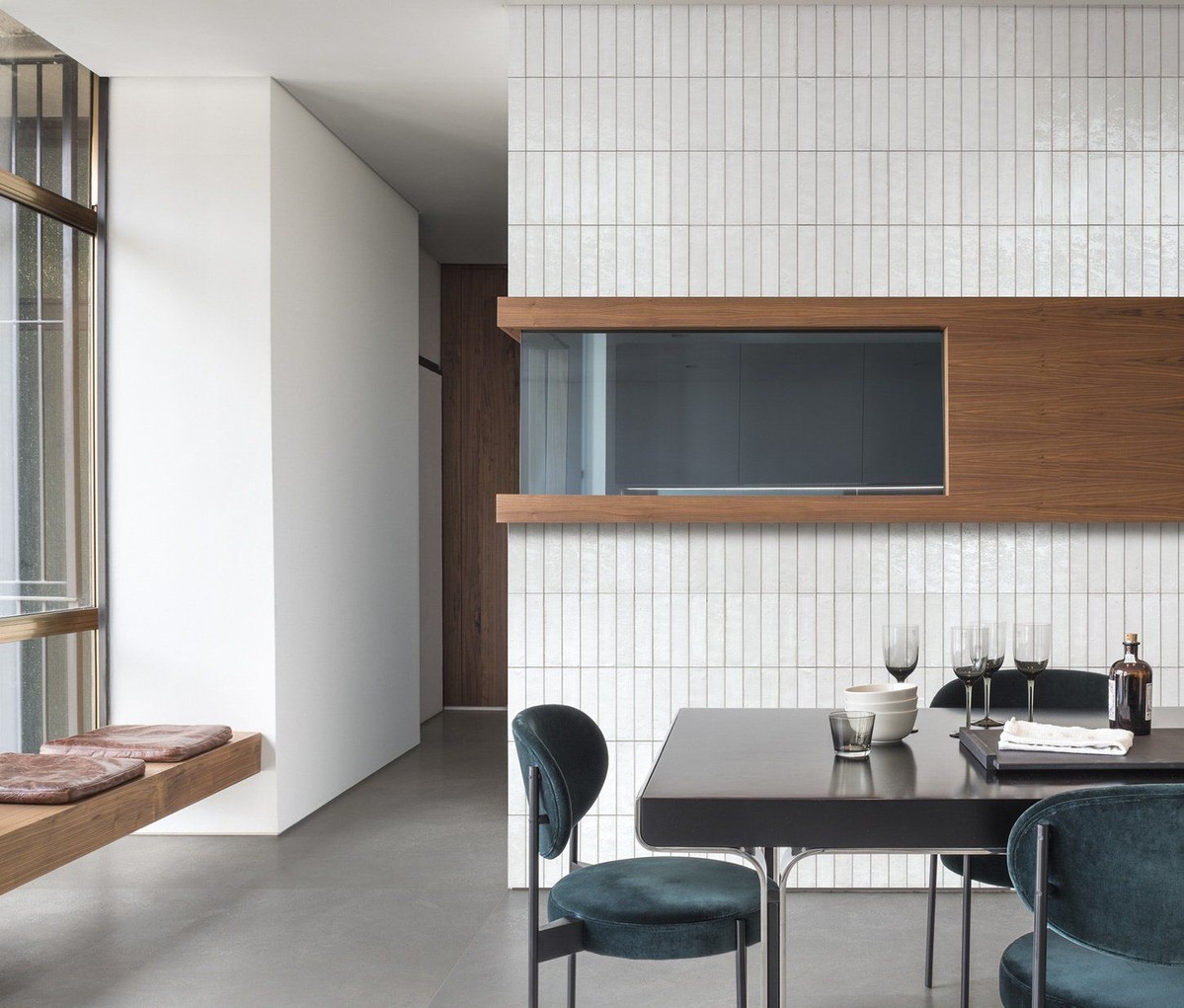
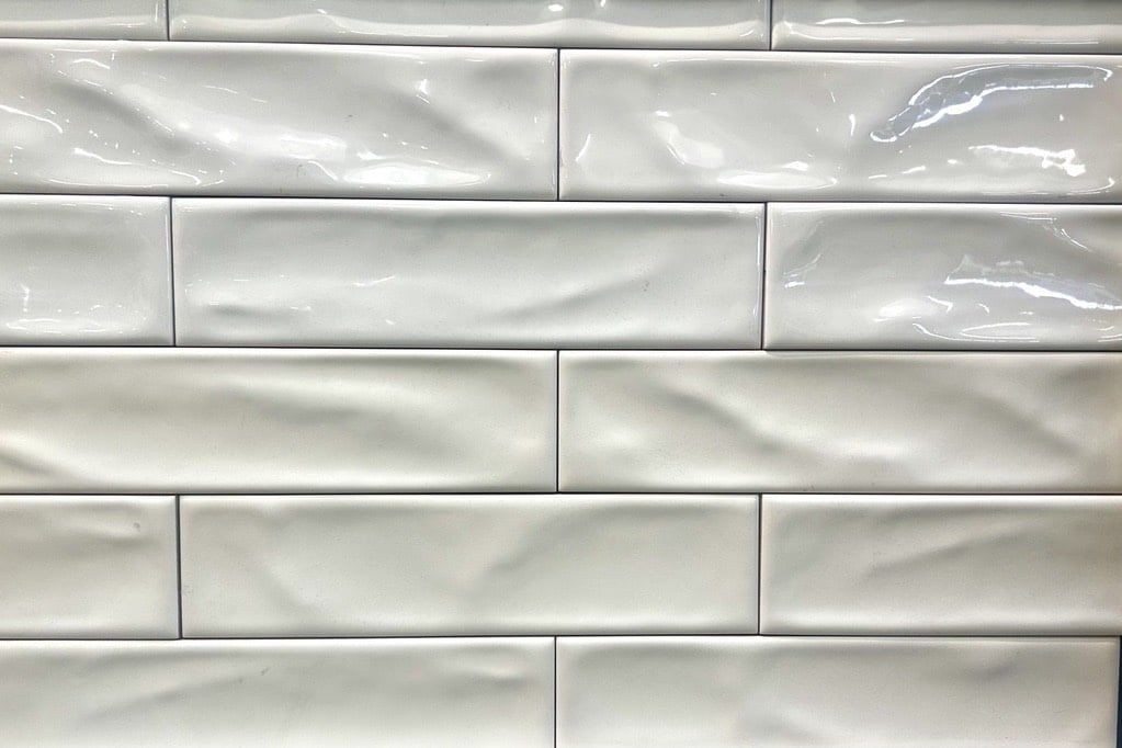
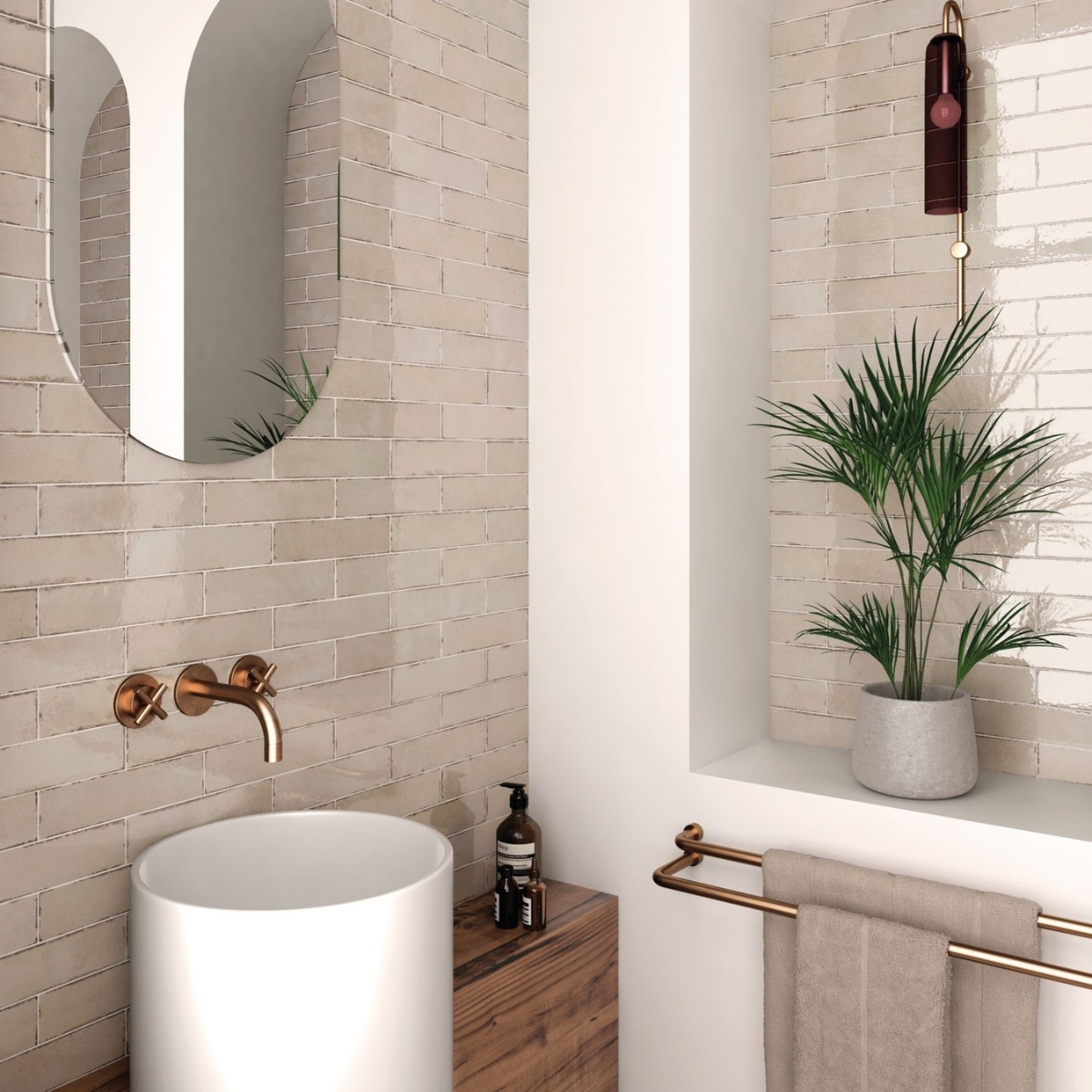
1st place! Simple Serenity: Artisan White Glossy (2.5 x 8)

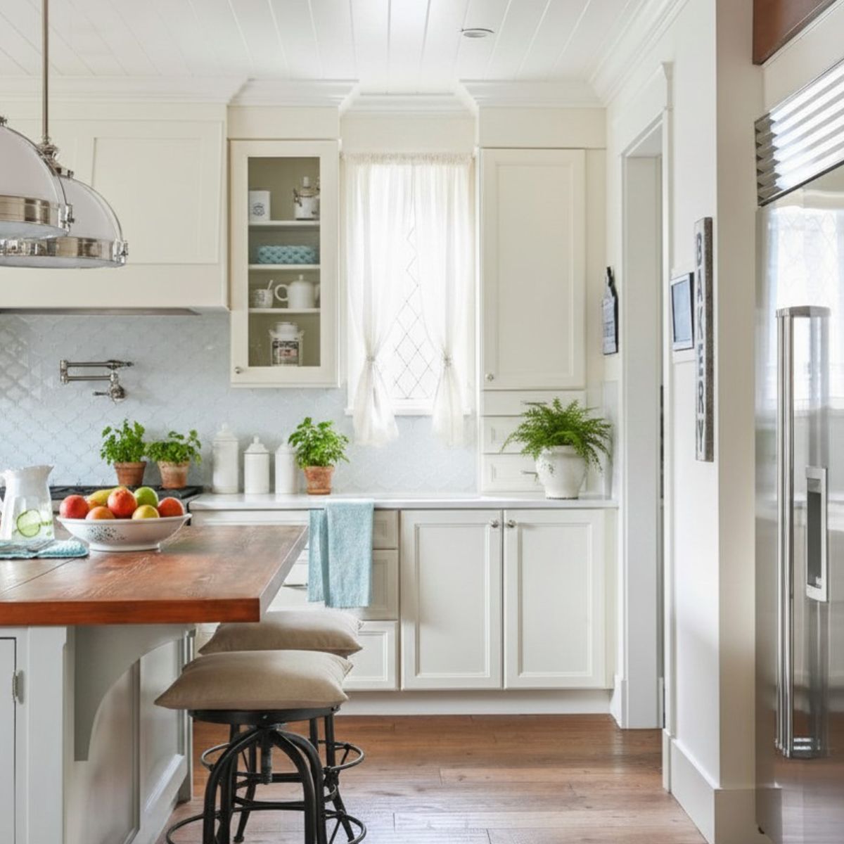
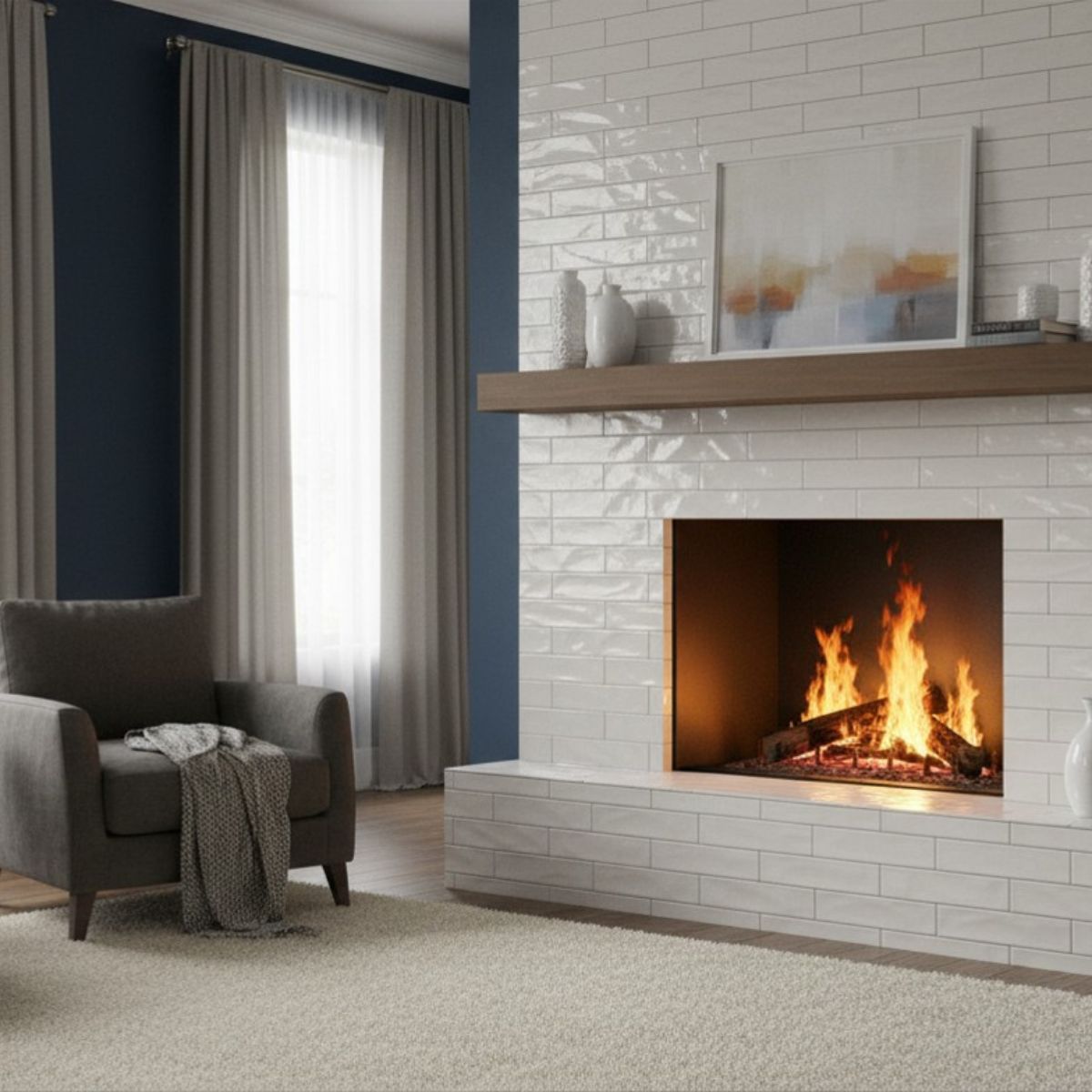
This classic glossy ceramic wall tile from Spain topped our charts for the second year in a row—and it’s easy to see why. Its clean, coastal-inspired look brings effortless charm to mid-century modern and minimalist spaces alike. Consider it the design equivalent of a timeless hit that never goes out of style—always chic, always in rotation.

Happy Holidays from our TileTown family to yours—see you in 2025!

The Verdict: White, organic-inspired tiles stole the show this year, proving that timeless, natural beauty never goes out of style. We can’t wait to see what makes next year’s best-of list.

Featured

Tips for Choosing Coloured Tiles vs. Black and White

From dazzling and glossy greens and blues to timeless greys and whites, tiles come in an assortment of colours and shades, each with their own design capabilities. Knowing which colour palette to use between the wide range of tile colours requires careful consideration, as the tiles you select can impact your room’s mood, perceived size, and so on.

To help you on this chapter of creating an extraordinary colour story, here are some tips for choosing tiles based on colour and shade.

Consider the room itself

Something you’ll want to think about and build towards when selecting tile colours is cohesion. This can pertain to the overall aesthetic and existing colours/design already existing in the room and doing your best to tie everything together with your tile colours. Such variables you need to think about for cohesion include:

-The colour of the walls
-The type of furniture in the room (colours, materials, finishes, etc.)
-The room size
-The lighting in the room (natural light or artificial)

If your furniture mostly consists of browns and greens, with wooden accents and several plants, you may consider choosing lighter coloured tiles in beige or grey to accent the already existing earth tones (which are a big trend in 2022). Something akin to our Versa 75 Caramel Click Vinyls could pair excellently with an earth tone vibe.

Perhaps you have a room that you want to appear bigger. The best choice would be a cream or pastel floor tile to accentuate the dimensions of the room and make it appear larger.

(You can learn more about tiles and room sizes by reading our blog post on the topic.)

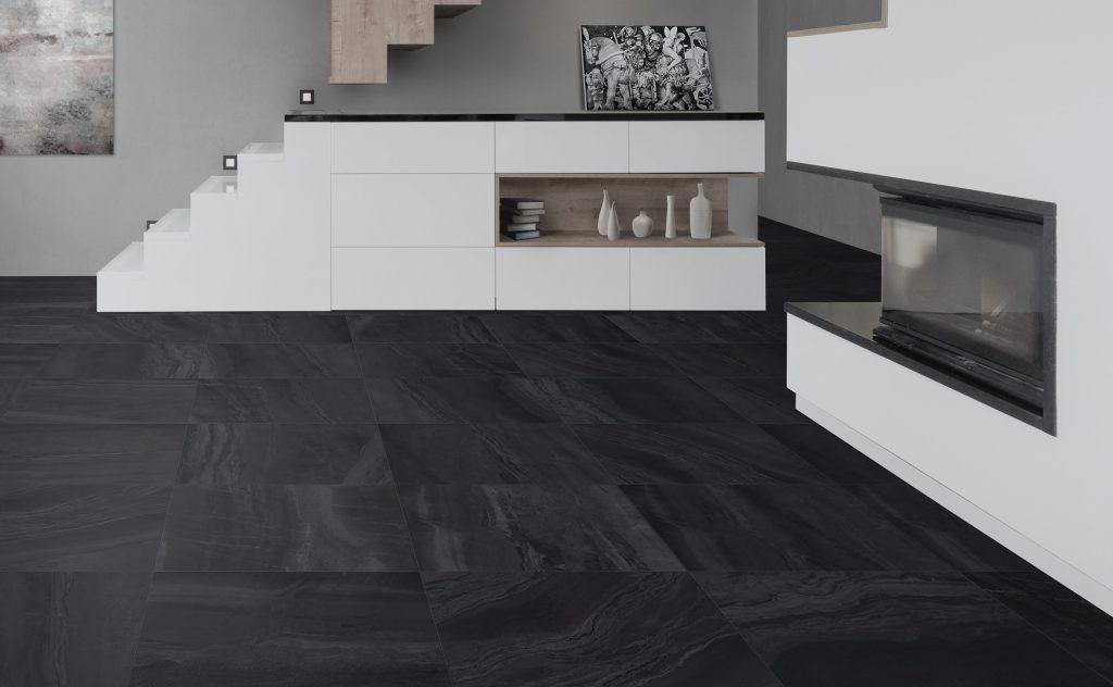
Larger rooms, like dining areas or kitchens, are paired well with darker floor tiles — especially if there’s plenty of natural light. Our Nohva Black Porcelain Tile works particularly well for enhancing more open areas, and the sleek matte black finish can be used to highlight any colour story you choose.

Featured: Nohva Black 12X24 Porcelain Tile

The overall goal when choosing a colour story for a room is ensuring that you’re creating harmony between colours. This of course does not mean you have to stick to a monochromatic look, you simply want to consider how each aspect of your room ties into one another.

Colours can impact your mood

It’s been proven time and again that colour has a substantial impact on people’s moods and appearances. There are plenty of tips and tricks regarding on how wearing certain colours can help you become more approachable, or how different coloured cars have different significances and meanings.

The same can be applied to tiles. Because of our automatic associations of colours to feelings, environments, or moods, tiles can play a major part in how a room feels.

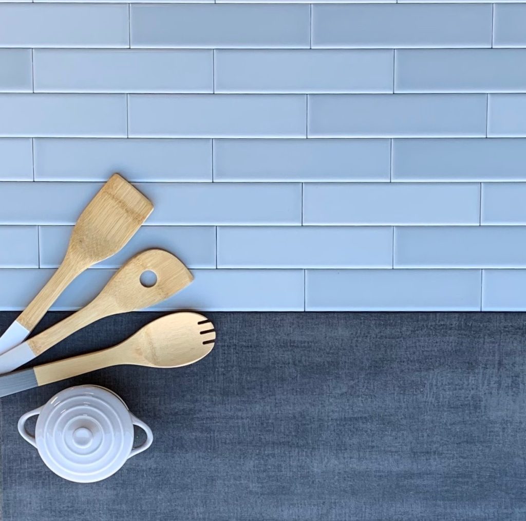
For instance, say you want your office area to feel calm and tranquil, or you want to make your kitchen feel less hectic with a nice backsplash. The best colour option would be a light blue, as blue has associations with serene waves or the stillness of the sky. The Dolce Sky (05) tiles would serve as a subdued feature to help you feel more restful in any busy environment.

Featured: Dolce Sky 2×8 Matte Ceramic Wall Tile

White tiles can evoke thoughts of cleanliness, perfection, and peace, as these are all things associated with white. This would do well in a bathroom or kitchen, especially if you’re wanting to portray a streamlined, polished look to your guests. In this instance, the La Marca Statuarietto tiles would best suit your refined taste.

Maximizing and minimizing: how to make either work

Depending on your own design preferences, you’re either going to gravitate towards maximizing your colours or minimizing them. Although there isn’t a right or wrong in these choices, it’s important to consider how to elevate these concepts with your tile choices.

Much in the same way you choose tile patterns, creating a blended look requires that you don’t overstimulate your guests. This is not to say you can’t use colour — rather, it’s about making smart choices on where you place them and how you incorporate colours together.

Let’s say you want to spice up a duller room that primarily consists of whites and greys. You can add a pop of colour to this area by adding an accent wall to draw the eye. Or, if you’re very big on colours and want to feature more of them, simply choose colours that are complimentary or have the same tones (cool, warm, etc.).

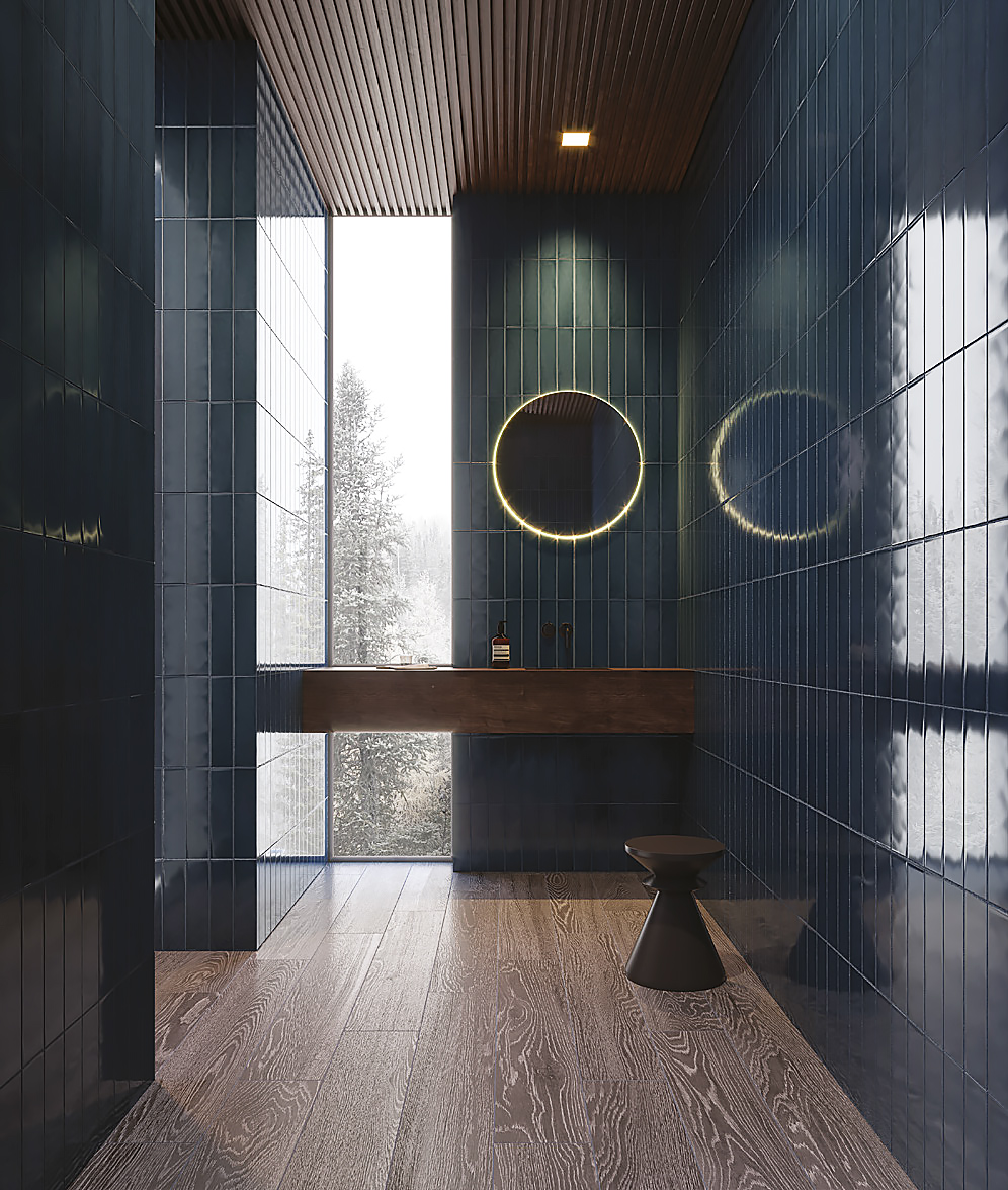
If you’re looking for coloured tiles that work well as an accent, our Lume Series (award winning, by the way) features an assortment of rich colours, such as the Lume Green in an enchanting gloss finish, or the soothing Lume Blue.

Some areas of your house may feel overstimulating with too much colour, especially in smaller, tighter spaces. In this instance, sticking to a monochrome scheme consisting or blacks, whites, and greys would help make your room feel less overwhelming and more organized.

A great tile for lightening up and pulling together a monochromatic space is the Paint Stone White Porcelain Tiles.

Featured: Paint Stone White 12X24 Porcelain Tile

(These tiles, and all of our other Italian tiles, are also a part of our incredible Italian Days event which continues throughout July. Learn more about this fun event.) For more assistance in visualizing a space, check out Tile Town’s remarkable Visualizer Tool, or visit a Tile Town near you!

Free Tile Design Help? Yes, That’s a Thing

Choosing tile sounds easy until you’re suddenly comparing 12 shades of white and asking, “Is this one… emotionally warmer?”

That’s where TileTown’s free design consultations come in.

Available in-store or virtually, these complimentary appointments help you choose tile that works for your space, style, budget and timeline. You can book a design appointment online, browse real TileTown tile collections or try the Room Visualizer before you visit.

Walk-ins are welcome too, but booking ahead gives you dedicated time with a consultant.

What Can a TileTown Design Consultant Help With?

A lot, actually. Not in a “please unpack my childhood” way, but close.

Pretty tile is only helpful if it’s the right tile for the job. Tile Town’s design consultants are Schluter®-Systems certified, with waterproofing and floor application training, so they can help you choose tile that works for the room, the install, and the real-life details around it.

They can help you:

  • Choose tile for bathrooms, kitchens, showers, floors, fireplaces and backsplashes
  • Pair floor tile with wall tile
  • Compare matte, glossy, textured, porcelain, ceramic and stone-look options
  • Choose grout that works with the tile, not against it
  • Coordinate tile with cabinets, counters, paint, hardware and lighting
  • Find in-stock options if your timeline is tight
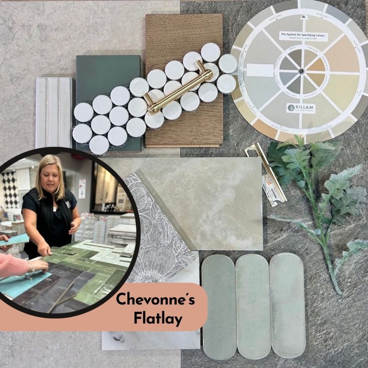
  • Build a flatlay so you can see everything together
  • Turn inspiration photos into actual products you can buy
  • Suggest a specific tiler/pro for your project if you require one

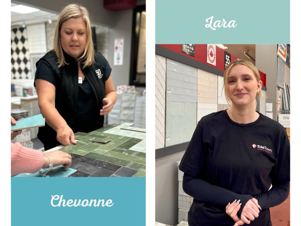
Meet Chevonne and Lara

Representing B.C., our talented design consultant Chevonne works with customers out of TileTown Langley, helping pull together colours, finishes and materials that feel polished but still practical.

Representing A.B., our skilled design consultant Lara works with customers out of TileTown Edmonton South, helping turn inspiration images into real tile plans for kitchens, bathrooms, floors and more.

Whether you arrive with one photo, a contractor’s timeline or 83 screenshots that you swear are more warm cream than beige (don’t worry, we believe you!), they can help you narrow things down without judgement.

Why Flatlays Are Your Friend

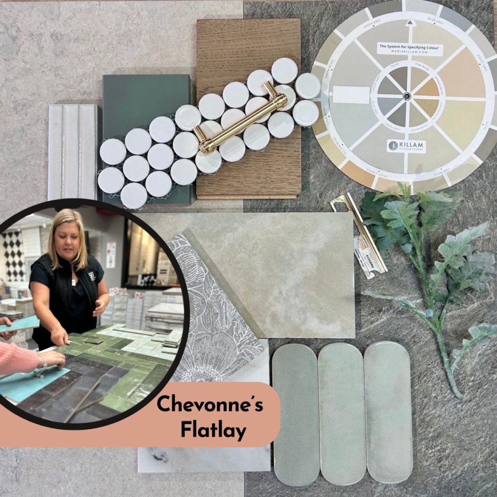
TileTown flatlay with green, neutral and textured tile samples.

Chevonne’s flatlay pairs Genesis Storm Matte 12×24 Glazed Porcelain Tile with Heritage Nude 12×24 Glazed Porcelain Tile, layering soft greens, warm wood, white mosaics and brass finishes for a calm, collected palette that feels ready for real life.

A flatlay is one of the easiest ways to avoid expensive second-guessing.

By seeing tile beside grout, paint, counters, wood tones and hardware, you can catch problems early. Maybe the white tile pulls too grey. Maybe the grout has too much contrast. Maybe the “subtle feature tile” is quietly auditioning for Vegas.

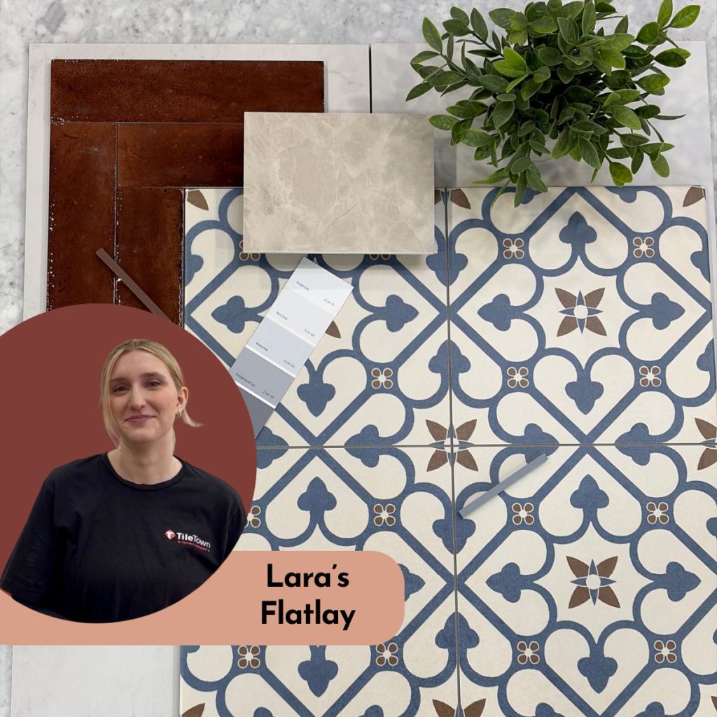
TileTown flatlay by Lara featuring Brighton Blue 18x18 Glazed Porcelain Tile and Lume Caramel tile with warm neutrals, marble-look tile, greenery and coordinating finish samples.

Lara’s flatlay pairs Brighton Blue 18×18 Glazed Porcelain Tile with Lume Caramel tile, balancing bold pattern with glossy warmth, soft neutrals and fresh greenery for a look that feels classic, colourful and easy to live with.

Flatlays help you compare:

  • Warm vs. cool tones
  • Large-format tile vs. mosaic tile
  • Matching grout vs. contrast group
  • Soft texture vs. bold pattern
  • Simple backsplash vs. statement wall

It’s a small step that can save a lot of “oh no” later.

Real Tile Advice Beats Guessing

Online inspiration is helpful, but tile has real-life rules. It needs the right size, finish, texture, slip resistance and installation specs for the space.

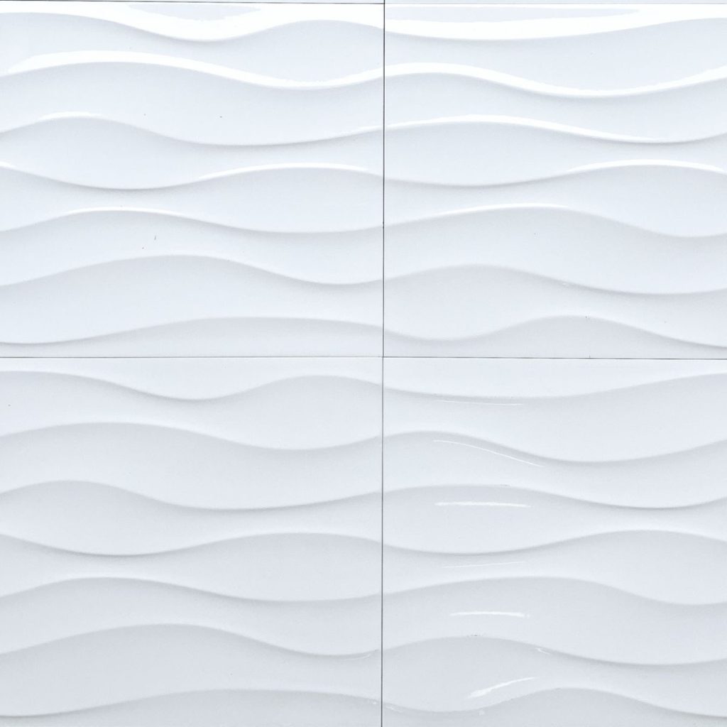
Close-up of Cascade Wavy White textured ceramic wall tile from TileTown.

Cascade Wavy White adds soft texture to walls, showers, fireplaces and backsplashes.

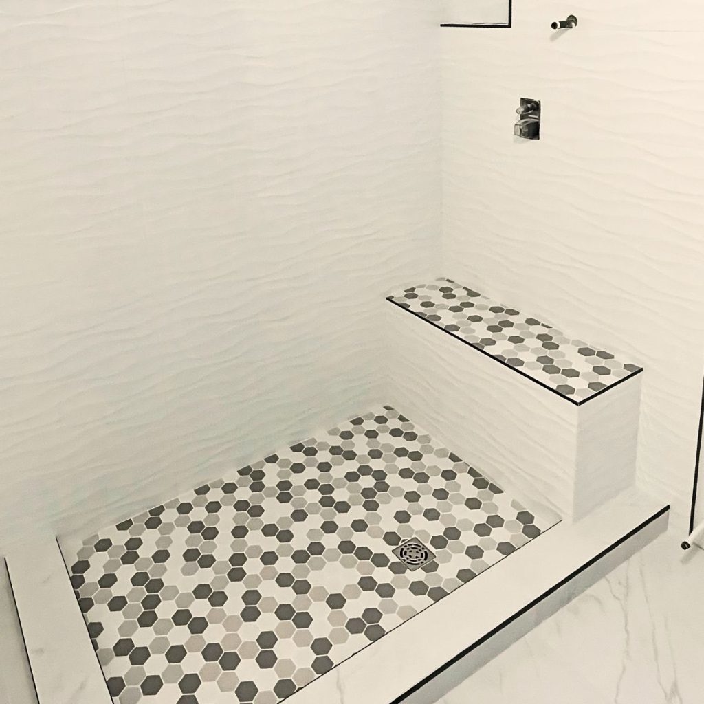
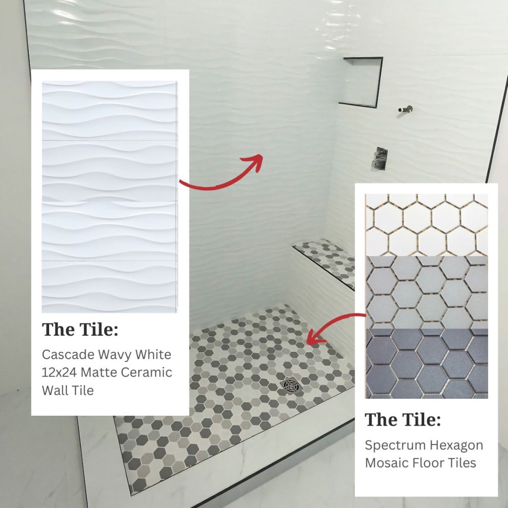
This bathroom shower reno pairs TileTown’s textured Cascade Wavy White wall tile with Spectrum Hexagon Mosaic floor tile for a clean, layered look.

For example, Cascade Wavy White 12×24 Ceramic Wall Tile adds soft movement to shower walls, fireplaces, feature walls and backsplashes.

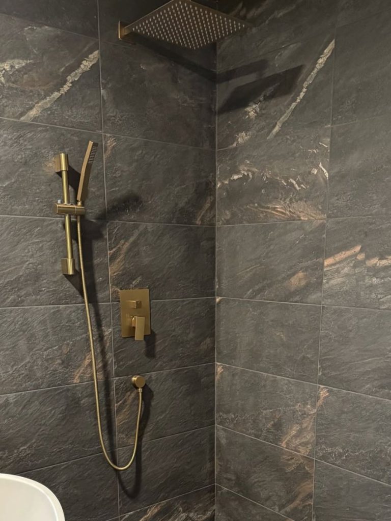
Shower with Fitch Rainbow porcelain tile from TileTown.

Fitch Rainbow brings rich, stone-inspired variation to showers, floors and feature walls.

For a bolder stone-inspired look, Fitch Rainbow 12×24 Porcelain Tile can work on floors, walls, showers and fireplaces.

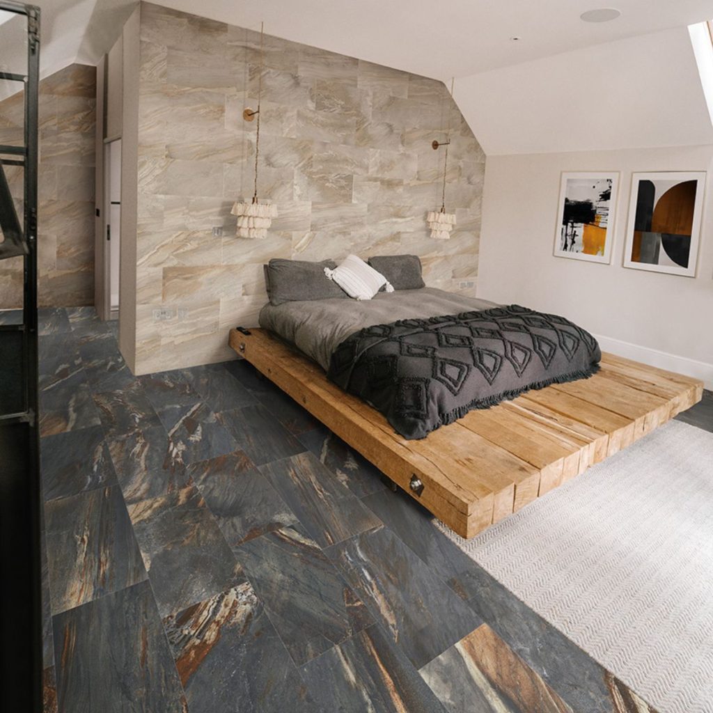
Bedroom with Fitch Rainbow stone-look tile on the feature wall and floor from TileTown.

Fitch Rainbow tile brings a bold, stone-inspired look to this bedroom feature wall and floor, adding natural movement, warmth and a little drama without requiring a full personality change.

A consultant can help you figure out what works where, what’s available and what will still look good once it leaves the showroom lighting, which, frankly, flatters everyone.

What to Bring

You don’t need a perfect plan. That’s the whole point.

Bring what you have:

  • Photos of your space
  • Rough measurements
  • Inspiration images
  • Cabinet, counter or paint samples
  • Hardware finishes
  • Tile you already like
  • Your budget
  • Your timeline

No measurements? Still come. No samples? Fine. No clue? Honestly, that’s a very normal starting point.

And remember: Screenshots are a viable start. TileTown’s design consultants help turn your saved inspiration into real products, smart pairings and a plan you can build from.

We’re ready.

Ready for free tile design help? Book an in-store or virtual appointment, browse TileTown’s tile collections, try the Room Visualizer or stop by your nearest TileTown showroom.

AI Made a Pretty Tile Picture. Now Let’s Make It Real

AI design tools are great for inspiration, but not every tile they dream up exists. Here’s how to turn a pretty render into a practical TileTown shopping plan.

AI can do a lot. It can write a poem, plan a vacation and generate a bathroom so stylish it makes your current one feel personally bullied.

But here’s the catch: the tile in that AI image might not actually exist.

At TileTown, we’re seeing more customers bring in AI-generated kitchens, bathrooms and floors, hoping to find the exact tile in the image. Sometimes, we can get close. Sometimes, we can find something better. And sometimes, the “tile” is just a gorgeous little robot fib.

AI is great for inspiration. But when it’s time to actually buy tile, you need real products, real samples and real advice.

That’s where TileTown comes in.

Browse real, in-stock tile collections, visit one of our showrooms or book a free design appointment.

AI can start the idea. We’ll help make it buildable.

Why AI Tile Images Can Be Tricky

AI images look convincing, but they don’t always come with the practical details a real renovation needs.

That dream tile may not have:

  • A real product name
  • An actual size
  • Stock availability
  • Shower or floor-use specs
  • Slip-rating info
  • Trim pieces
  • Grout recommendations

In other words: it’s a vibe, not a purchase order.

And tile has a job to do. Shower tile, floor tile, backsplash tile and fireplace tile all need to perform differently. “Looks cute online” is sadly not an industry standard.

Start With Tile That Actually Exists

The smarter way to use AI? Start with a real TileTown product.


Instead of asking:
“Show me an earthy brown kitchen backsplash with handmade-looking tile.”

Try a specific prompt:
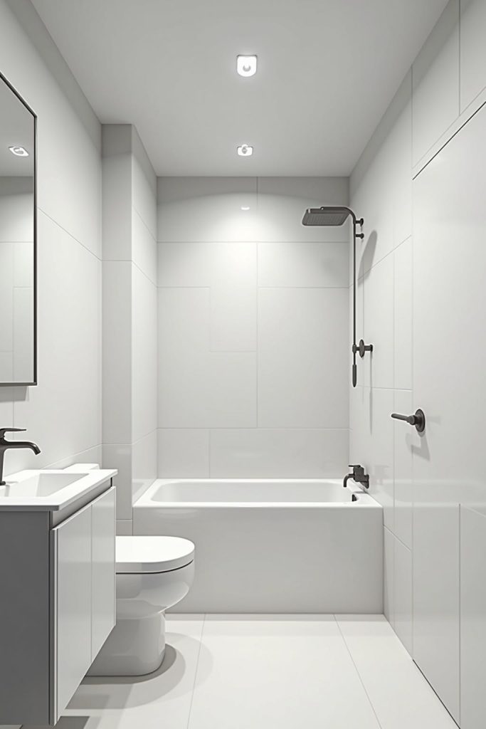
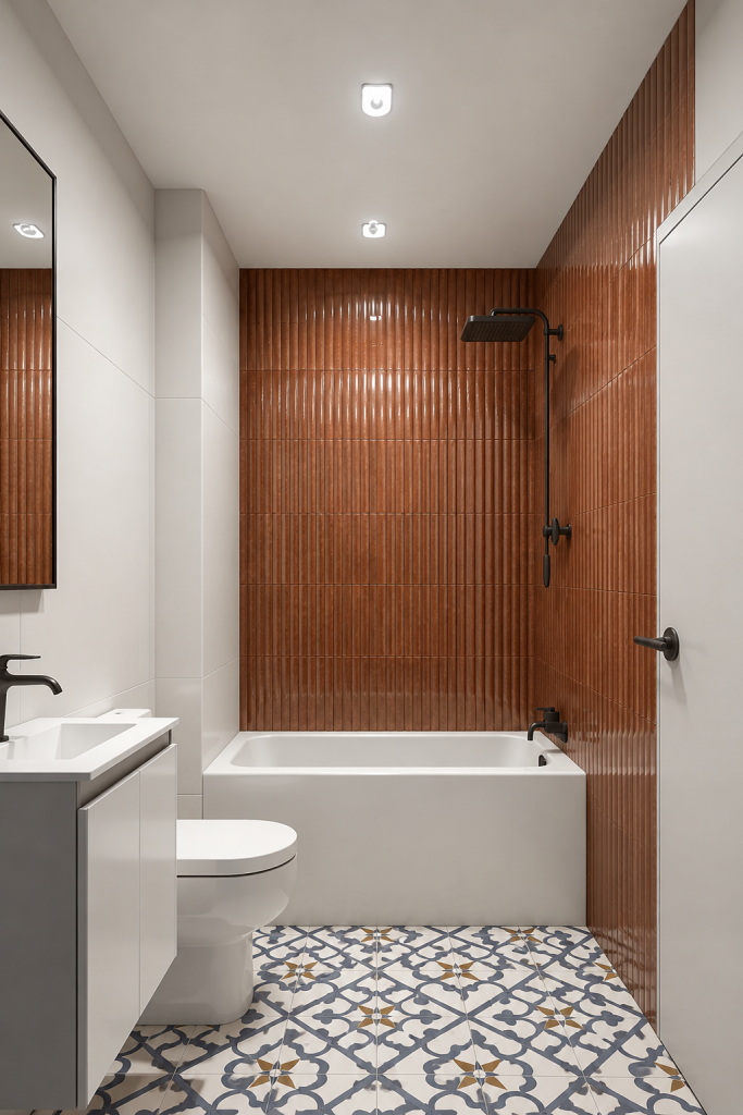
“Place Lume2 Caramel 2×9 tile from TileTown on the shower wall in this uploaded bathroom photo & Brighton Blue 18×18 porcelain on the floors. Keep the cabinets, counters and lighting close to the original.

Pro Tip:
Including the webpage url of the product gives a clear signal to ChatGPT so you don’t have to waste time trying to get the image right.


This gives AI a real TileTown product to work with, instead of letting it invent a dream tile you can admire, screenshot and never actually buy.

It also helps to upload a photo of your actual space. Without one, AI may give you a gorgeous editorial kitchen with the lighting of a Nancy Meyers movie and the budget of a boutique hotel lobby. Lovely? Yes. Useful for your Tuesday-night backsplash decision? Not always.

Original bathroom photo shown beside an ChatGPT generated AI version with a caramel tile backsplash.

ORIGINAL BATHROOM

AI VERSION USING PROMPT

Uploading a real room photo (left) gives AI a better starting point, but the result (right) is still inspiration, not a final design plan.

You can see how different the same tile idea can feel once lighting, counters, cabinets and layout enter the chat. AI can help you picture possibilities, but samples and expert advice help you make the right call in real life.

Tile Inspiration: Our New Lume2 Caramel

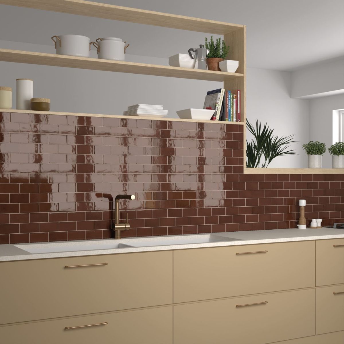
Looking for something warmer? Lume2 Caramel 2×9 Glazed Porcelain Tile adds glossy colour and depth to a kitchen backsplash, bathroom wall or feature moment.

It’s a good option when you want a space to feel layered and inviting, not like it was assembled entirely from rental-apartment greige.

NEW Lume2 Caramel glazed porcelain tile from TileTown.

Want a Softer Colour Story?

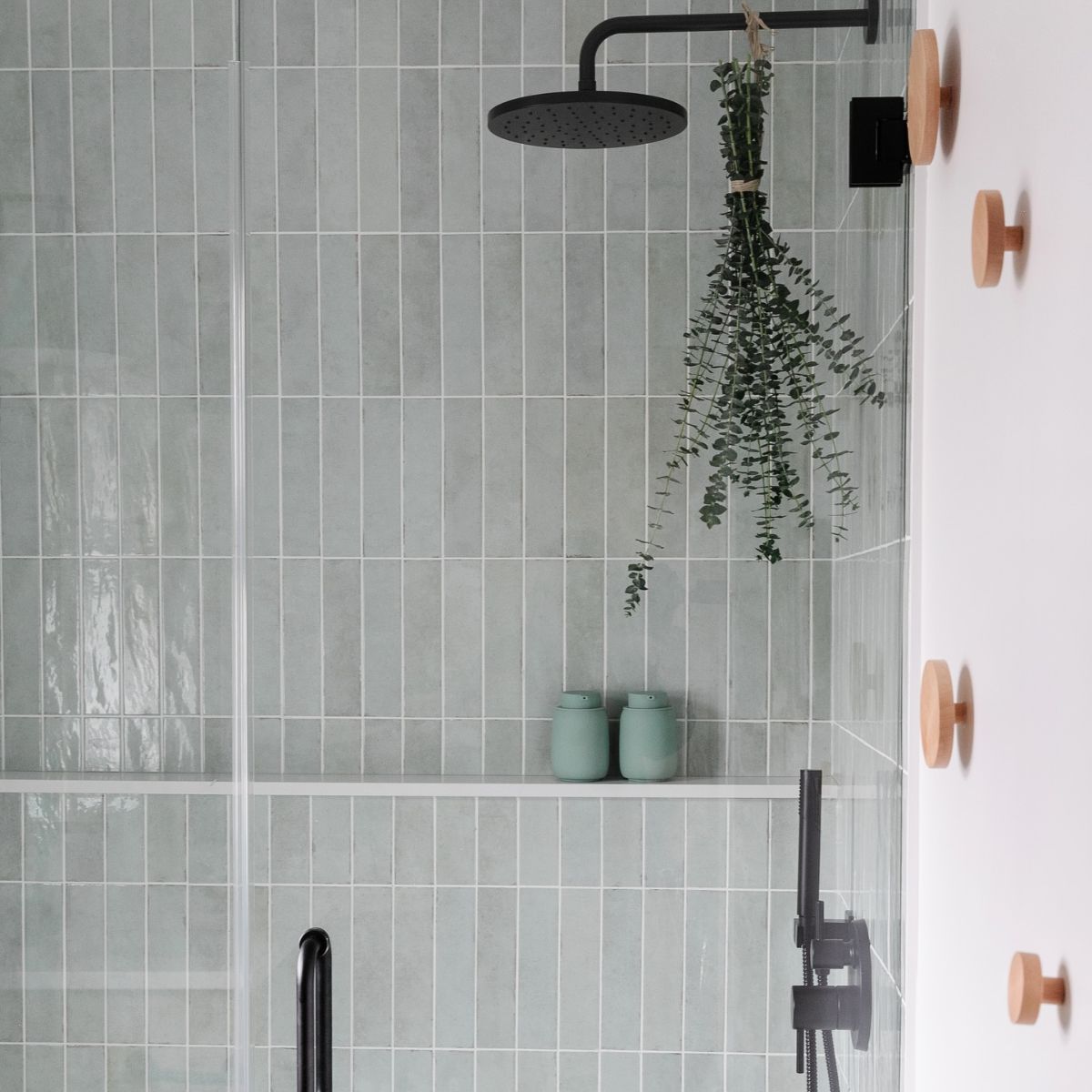
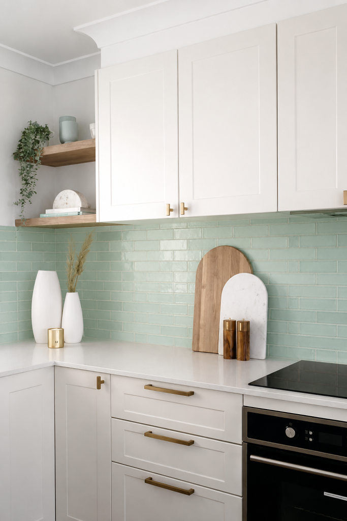
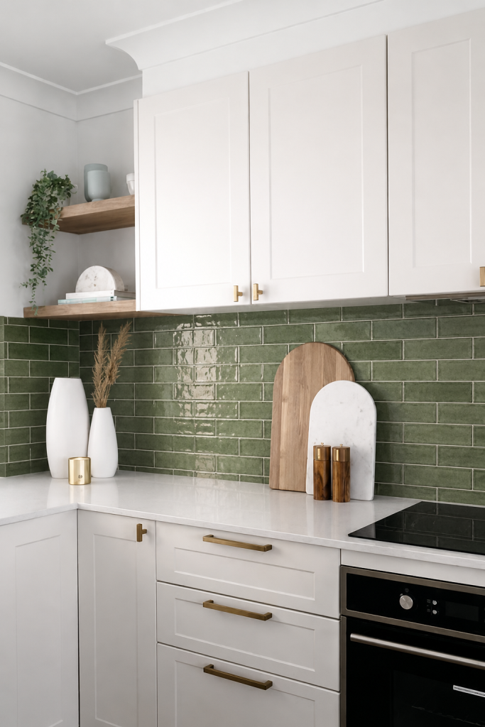
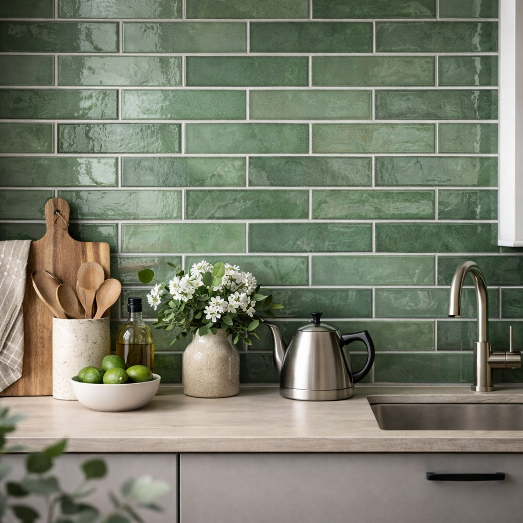
If your AI image is leaning fresh, glossy and green, look at real options like Tribeca Sage Green 2.5×10 Glazed Porcelain Tile or Tribeca Seaglass Mint 2.5×10 Glazed Porcelain Tile.

Both bring that handmade-inspired subway tile feel, with tonal variation and soft edges that add personality without making the room yell, “Look at me, I’m whimsical now.”

Kitchen backsplash with Tribeca Seaglass Mint glazed porcelain tile from TileTown.

ChatGPT image:Tribeca Seaglass Mint brings glossy colour, subtle variation and handmade-inspired character to backsplashes, bathrooms and feature walls.

Bathroom wall featuring Tribeca Sage glazed porcelain tile from TileTown.

ChatGPT image: Tribeca Sage creates a soft, fresh backdrop with just enough colour.

Try the Room Visualizer

The easiest way to avoid falling for fake tile? Use real tile from the start.

Feel confused about ChatGPT and other AI platforms? TileTown’s Room Visualizer lets you upload a photo of your room and preview TileTown tile, vinyl flooring and pavers in your space, right from our website.

Use it to test:

  • Bathroom tile
  • Kitchen backsplash tile
  • Floor tile
  • Shower tile
  • Vinyl flooring
  • Outdoor pavers

It’s not a replacement for samples, but it’s a great first step before visiting the showroom.

Bring Us the AI Image Anyway

Already made an AI room you love? Bring it in.

The image tells us what you’re drawn to: colour, texture, scale, pattern and mood. Our job is to translate that into real TileTown products.

Bring:

  • The AI image
  • Photos of your actual space
  • Rough measurements
  • Cabinet, counter or paint samples
  • Your budget
  • Your timeline

If your AI image shows a glossy caramel backsplash, we might point you toward Lume2 Caramel. If it shows a soft green wall tile, Tribeca Sage Green or Tribeca Seaglass Mint could be strong starting points. If it shows a patterned floor, we can walk you through mosaics, hex tile and other options that exist outside the glowing rectangle.

Bathroom shower with Cascade Wavy White wall tile and hexagon mosaic floor tile from TileTown.

Real tile, real shower, real choices: textured wall tile meets patterned mosaic flooring.

Always Take Samples Home

A screen can lie. Tile samples are much less dramatic.

Before you commit, we provide full size tile samples to take home:

  • In morning light
  • At night
  • Beside your cabinets
  • Next to your countertop
  • Under your actual bulbs
  • On the floor or wall where they’ll go

Tile changes with light, grout, paint, furniture and surrounding finishes. A sample helps you catch that before installation, which is always preferable to learning it while standing barefoot in regret.

Book Free Tile Design Help

Stuck between three tiles? Trying to match an AI image? Wondering if your grout choice is quietly ruining your life?

Our design consultants can help with:

  • Matching inspiration images to real tile
  • Choosing floor, wall, shower or backsplash tile
  • Pairing colours and finishes
  • Selecting grout
  • Checking stock
  • Working within your budget
  • Planning your next steps

You can book online for in-store or virtual appointments, or stop by your nearest showroom.

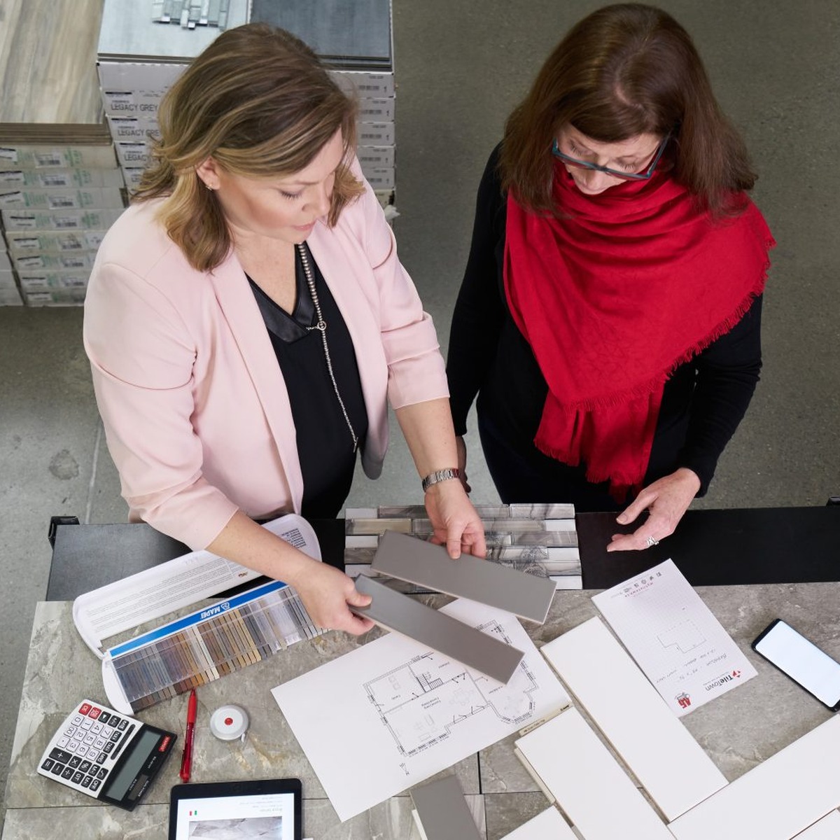
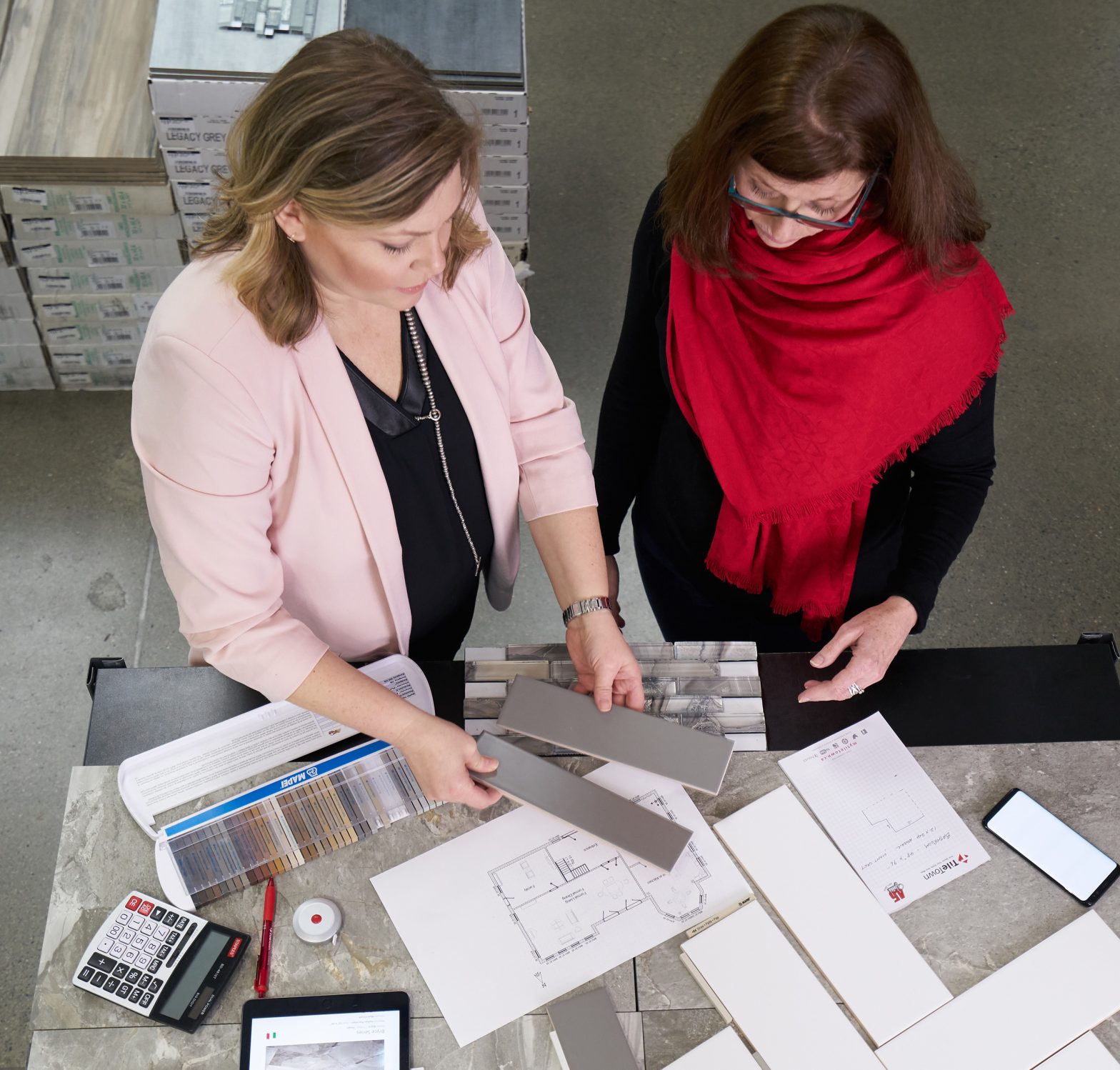
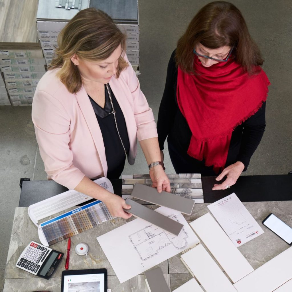
TileTown design consultant reviewing tile samples and grout options with a customer.

TileTown design consultants can help turn inspiration images into real product options.

AI can help you imagine the room. TileTown can help you build it.

Use AI for ideas. Use the Room Visualizer to preview real products. Take samples home. And when you’re ready to turn the pretty picture into an actual plan, visit TileTown or book a free design appointment.

We’ll help you find tile that looks good, works hard and, most importantly, exists.

Small detail. Surprisingly important.

The Tile Trend of 2026? Texture, Texture, Texture

Ripples, waves, stone looks and handmade-style finishes are making tile feel warmer, richer and a lot more interesting.

Flat tile is not dead. It is just no longer the only one getting the spotlight.

One of the biggest tile shifts right now is texture: ripples, waves, handmade edges, weathered finishes and surfaces with enough movement to make a room feel richer without piling on colour or pattern. It is an easy way to add depth to a kitchen, bathroom or feature wall without turning the whole space into a design monologue.

In other words, if your room needs more personality but you are not ready to commit to something loud, texture is a very good place to start.

Why texture is having a moment

Texture does what flat surfaces cannot: it plays with light. A wavy gloss tile catches shadows. A softly imperfect finish feels relaxed instead of showroom-stiff. A stone-look porcelain adds depth before you have even brought in the wood accents, towels or expensive hand soap pretending to be self-care.

That is why this trend works. It adds interest without adding chaos.


1. A Soft Gloss That Still Feels Fresh

 A glossy mint tile adds colour, texture and a little lift.
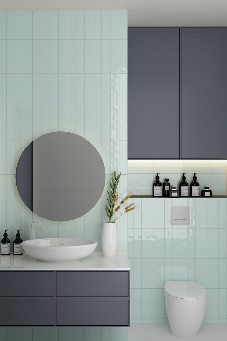
Tile shown: Boulevard Mint Gloss 3×12 Glazed Ceramic Tile

Boulevard Mint Gloss 3×12 Glazed Ceramic Tile proves texture and colour can show up together without making a scene. The soft mint feels light and calm, while the glossy finish gives the wall a little lift.

It is fresh, a little playful and still easy to live with. Basically, the kind of tile that wakes up a bathroom without yelling.


2. Pattern With Built-In Charm

Pattern brings instant rhythm and old-world charm.
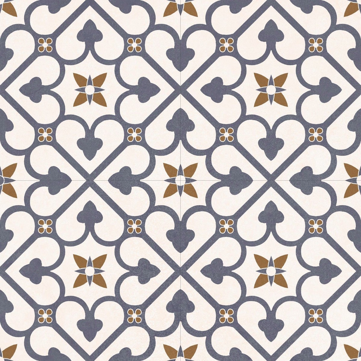
Tile shown: Brighton Blue 18×18 Glazed Porcelain Tile

Brighton Blue 18×18 Glazed Porcelain Tile brings a different kind of texture: visual texture. The pattern adds rhythm, contrast and a little old-world charm that makes a room feel considered fast.

Use it where you want the tile to do some of the heavy lifting, like a powder room floor or feature wall. It has personality, but it is not needy.


3. Subtle Texture for Clean White Spaces

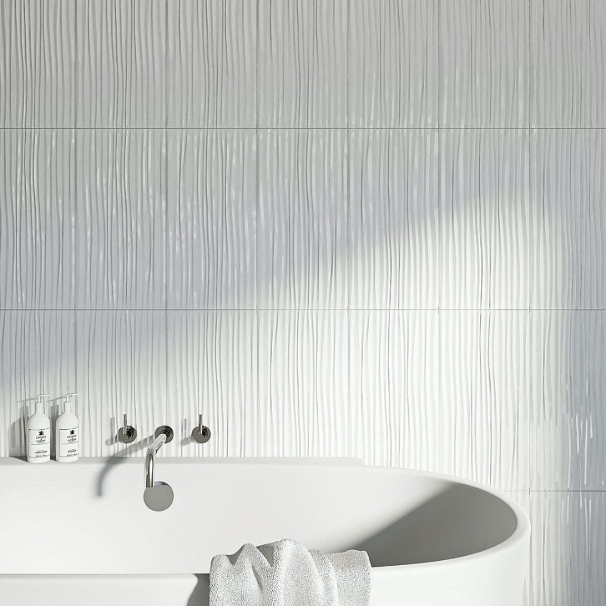
A wavy white wall adds movement without making a fuss.
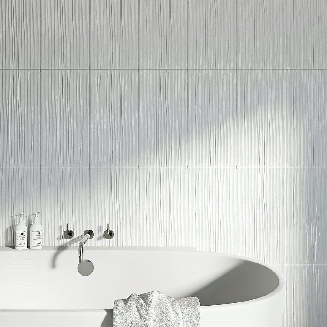
Tile shown: Cascade Rainfall White 12X24 Gloss Ceramic Wall Tile

Cascade Rainfall White 12X24 Gloss Ceramic Wall Tile is for anyone who wants texture without drama. The wave effect is quiet, but it changes the whole wall once the light hits it.

It is clean, minimal and just interesting enough to keep a white bathroom from feeling like it gave up.

4. White Tile, but With a Little Life
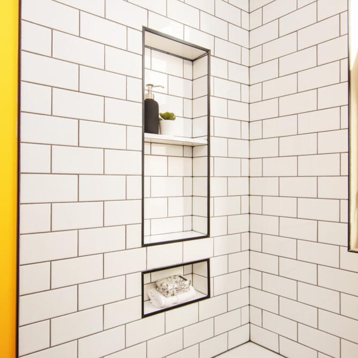
White tile, but with shine, variation and a lot more life.
Tile shown: Lume White 2.25×9.375 Gloss Glazed Porcelain Subway Tile

Lume White 2.25×9.375 Gloss Glazed Porcelain Subway Tile is a great example of how texture can keep white tile from feeling flat or default. The glossy finish and variation give it that softly handmade look people keep falling for, for good reason.

It is polished, a little imperfect and a lot more interesting than basic subway.


5. A Backsplash With Better Cheekbones

A rippled gloss finish gives a simple white wall more presence.
Tile shown: Metro Pearl Wave Gloss 3×12 Glazed Ceramic Tile

Metro Pearl Wave Gloss 3×12 Glazed Ceramic Tile takes a simple white wall tile and gives it movement. That wave detail catches the light and makes a backsplash or bathroom wall feel more dynamic without pulling focus from everything else.

Neutral, yes. Boring, no.


6. Stone-Look Texture That Stays Calm

Soft stone-look texture keeps the space calm, layered and expensive-looking.
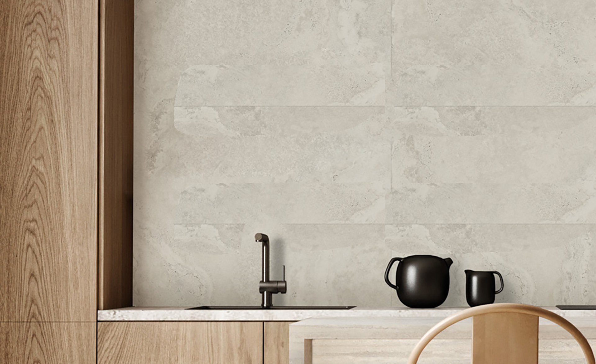
Tile shown: Wonder Shade 12×24 Glazed Porcelain Tile

Wonder Shade 12×24 Glazed Porcelain Tile is texture in a quieter register. Instead of shine or ripples, it brings soft stone-inspired movement that makes a room feel grounded and layered.

This is the kind of tile that makes a bathroom feel expensive without trying too hard, which, frankly, is the dream.


7. A Softer Take on Stone

This cloudy stone look brings texture the subtle way.
Tile shown: Navona Soft Niveo 12×24 Porcelain Tile

Navona Soft Niveo 12×24 Porcelain Tile leans into that cloudy, travertine-inspired look that adds warmth and texture in a more natural way. It is a strong option for minimalist spaces that still need a pulse.

Serene, subtle and very grown up.


8. Classic Texture Underfoot

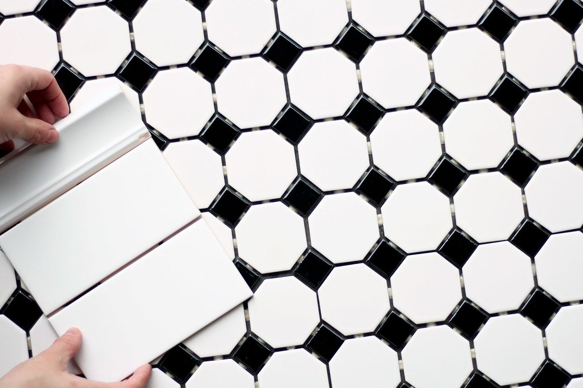
Classic black-and-white octagon tile adds crisp, timeless character underfoot.
Tile shown: Retro Octagon Matte White With Black Dot 2×2 Ceramic Floor and Wall Tile

Retro Octagon Matte White With Black Dot 2×2 Ceramic Floor and Wall Tile is proof that texture can also mean pattern and shape. This one brings instant rhythm and a crisp, timeless feel.

It is especially good in bathrooms and laundry rooms where you want the floor to have a little personality without requiring a full pep talk.


9. A Matte White That Feels Softer

A smaller matte white tile gives the wall a softer, more relaxed feel.
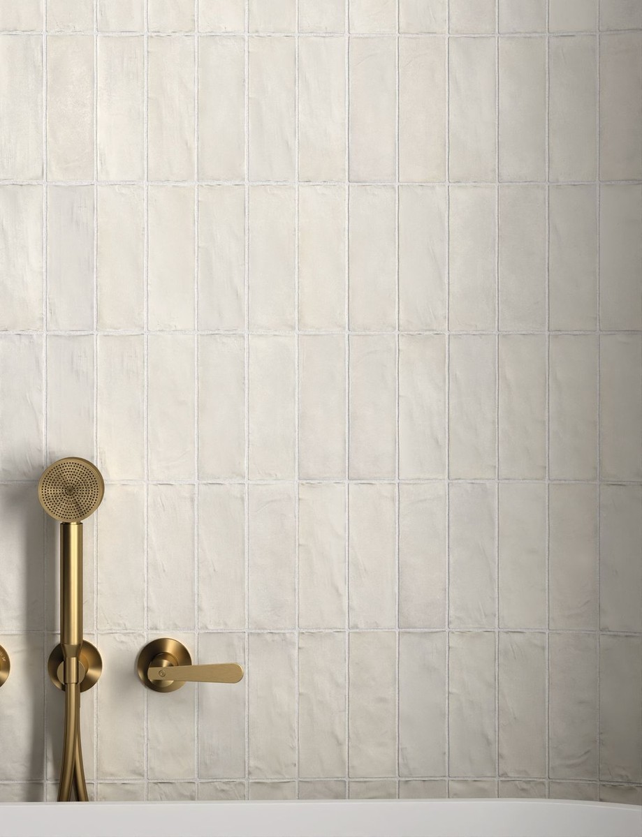
Tile shown: Sabbia Silica White 2.5×8 Glazed Ceramic Tile

Sabbia Silica White 2.5×8 Glazed Ceramic Tileis a reminder that texture does not have to be dramatic to work. A smaller format, softer finish and repeated shape can do a lot on their own.

It is white wall tile with a more relaxed, less obvious energy.


How To Use Textured Tile Without Overdoing It

A sculptural wave tile adds movement fast, so keep the rest of the room clean and let it do the flirting.
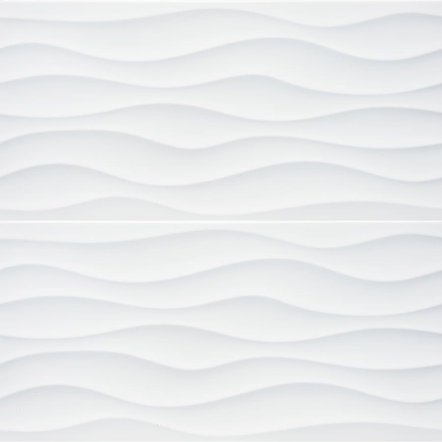
Tile shown: Cascade Wavy White 12×24 Matte Ceramic Wall Tile

If you are using something sculptural like Cascade Wavy White or Metro Pearl Wave, let that be the star and keep the rest of the room simple.

Stone-look porcelain adds calm movement and spa energy without the spa-brochure vibe.
Tile shown: Navona Soft Niveo 12×24 Porcelain Tile

If you are leaning into stone-look texture like Wonder Shade or Navona Soft Niveo 12×24 Porcelain Tile, warm woods, brushed brass and matte black all play nicely with it.

And if you are not sure how much texture your space can handle, start small. A backsplash, shower wall or powder room floor can go a long way.

Final Thoughts

Texture is one of the easiest ways to make a space feel more current in 2026. It adds depth, softness and personality without demanding a full design personality transplant.

Want to test the look before you commit? Try TileTown’s Room Visualizer and see how these surfaces behave in your actual light, with your actual finishes, before your sample pile starts bossing you around.

Or come in and speak to one of our pros!

Shop the tiles in these images

Warm Neutrals Are Replacing Cool Gray: How to Use Tile to Soften a Space

Cool gray had a long run. Respectfully, it is time for a nap.

The mood now is warmer: beige, taupe, sand, oat and soft greige tones that make a room feel calmer, gentler and a lot less like a waiting room with under-cabinet lighting.

Think less icy showroom, more deep exhale. Softer walls. Sunnier floors. Backsplashes with a little glow instead of a little attitude problem.

Warm neutral gloss tile proves beige can still have a pulse.
Tile shown: Tribeca Oatmeal 2.5×10 Glazed Porcelain Tile

This is the kind of warm neutral that is winning right now: light-catching, softly varied and just polished enough to make a bathroom feel expensive without slipping into spa-brochure territory.

A weathered greige wall tile adds mood without making the room feel cold.
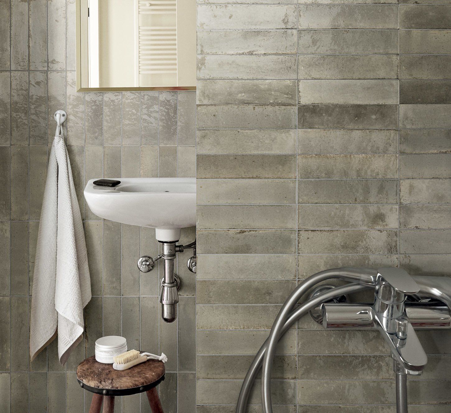
Tile shown: Lume Greige 2.25×9.375 Gloss Glazed Porcelain Subway Tile

The weathered look here is what makes the room feel grounded. It is neutral, yes, but it is not blank. It has just enough movement to keep the wall alive.

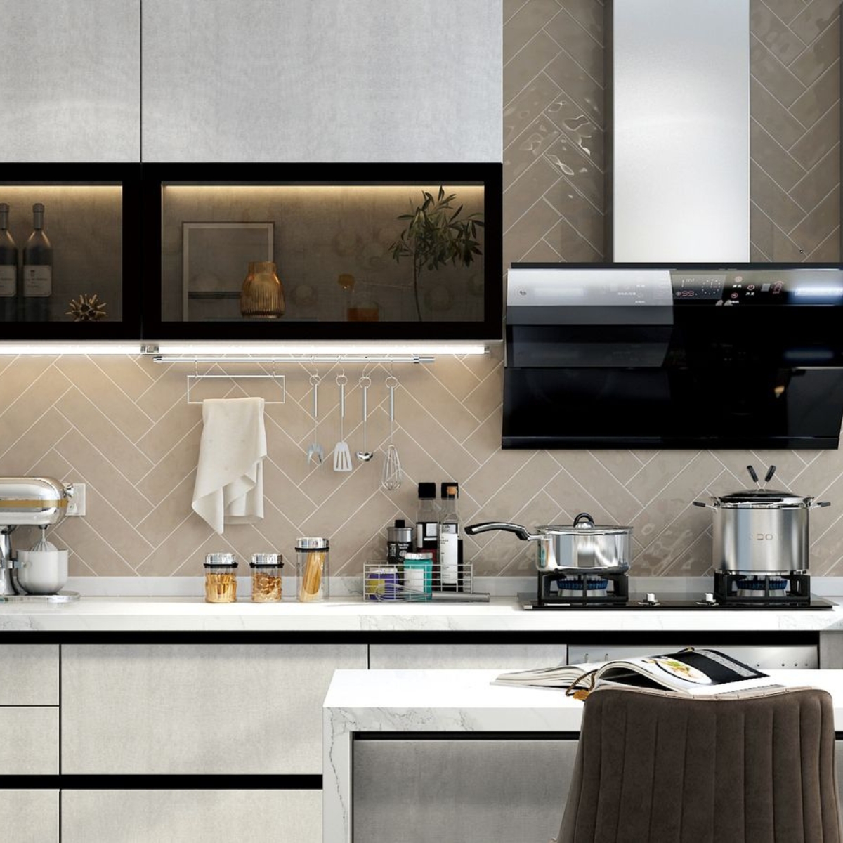
A warm herringbone backsplash softens a kitchen fast.
Tile shown: Boulevard Latte Gloss 3×12 Glazed Ceramic Tile

Warm neutrals also do a lot with very little. Here, the herringbone layout adds movement, but the soft taupe keeps it calm. The kitchen looks sharper because the backsplash is not trying to outshine everything else.

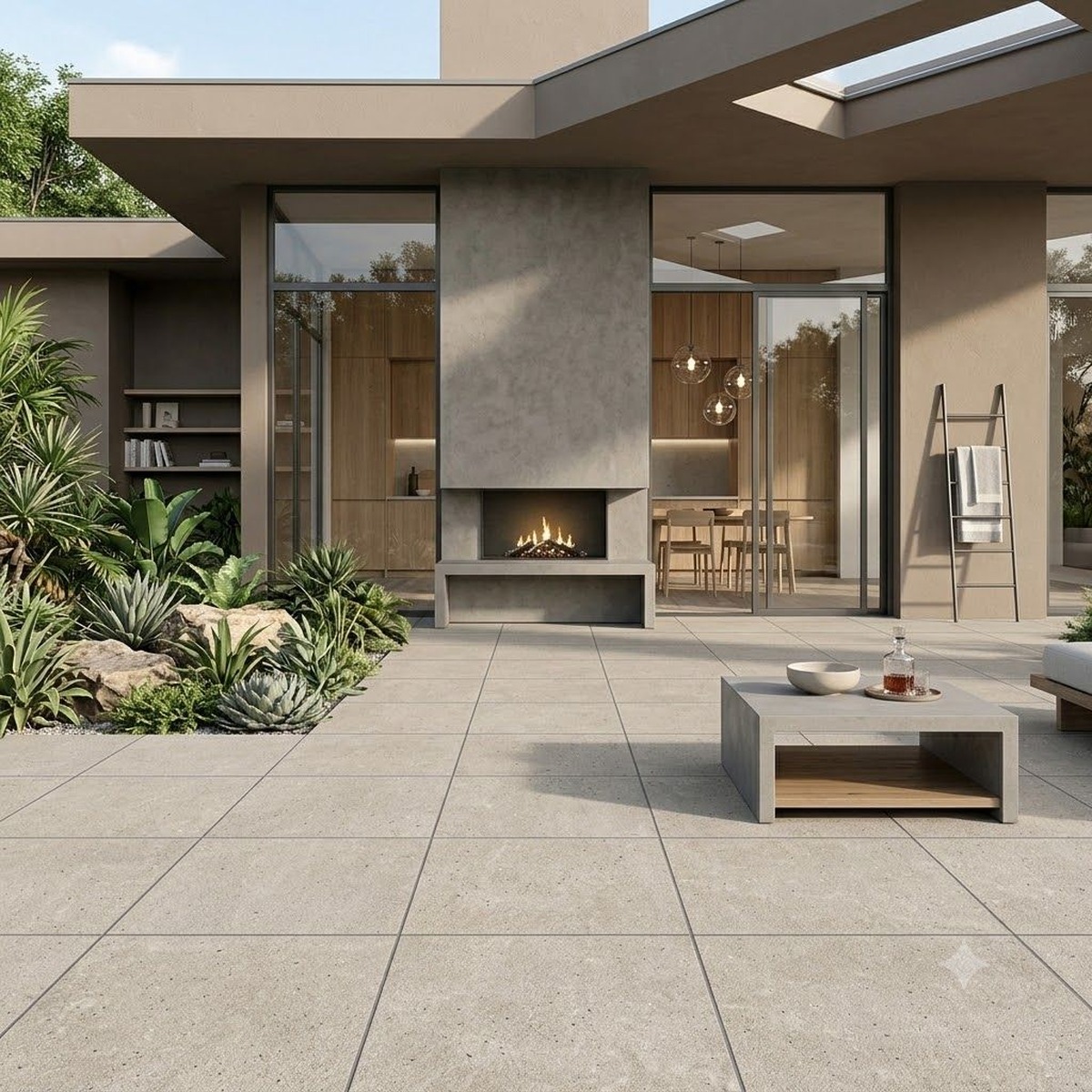
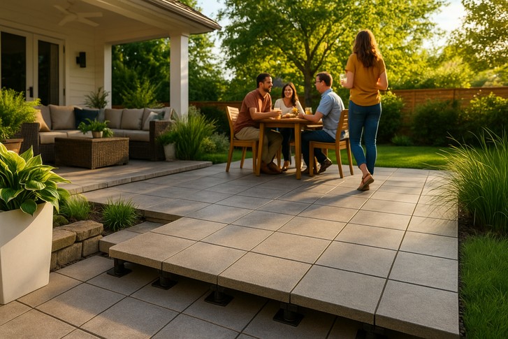
Outdoors counts too. Warm stone-look pavers keep a patio bright, relaxed and easy on the eyes.
Tile shown: Wonder Dunes 12×24 Glazed Porcelain Tile

Warm neutrals are not just for kitchens and bathrooms. Outdoors, they read sun-washed and calm, which is exactly what you want from a patio instead of corporate plaza, but make it residential.

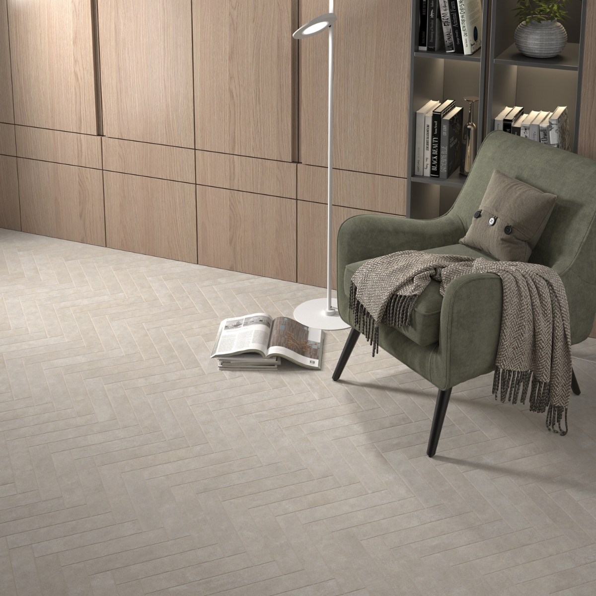
A pale herringbone floor brings subtle rhythm to a room and makes the whole space feel warmer.
Tile shown: Stage Taupe 2.5×12 Glazed Porcelain Tile

This is the quieter side of the trend. A soft sand floor in herringbone does a surprising amount of work: it adds texture, keeps the room warm and still lets the furniture have a life.

Warm neutrals make a richer accent tile look even better.
Tile shown: Lume Blue 2.25×9.375 Gloss Glazed Porcelain Subway Tile

And this is why warm neutrals are such a good base. Once the bigger surfaces feel softer, you have room to bring in a moodier accent without the whole space turning into a design monologue.


That is really why cool gray is losing ground. Warmer tones are easier to live with. They flatter wood, brass, black accents and richer colour. They make a room feel layered without making it feel busy. And they give you a much better starting point if you want to add one moodier note later on.

Want to test the look first? Try TileTown’s Room Visualizer and see how these warmer tones behave in your own light before you commit.

Shop the tiles in these images

Mud-Season Makeover: 4 Tile Updates That Make Sense Right Now

March in B.C. and Alberta is not exactly gentle on a house. Wet boots, slush, mud and grey light make this the perfect time for a hardworking tile refresh.

Early spring is when practical upgrades suddenly feel very sexy. Entryways are working overtime, backsplashes are catching more light and everybody seems to be itching for a reset before full-on reno season kicks in. The smart play right now is tile that adds warmth, handles mess and still looks good once the umbrella graveyard by the front door clears out.

That means durable porcelain underfoot, easy-clean surfaces in busy zones and colours that soften the tail end of winter. Warm greens, earthy stone looks and glossy handmade-style finishes are all feeling especially right lately.

Four tile updates that make sense this time of year:

Refresh the backsplash with green gloss tile: Spring is a great time to swap flat white for something with more life. Tribeca Sage Green 2.5×10 Glazed Porcelain Tile adds shine, colour and a little artisanal charm without going full look-at-me.

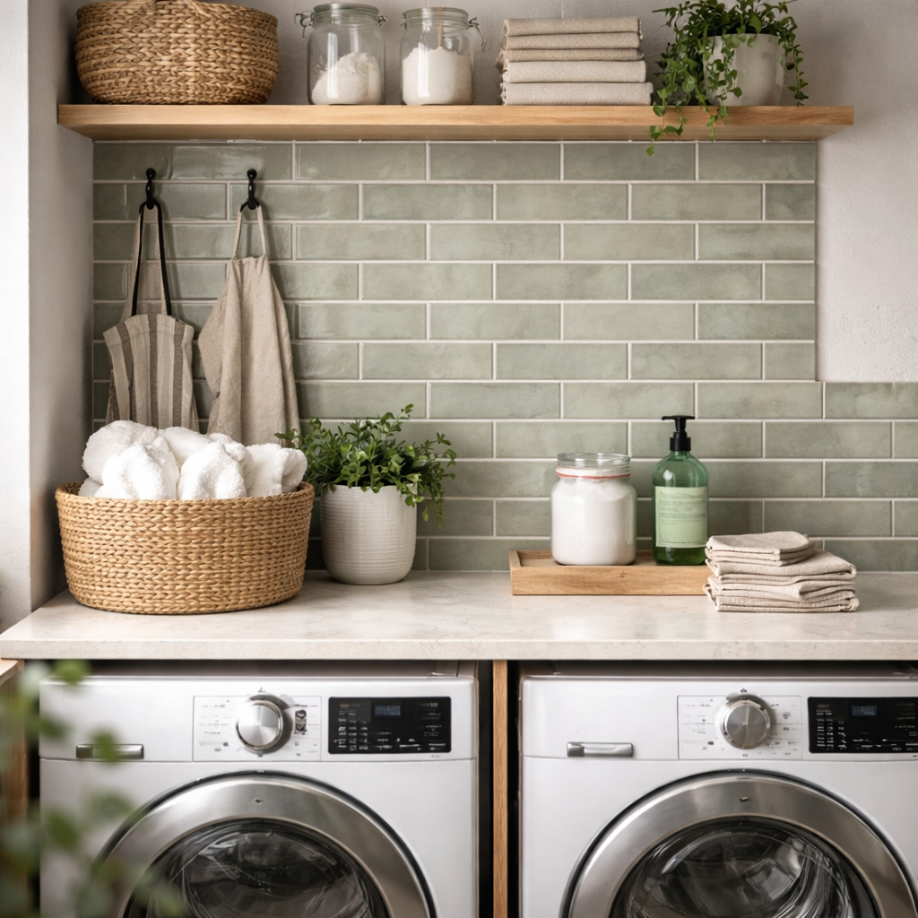
Choose a softer green for a quieter update: If you want warmth without too much gloss, Raku Sage 2.5×8 Glazed Porcelain Tile brings subtle variation that works beautifully in kitchens, bathrooms and laundry rooms.

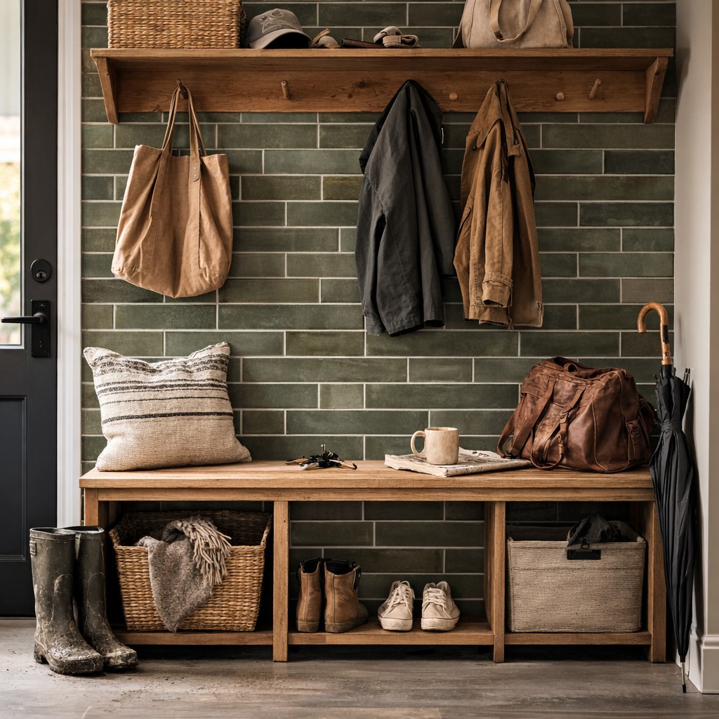
Lean into earthy, grounded colour: For anyone tired of icy finishes, Stage Forest 2.5×12 Glazed Porcelain Tile hits that warmer, nature-inspired note that feels very current right now. – and it’s on sale right now!

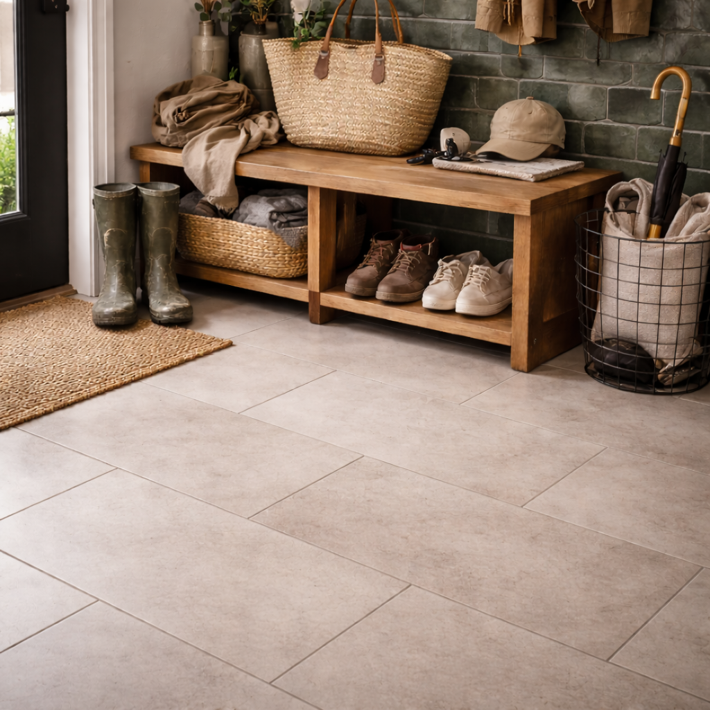
Make the floor do the hard work: Busy spring entryways call for flooring that can take abuse and still look polished. Aura Canvas Matte 12×24 Glazed Porcelain Tile is durable porcelain sized for cleaner sightlines and easier everyday maintenance.

Make it easy on yourself

Tile Town can cover more than the pretty part. Browse products and installation materials, test finishes in the Room Visualizer and, if this is the month you finally stop pretending you’ll tile it yourself, visit us so we can connect the proper pro for your project. Here are a few trusted pros we regularly work with.

Start with the room that is taking the biggest beating right now, then build outward. March is messy. Your tile doesn’t have to be.

The Tile Pattern Trick That Makes a Basic Room Look Custom

This season’s smartest refresh is not a full reno. It’s a better tile pattern. A new layout can make the exact same tile feel cleaner, bolder or way more designer.

If your kitchen, bathroom or fireplace is feeling a little blah, start with the pattern before you start pricing out an emotional-support demolition. The rooms that feel freshest are a little more personal and a little less cookie-cutter, which is exactly why tile pattern is pulling so much weight right now.

Three tile patterns that instantly change a room

  • Herringbone tile pattern
  • Penny round mosaic tile
  • Hexagon tile pattern

Herringbone adds movement. Penny rounds bring texture without a lot of visual noise. Hexagon tile makes even a simple palette feel more considered. Translation: you do not always need a new tile. Sometimes you just need a smarter way to use it.

Three easy pattern directions to try

Pictured: Boulevard Latte Ceramic Tile

Go graphic with a herringbone tile pattern: Our Herringbone Hype guide is a good reminder that layout can completely change a room. For a calm, modern base, Aura Canvas Matte 12×24 Glazed Porcelain Tile keeps things soft and versatile.

Try penny round mosaic tile for texture: If you want a classic look that still feels lively, Lumiere White 1″ Penny Round Gloss Ceramic Mosaic is an easy win for fireplaces, backsplashes and small statement moments.

Use hexagon tile to loosen up a simple scheme: For a pattern that feels clean but less expected than a plain square, Mayfair Blanco 7.8×8.9 Hexagon Porcelain Tile adds instant shape without a lot of fuss.

Need a Little Pattern Inspiration?

If you’re not sure where to start, sometimes the quickest way to see what a tile pattern can do is to watch the whole room shift in real time. This Instagram post showing even more tile layout  patterns is a great reminder that layout isn’t just a finishing detail. It’s often the thing that can take a space from standard to standout.

Whether you lean classic, playful or a little more graphic, changing the pattern is one of the easiest ways to give tile more personality without changing the whole palette.

Take a peek at Tile Town’s tile pattern Reel here!

Before you commit, test a few looks in Tile Town’s Room Visualizer. It lets you preview tile and possible patterns in your own space using our tile. Very useful if your design process tends to swing between inspired and mildly chaotic.

Where Tile Town fits in
Browse our in-stock tile collections, play with pattern in the Room Visualizer,  and come by a showroom to ask an in-store design consultant which layout makes the most sense for your space.

TileTown Turns 55 : Built Tile by Tile

Some places quietly become part of the neighborhood. You grow up with them. You rely on them. You know they’ll be there when you need them.

That’s been Tile Town since 1971.

From our first two stores to five locations across Alberta & British Columbia, we’re celebrating 55+ years of helping people create homes they love. Kitchens, bathrooms, renos, new builds, and all the in-between moments that make a house feel like yours.

Looking for a store near you? Here’s where to find us!

How it started

We began with two locations serving Vancouver and Victoria, built on a simple idea: tile shopping made easy with a one-stop shopping experience. Over the years, we have earned a strong reputation as trusted tile and design experts. We love when someone walks out of our showrooms thinking, Okay. I get it now. 😁

History in the making: TileTown’s one-year anniversary ad (1972). Practical, proud and very “come on in.”


Building tile by tile

Our story, in short: steady growth, smart moves and a lot of staying power.


Then and now:

Fifty-five-plus years looks like vintage signage, old storefronts, and the behind-the-scenes reality that keeps your project moving: pallets, busy Saturdays, and someone yelling “Yep, we’ve got it in the back.”

Richmond

Our Richmond showroom through the years, from Bridgeport Road to moving down the street to our current home.

Then: Richmond’s Offset “Boutique” beside the showroom (opened 1976), c. 1984. A very strong sign era! The boutique sold towels, soap dishes, area rugs, etc. before being sold.

Edmonton South

Our Edmonton South showroom, then and now: decades of helping customers get it right.


The people who make it feel local

A tile store is only as good as the advice you get in it. We’re proud of the experience behind our counters and proud of the fact that a lot of our team sticks around.

As our current President and Owner Mike Scardina puts it:

“Tile Town isn’t a big-box retailer; we’re a small, family-owned business. Having employees with tenure is critical from design and installation to customer relationships in our business.”

TileTown president and owner Mike Scardina (c. 2020s).

Joelle Cooke, General Manager

Joelle started with us as the Surrey store manager in 2015 and grew into our General Manager, the person who keeps the wheels on and the standards high!

GM Joelle Cooke (Surrey showroom), c. 2022. Started in the Surrey location in 2010 and has since grown into the GM role, with a brief hiatus where Mike begged her back in 2015.

“Tile Town’s company motto is “Improving People’s Quality of Life” and Joelle improves our employees QOL everyday. She is not only our GM but more importantly a honest and caring person who our employees TRUST emphatically. Our company would not be a success without Joelle as an integral part of it!!” – Mike Scardina

Brad Bellafontaine: 48 years (and counting)

Brad is our longest-serving team member and a TileTown institution in Edmonton! Which means he’s seen tile trends loop back around and still steers customers toward what actually works for their projects. Helping people create beautiful spaces is his specialty.

Then (left): Brad Bellafontaine loading an order at TileTown’s Edmonton South (c. 1980s). Now (right): Brad at Edmonton South (c. 2020s). “Once in tiles, always in tiles” – Brad

READ MORE: Over 40 years of Tiles and Smiles for TileTown Store Manager
WATCH: Brad’s 45th anniversary video (staff favourite)

“Tile Town’s strengths have been Head Office participation: Loyal, trustworthy and customer minded… We like to treat our staff like Family. We celebrate all the holidays together and have BBQ’s in the summer and team building throughout the year…Making new friends and having tile that is exclusively ours. That has always been one of the highlights of Tile Town.” – Brad Bellafontaine

Jason Makowski: 10 years strong!

Jason started as a wee tile mover and is now celebrating 10 years with Tile Town as our Operations Manager. Tile Town wouldn’t run nearly as smoothly without him. He’s the kind of behind-the-scenes consistency customers feel, even if they never see it.

Jason Makowski, Tile Town’s operations manager, marking 10 years growth on the job.


We’ve built relationships with local pros, too

If you need help beyond choosing tile, we’ve also built relationships with local professionals we can recommend, so you can get a more rounded tiling experience. Not just a stack of boxes and a “good luck.”

Brendan helping a customer get unstuck at Edmonton West.


Community, year-round

Being local means showing up. We do givebacks throughout the year, with extra energy in summer and the holidays, plus plenty of “we brought the truck” moments in between.

HIGH-FIVE AND THRIVE: Tyler at the Cloverdale Rodeo (2016), making new friends the old-fashioned way.

MOO-VING SUPPORT: TileTown in the Cloverdale Parade (2022). Proof community support can come with a side of cow-print.


A quick time-capsule moment


Tyler, our mascot

Tyler’s been part of TileTown’s personality for decades, from the early puppet era to the big red tile many customers know today.

The many looks of Tyler over the years.

No strings attached: Tyler’s been along for the ride since the early days.

A still from an old TV ad starring Tyler in his claymation era (c. 1980s). Big nostalgic energy.

WATCH: Tyler in the 1980s (vintage video)


The part that matters

Tile tends to show up in your life when something’s changing: a new place, a fresh start, a long-overdue fix. So 55+ years isn’t just “we’ve been around.” It’s this: we’ve helped a lot of neighbours make choices they’re still happy to live with.

Planning a project? You’ll have decades of experience on your side. Come chat with us.


BONUS: The TileTown Time Capsule (Keep Scrolling)

Victoria ad, 1980.

Leo Moruck, Victoria manager (c. 1977)

Edmonton South on Argyll Road, early 1980s (fourth store to open).

King George Hwy, Surrey. 1990 (fifth store to open).

A TileTown throwback. Serving customers since… always. (c. 1980s–90s).

Victoria’s garage door, featuring a throwback Tyler logo.

Winter‑Proof Your Entryway With Tile That Can Handle Real Canadian Winter

January is when your entryway stops being a cute little foyer and becomes a full‑time job. Snow melts. Salt dries. Gravel shows up like it pays rent. If your floor is the weak link, winter will find it.

Here’s how to choose—and care for—tile that shrugs off slush season.

Start with a tile that doesn’t panic at moisture

For entryways, mudrooms and anywhere boots land, porcelain is the MVP. Dense, low‑porosity, and far more forgiving of moisture, salt and grit than many other surfaces. What to look for:

  • Porcelain floor tile for durability and water resistance
  • A textured finish for more confidence under wet boots
  • A forgiving pattern or visual movement that won’t spotlight every tiny speck of sand

Good ready-to-browse options

Navona Soft Niveo 12×24 Porcelain Tile

  • Stone‑look, matte porcelain with natural variation, suited to floor or wall. Italian manufacture and V4 shade variation are noted on the product page, which signals a subtle, realistic stone feel rather than a flat uniform look.
  • Works beautifully in an entry, brings texture without high‑gloss slip risk.

Fitch Fawn 12X24 Porcelain Tile

  • A richer stone look with substantial variation. Also rated frost resistant, which is a real plus for Canadian winter loads when outdoor snow gets tracked in and stepped on.
  • Neutral earth tones hide grit better than a flat, pale tile.

More dramatic, pattern-forward option:

Octagon Marmol Black 7.87 x 7.87 Glazed Porcelain Tile

  • For a small entry with big style, octagon mosaics add visual drama without needing loud colour. Good for a feature strip or a small zone near the door, paired with plain porcelain around.
  • Matte finish keeps it practical under wet shoes.

Also a strong, moody floor pick:

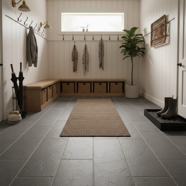
Image created in Room Visualizer.

Super Black Slate Matte 12×24 Glazed Porcelain Tile

  • Sleek, dark, low‑gloss surface with subtle texture. If you want a look that hides all the January chaos—salt, snow, mud—this is a knockout.
  • Works as full floor or as contrast band around a lighter floor, especially when paired with a neutral rug or mat.

Pick a grout that’s practical, not punitive

Winter mess loves grout lines. Two choices that actually help:

  • Bigger‑format tile = fewer grout lines to clean. Both Navona and Fitch are 12×24, so you’re already cutting lines vs. tiny tile.
  • Grout close to tile colour = less visual grid and fewer obvious stains. It’s timeless and easier to live with.

Bonus: talk to your installer about grout type and sealers for your traffic level; it’s an easy step that saves scrubbing later.

Build a two‑mat system

Yes, two. It’s simple, cheap, and effective.

  • Outside mat: knocks off snow and grit before it enters your home
  • Inside mat: catches the melt and salt so it doesn’t dry into a crusty, white science experiment on your floor

This double buffer is the single best strategy to protect tile from winter salt and grit—before you ever mop or seal.

Clean salt early, not heroically

Salt damage is slow burn. It builds, dries, then turns into a full Saturday scrubbing mission.

Quick routine that actually works:

  1. Dry sweep or vacuum first, so you remove grit before adding water
  2. Damp mop with a pH‑neutral cleaner. Avoid harsh acidic cleaners unless your tile manufacturer specifically recommends them
  3. Rinse if needed so cleaner residue doesn’t attract more dirt
  4. Deal with white haze early. Often it’s salt or cleaner residue. A 10‑minute fix now beats a full‑floor deep clean later.

When you need a stronger cleaner for winter build‑up

Aquamix Heavy-Duty Tile & Grout Cleaner 946ml (1 quart)

  • Concentrated cleaner and degreaser for heavy soil or older residue. Good for a periodic reset after weeks of winter traffic.
  • Works on a wide range of materials, including porcelain and grout. Useful to keep on hand in a winter kit.

Small step, big impact: pre‑grout help

If you or your installer are doing fresh grout or a small repair, a prep product can save time and mess.

Aquamix Grout Release 946ml (1 quart)

  • A temporary coating before grouting that protects against grout staining and makes clean‑up easier. That means less haze and less elbow grease once the grout is done.
  • Helpful for walls or floors, and for anyone anxious about grout cleanup after a DIY or installer job.

Optional but smart: sealing for added protection

If you have natural stone tiles, or grout lines that keep picking up stains, a penetrating sealer is a low‑effort hedge against future stains.

Aquamix Penetrating Sealer 946ml (1 quart)

  • Water‑based, low‑shine, natural look that resists stains. A good match for stone look tiles or to protect grout and other surfaces.
  • Simple add‑on step after a thorough cleaning and before heavy use. Helpful to keep in a winter maintenance closet.

Design tips that still feel like you

Winter‑ready doesn’t have to mean builder beige. A few looks that hold up in high‑traffic zones:

  • Stone‑look porcelain for natural texture without worry, like Navona or Fitch
  • Soft pattern or neutrals that camouflage grit, such as darker or mid‑tone tiles rather than ultra‑light
  • Earthy greens or muted tones if you want colour without showing every footprint

If you want help narrowing it down, TileTown staff can point you to options based on household reality: kids, pets, stairs, ski people, all of the above.

Tiny January challenge: take a photo of your entryway at its messiest. That’s your actual design brief.

The 2026 Backsplash Refresh: Warm, Natural, Low‑Fuss

January is peak why‑does‑my‑kitchen‑feel‑tired energy. The good news: a backsplash refresh can change the whole mood without a full renovation meltdown.

Here are the backsplash directions showing up in 2026, plus how to pick one that fits budget and tolerance for grout cleaning.


Trend 1: The slab‑look backsplash

Minimal lines, maximum calm. Designers are leaning into carrying countertop material up the wall for a seamless, cohesive look. Fewer grout lines, less visual clutter, easier to live with.

TileTown‑friendly ways to get the look

If a natural stone slab isn’t in the plan, porcelain slabs or large‑format porcelain can mimic stone visuals with less maintenance and often a friendlier price point. Good for messy cooks, minimalists, or anyone who has whispered I hate cleaning grout into the void.

Aura Canvas Matte 12×24 Glazed Porcelain Tile

  • Large, soft stone‑look tile that reads clean and calm, perfect for a slab‑style layout. Matte finish, usable on both floors and walls, so it carries a cohesive aesthetic from counters to backsplash or even adjoining floor.
  • Works especially well with warm whites, greiges, light woods or natural oak cabinets.
  • When you want the sense of a single, quiet plane rather than a busy mosaic, this reduces visual noise and looks timeless.

Design tip: use same or similar tile on the counter return or small wall to keep the seamless look, then add texture elsewhere, like wood shelving or brushed metal hardware.


Trend 2: Handmade‑look texture

Zellige energy without preciousness. Natural variation catches light, adds movement even in a single tone.

How to make it feel current, not chaotic:

  • Choose one tone and let texture do the talking
  • Keep grout close to tile colour for a softer, longer‑lasting look
  • Consider a classic layout such as stacked or simple brick so variation stays the star

Good for renters‑turned‑homeowners, design people, anyone craving warmth without a loud pattern.

Great picks right now

No. 1 Bestselling Tile of 2025
Design & Tiled by @dueckbuiltcontracting

Artisan White Glossy 2.5×8

  • High‑gloss, artisan‑style subway with tonal variation that adds depth without needing multiple colours. If you want texture and a touch of colour in 2026, this keeps the wall engaging but not fussy.
  • Works beautifully behind a neutral counter or wood cabinetry, especially when grout matches or is just a shade off.
  • Also practical: glazed porcelain, so easier to wipe clean than many natural clays.

Stage Forest 2.5×12 Glazed Porcelain Tile

  • Textured, earthy tone subway that’s on sale right now, recently marked down. A subtle, moss‑to‑stone colour that feels warm and natural, great for the January refresh moment.
  • Matte finish, good for both walls and floors, but perfect for backsplash when you want something organic under a kitchen light.
  • Because it’s a classic subway plus natural variation, you’ll get current texture without the backsplash punishing you on cleaning or style.

Layout tip: staggered brick or slight stack both work. Forest tones pair well with black or brass hardware, or simple white counters.


Trend 3: Warm colour is back

Goodbye all‑white everything. 2026 kitchens are moving toward warmer neutrals and richer, moodier tones. Creamy whites, taupes, sand, deep greens, and grown‑up muddy pastels.

Backsplash ideas that play nicely with warm colour:

  • Warm white that feels creamy, not clinical
  • Earthy beige or sand tones with subtle variation
  • Deep green or oxblood accents in a smaller zone such as a niche or behind the range

Bonus colour option

Lume Blue 2.25×9.375 Gloss Glazed Porcelain Subway Tile

  • If you want a single accent zone not neutral, this deep, jewel‑like blue keeps the backsplash lively but still elegant. Gloss reflects light, great for smaller or darker kitchens.
  • Works in a stripe, a framed niche, or a slim band above a dark counter.
  • Pair with warm whites or soft stone visuals elsewhere to avoid looking cold.

Colour pairing tip: keep the largest surfaces neutral or natural, then add a single accent wall, niche, or coffee bar splash with colour. It keeps the kitchen from feeling loud in the long run.


A quick, no‑regrets backsplash checklist

Before you fall in love with a tile at 11:47 p.m., do this:

  1. Look at your countertop first. Busy counters usually want calmer backsplash choices.
  2. Decide your vibe: seamless, textured or colourful.
  3. Pick grout on purpose. Matching grout is easier to live with, ages better.
  4. Order a sample, then view it morning and night. Lighting changes everything, especially in January.

The 30‑minute Is‑This‑Worth‑It test

Tape a piece of paper to the wall roughly the size of your future tile area and live with it for a day. If even a blank rectangle makes your kitchen feel more intentional, congrats: you’re backsplash‑ready.

If you want, tell us your counters and cabinet colour—something like white quartz + oak or black granite + white cabinets—and we’ll suggest three directions that fit 2026 trends without feeling try‑hard. Call or visit your local Tile Town for a complimentary design consultation.

TileTown Unwrapped – Your Top Tiles of 2025

Think of this as your year in tile. These are the five styles you kept in heavy rotation in 2025.

Some people track their year in playlists. You did it in tile choices. We pulled the numbers and built a TileTown Unwrapped to show which styles you loved most in 2025, from bold forever-faves to quiet workhorses that carried a lot of renvated rooms on their backs.

Here’s how your top tiles stacked up.


Image created with our Room Visualizer.

The moody main character

When you wanted a little drama underfoot, this is the tile you queued up. Super Black Slate Matte brought that “press play and let the room transform” energy, whether it was going into an entrance, bath or a hardworking mudroom.

Vibe check: Confident, grounded, never boring.


The surprise hit of the year

Fitch Rainbow was your “didn’t know I needed this until I tried it” tile. It showed up in sample orders, quotes and wishlists all year and turned a lot of maybe-renos into full-on projects.

Vibe check: Personality tile, saved to favourites more than once.


The comfort listen of your reno

Soft, easy to live with and simple to style around, Fitch Fawn became a go-to for spaces that needed warmth without shouting for attention. It’s the tile equivalent of a track you put on repeat while you cook, clean and live your life.

Vibe check: Calm, cosy, quietly stylish.


The clean, crisp crowd-pleaser

Mountain Lava White had a big year. When you wanted a fresh backdrop for everything else in the room, this is what you reached for. It works with light and dark finishes, plays well with pattern and makes spaces feel pulled together fast.

Vibe check: Fresh start energy.


Bathroom built by IG’s @dueckbuiltcontracting.

Your tile of the year

Artisan White Glossy took the top spot for 2025. Compact, glossy and endlessly remixable, it slotted into classic, modern and everything in between. Herringbone, stacked, brick pattern – this tile handled whatever layout you threw at it and still looked polished.

Vibe check: Timeless with just enough edge.


Honourable Mention: Tribeca Sage

The almost-made-the-chart favourite

Tribeca Sage was your runner up for 2025, sitting just outside the top five. It stayed in steady rotation all year and clearly has main-character potential for next season’s projects.

Vibe check: Under-the-radar now, future star in the making.


If our tile ended up in your reno, send us a photo! – your projects are our real Wrapped.