Interior design aesthetics come and go, yet time plays a significant factor in how refined or popularized a style becomes.
In the examples of vintage and contemporary, both aesthetics rely on time to help define their ever-changing elements. While one takes portions of the past and attempts to bring it new life, the other thrives off the current trends that redefine its style, allowing for more flexibility in interior design changes.
With this in mind, here’s a closer look at vintage and contemporary aesthetics, and what it takes to bring one or both into your home.
What is the contemporary aesthetic?
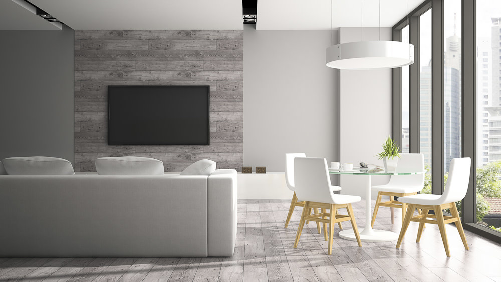
The contemporary style can be simple yet sophisticated, favouring a minimalist approach to interior design. Essentially, as the saying goes, “less is more,” and contemporary lives by these words.
While often mistaken for the modern aesthetic due to their similar approach in simplifying décor, modern pertains to a specific era that has stricter guidelines to achieve, notably from 1900 to the 1950s. On the other hand, contemporary relates to current trends in interior design and has more flexible guidelines as they are continually changing.
Of these guidelines, the most notable design elements include the following:
– Neutrals, blacks, and whites as a focal colour palette
– Lack of prints that distract the eye
– A classic wooden flooring paired with strategically placed textures
– Effective light sources that don’t wash out the neutrals in the room
– Smooth, crisp, and clean geometric silhouettes
Renovators looking to incorporate contemporary aspects in their homes should start by decluttering their larger living areas, as a significant as
aspect of contemporary is featuring a home’s space.
This style also works well with the monochromatic style, as those elements are featured in contemporary’s withdrawn colour palette.
If you’d like your home to maintain the streamlined aesthetic without coming off as too cold or barren, throw in some sleek textiles to offset the modernized look. A striped throw blanket or accent wall may help to add character while not appearing too busy. You could add some texture by installing a penny tile backsplash in your kitchen.
What is the vintage aesthetic?
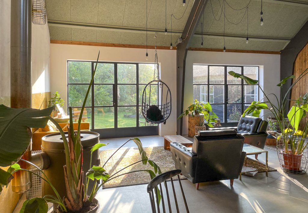
In contrast to contemporary’s fixation on current design trends, the vintage aesthetic is all about living in the past and making your home a reflection of styles from long ago. By the nature of its name, vintage can be pretty subjective, as anything from any time in the past could technically be considered “vintage.”
Do you still have encaustic tiles on your kitchen floor from when your house was first built? That’s vintage. Or do you have a reclining chair that your parents bought in the 70s? That’s also vintage.
Several terms for different aesthetics are considered vintage, including retro, French-country, shabby-chic, and the ever-popular midcentury modern.

But to narrow down the scope of attaining a vintage look, the most common characteristics include:
– Shades of orange and brown, with hints of brighter colours to add a pop
– A fixation for intricate patterns, such as florals, geometrics, and swirly lines
– Upholstered fabrics, with a particular preference for linen or cotton
– Flooring is either wood or an exciting tile design
– Textiles in the form of long curtains or throw pillows
– Furniture that looks used or worn out (whether intentionally or unintentionally) and upcycling it to be like new
Although you’ll want your furniture to look worn, that doesn’t mean they can’t be maintained — in fact; it’s recommended that you upkeep all of your vintage pieces to help them last longer.
Because vintage pulls from different colour stories, you’ll want to be strategic in the colour choices you make. Your ultimate goal will be to know the balance between too much colour and too little, and knowing which vintage accessories can help contribute to a cohesive palette.
Combining the two aesthetics
Taking the old and merging it with the new can be a much easier task than you might imagine, and while these aesthetics pull from vastly contrasting times, they have many similar elements that make them quite easy to execute alongside each other.
For example, since contemporary typically plays around with neutrals, you could throw in some vintage warm tones to help blend the palettes together. Perhaps in a bathroom with beige walls and white tile flooring, you could throw in a warm hazelnut bathroom mat, or add a vintage shelving unit to display towels and plants (which were a big trend in 2022).
Looking for more interior design advice? Visit any of our Tile Town locations for help from certified professionals — we can help you achieve the aesthetic of your dreams, no matter the era! –
