From dazzling and glossy greens and blues to timeless greys and whites, tiles come in an assortment of colours and shades, each with their own design capabilities. Knowing which colour palette to use between the wide range of tile colours requires careful consideration, as the tiles you select can impact your room’s mood, perceived size, and so on.
To help you on this chapter of creating an extraordinary colour story, here are some tips for choosing tiles based on colour and shade.
Consider the room itself
Something you’ll want to think about and build towards when selecting tile colours is cohesion. This can pertain to the overall aesthetic and existing colours/design already existing in the room and doing your best to tie everything together with your tile colours. Such variables you need to think about for cohesion include:
-The colour of the walls
-The type of furniture in the room (colours, materials, finishes, etc.)
-The room size
-The lighting in the room (natural light or artificial)
If your furniture mostly consists of browns and greens, with wooden accents and several plants, you may consider choosing lighter coloured tiles in beige or grey to accent the already existing earth tones (which are a big trend in 2022). Something akin to our Versa 75 Caramel Click Vinyls could pair excellently with an earth tone vibe.
Perhaps you have a room that you want to appear bigger. The best choice would be a cream or pastel floor tile to accentuate the dimensions of the room and make it appear larger.
(You can learn more about tiles and room sizes by reading our blog post on the topic.)
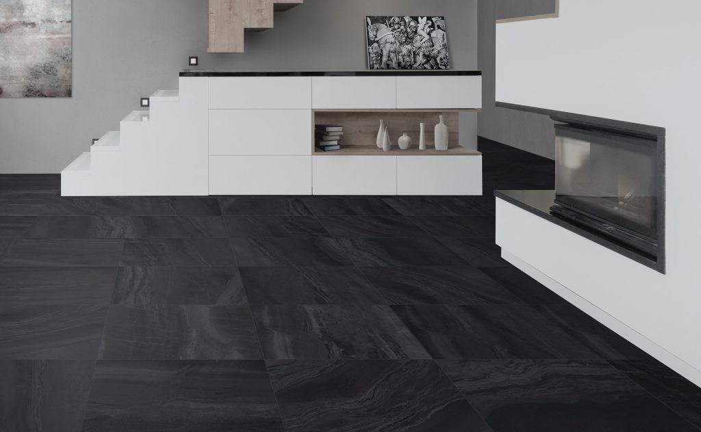
Larger rooms, like dining areas or kitchens, are paired well with darker floor tiles — especially if there’s plenty of natural light. Our Nohva Black Porcelain Tile works particularly well for enhancing more open areas, and the sleek matte black finish can be used to highlight any colour story you choose.
The overall goal when choosing a colour story for a room is ensuring that you’re creating harmony between colours. This of course does not mean you have to stick to a monochromatic look, you simply want to consider how each aspect of your room ties into one another.
Colours can impact your mood
It’s been proven time and again that colour has a substantial impact on people’s moods and appearances. There are plenty of tips and tricks regarding on how wearing certain colours can help you become more approachable, or how different coloured cars have different significances and meanings.
The same can be applied to tiles. Because of our automatic associations of colours to feelings, environments, or moods, tiles can play a major part in how a room feels.
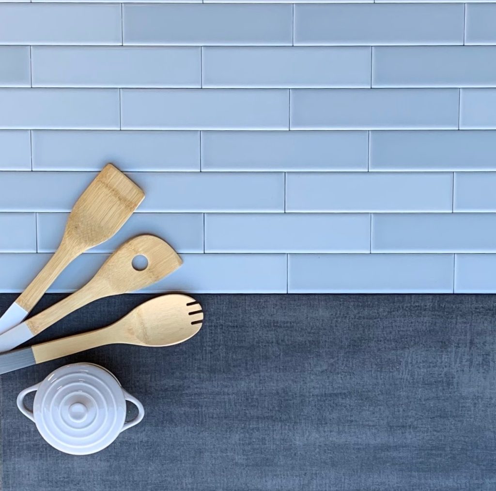
For instance, say you want your office area to feel calm and tranquil, or you want to make your kitchen feel less hectic with a nice backsplash. The best colour option would be a light blue, as blue has associations with serene waves or the stillness of the sky. The Dolce Sky (05) tiles would serve as a subdued feature to help you feel more restful in any busy environment.
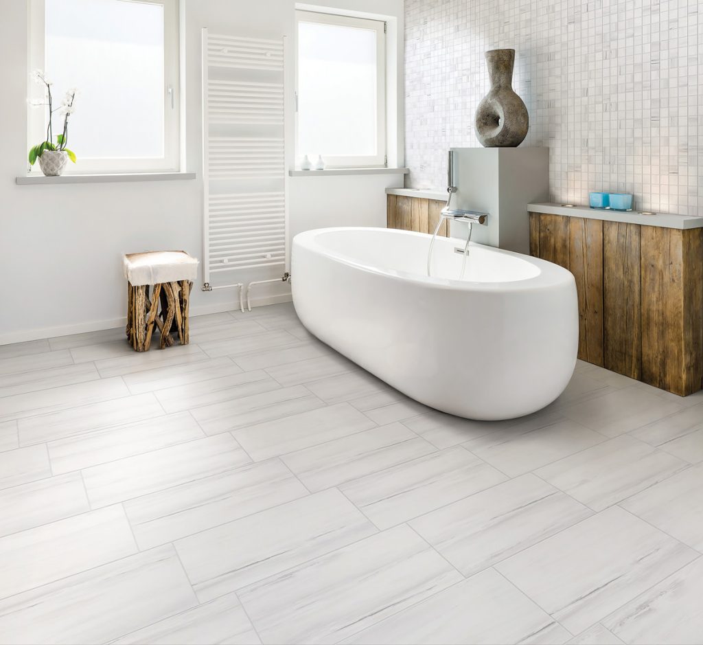
White tiles can evoke thoughts of cleanliness, perfection, and peace, as these are all things associated with white. This would do well in a bathroom or kitchen, especially if you’re wanting to portray a streamlined, polished look to your guests. In this instance, the La Marca Statuarietto tiles would best suit your refined taste.
Maximizing and minimizing: how to make either work
Depending on your own design preferences, you’re either going to gravitate towards maximizing your colours or minimizing them. Although there isn’t a right or wrong in these choices, it’s important to consider how to elevate these concepts with your tile choices.
Much in the same way you choose tile patterns, creating a blended look requires that you don’t overstimulate your guests. This is not to say you can’t use colour — rather, it’s about making smart choices on where you place them and how you incorporate colours together.
Let’s say you want to spice up a duller room that primarily consists of whites and greys. You can add a pop of colour to this area by adding an accent wall to draw the eye. Or, if you’re very big on colours and want to feature more of them, simply choose colours that are complimentary or have the same tones (cool, warm, etc.).
If you’re looking for coloured tiles that work well as an accent, our Lume Series (award winning, by the way) features an assortment of rich colours, such as the Lume Green in an enchanting gloss finish, or the soothing Lume Blue.
Some areas of your house may feel overstimulating with too much colour, especially in smaller, tighter spaces. In this instance, sticking to a monochrome scheme consisting or blacks, whites, and greys would help make your room feel less overwhelming and more organized.
A great tile for lightening up and pulling together a monochromatic space is the Paint Stone White Porcelain Tiles.
(These tiles, and all of our other Italian tiles, are also a part of our incredible Italian Days event which continues throughout July. Learn more about this fun event.) For more assistance in visualizing a space, check out Tile Town’s remarkable Visualizer Tool, or visit a Tile Town near you!