Spring reno season is here, and “supersize” is officially in style.
Tile Town’s newest porcelain slabs—a.k.a. mega tiles—let you cover countertops, feature walls, floors and patios with single-sheet elegance. Fewer grout lines, plenty of wow-factor. Here’s everything you need to know before you swap small squares for serious surface area.
1. What Is a Slab, Anyway?
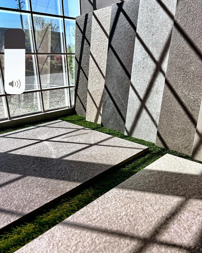
Porcelain slabs are large-format tiles—up to 1 × 3 metres—with thicknesses as slim as 6 mm. Made of high-density porcelain, they’re fired hotter and pressed harder than standard tiles, so you get stone-level strength in a lighter, easier-to-handle package.
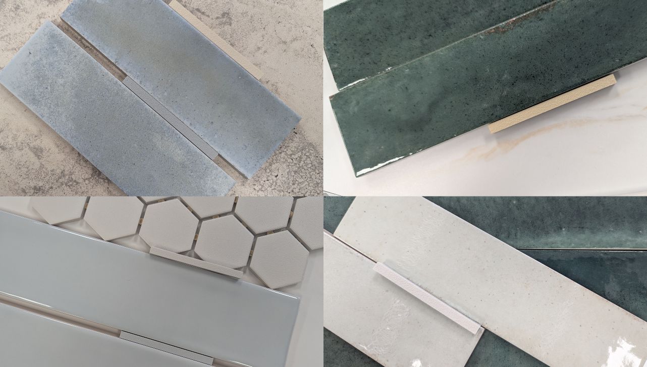
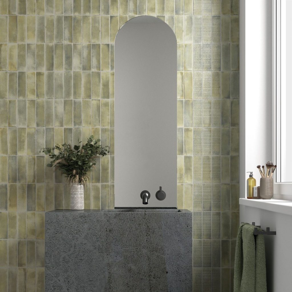
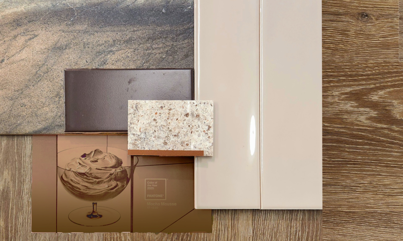
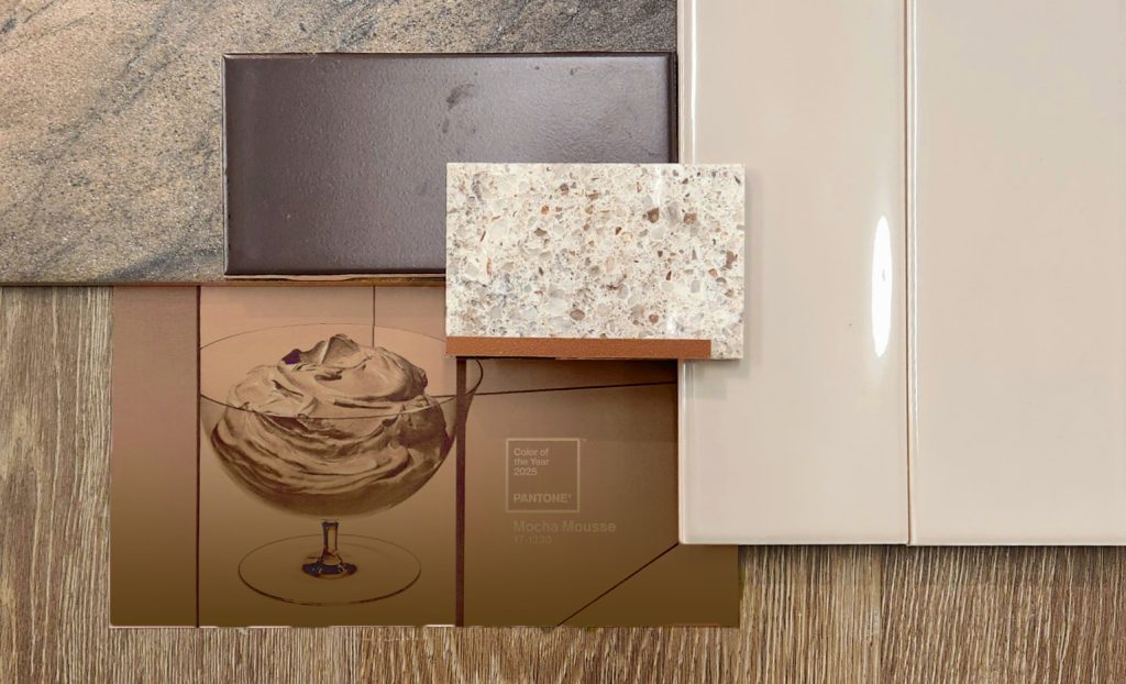
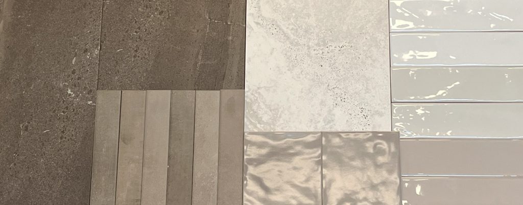
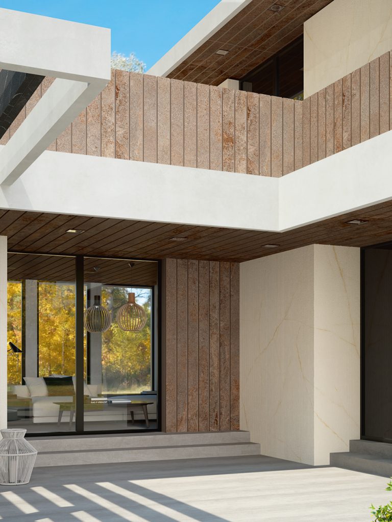
Stone-Look Slabs to Go Big
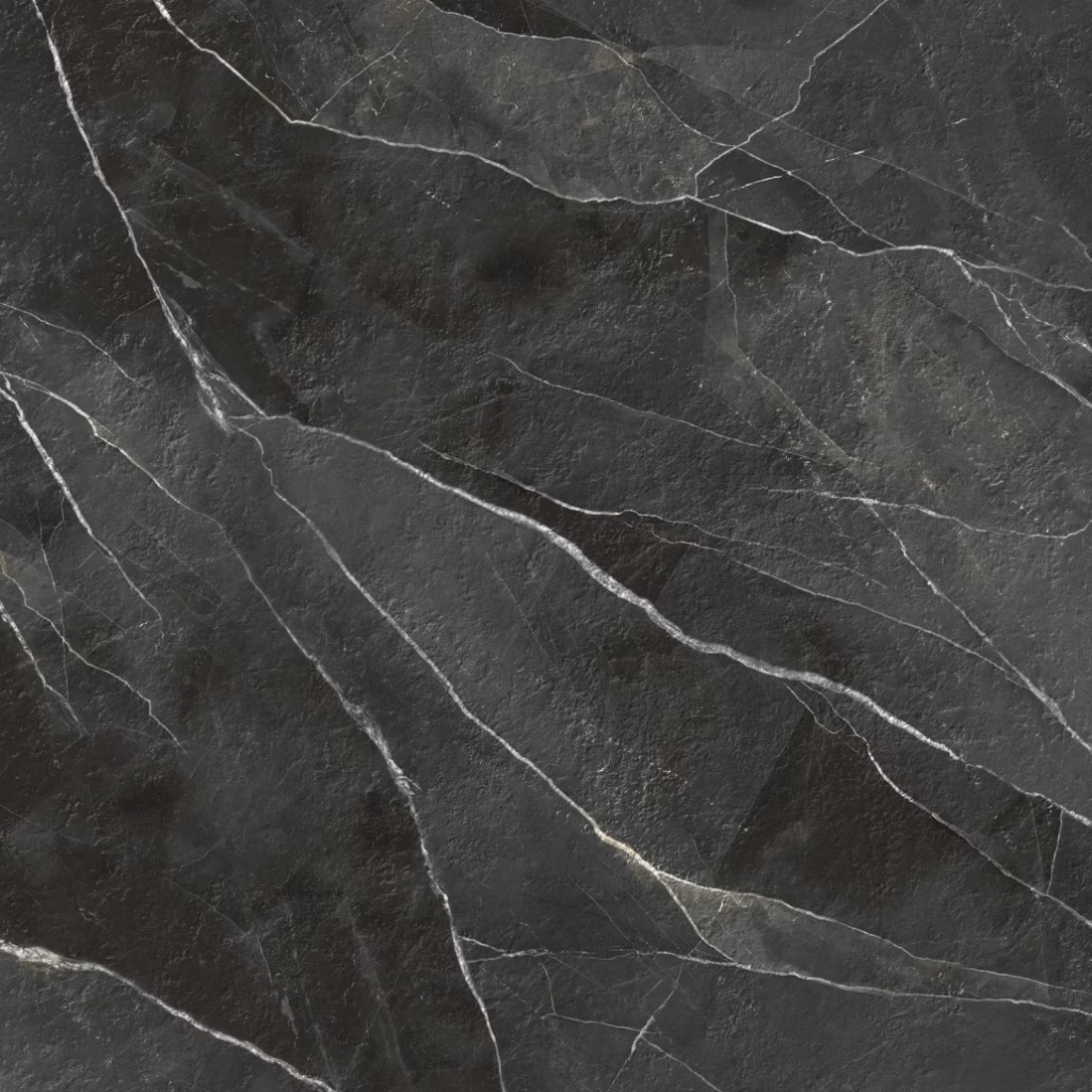
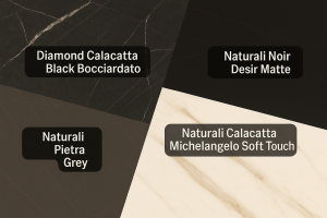
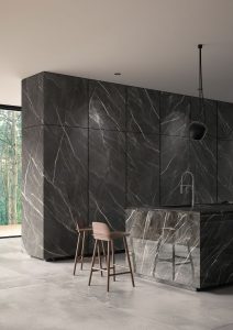
Diamond Calacatta Black Bocciardato
A dramatic black marble look, softened by waves of beige veining. Available in Natural, Bocciardato (bush-hammered for traction), or Polished finishes, it makes any surface feel museum-worthy. Ideal for floors, façades and waterfall counters.
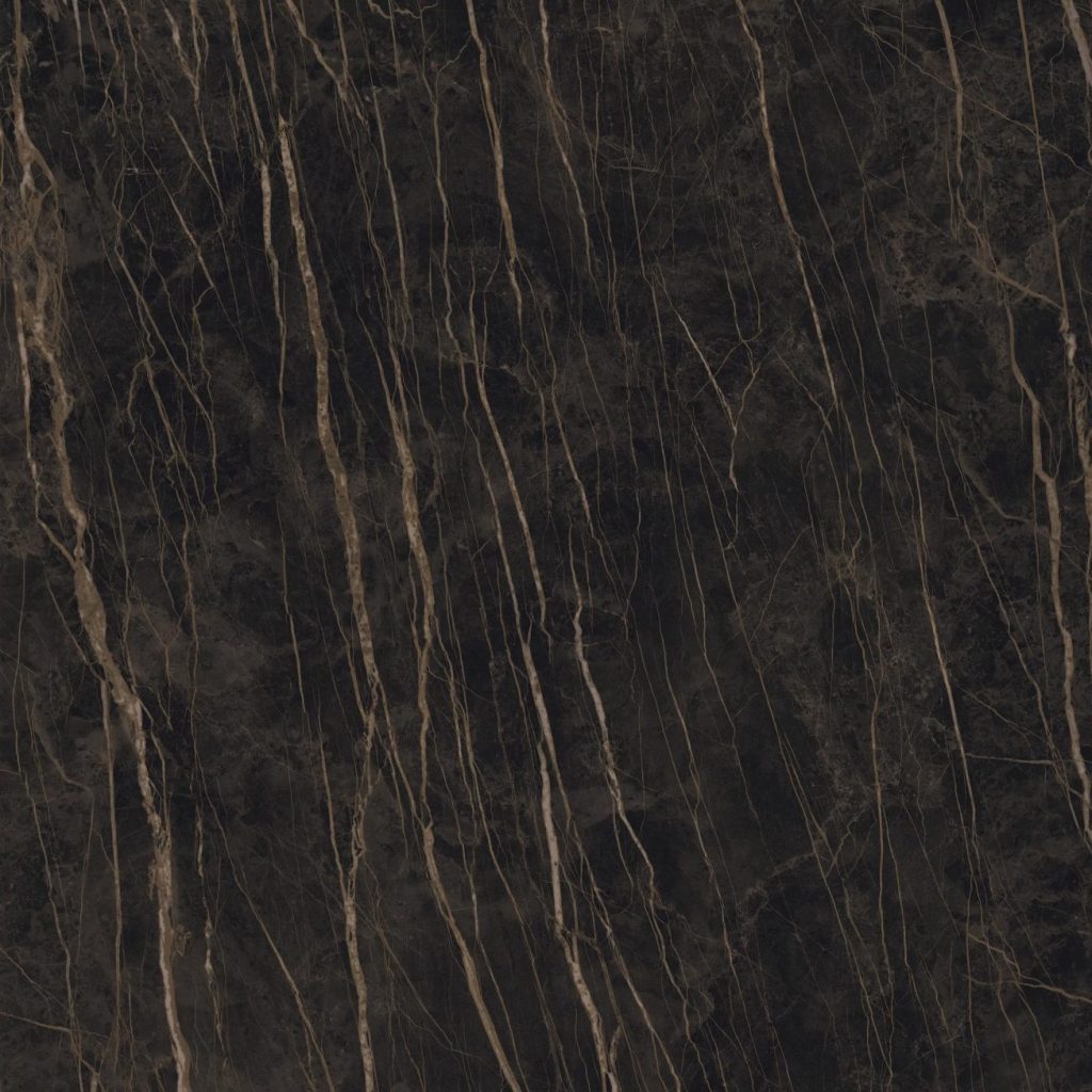
Classic Italian marble vibes, deepened by ivory-white veins. Offered in extra-large sizes (1000 × 3000 mm, 1620 × 3240 mm) and finished Natural or Bocciardato (R9/R10 slip rating), it’s perfect for both indoor and exterior applications—no grout lines, no boundaries.
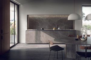
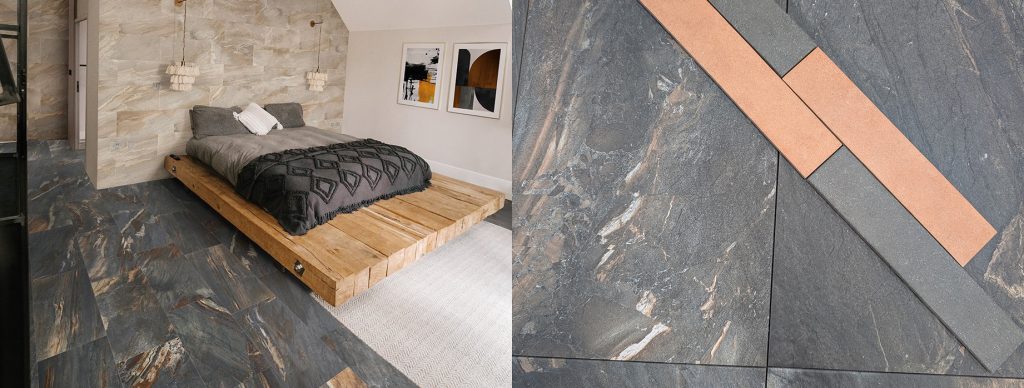
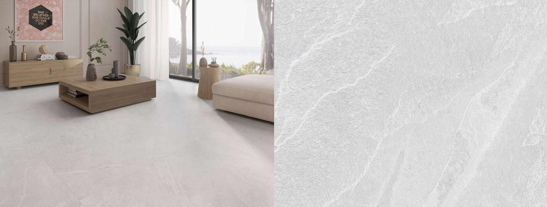
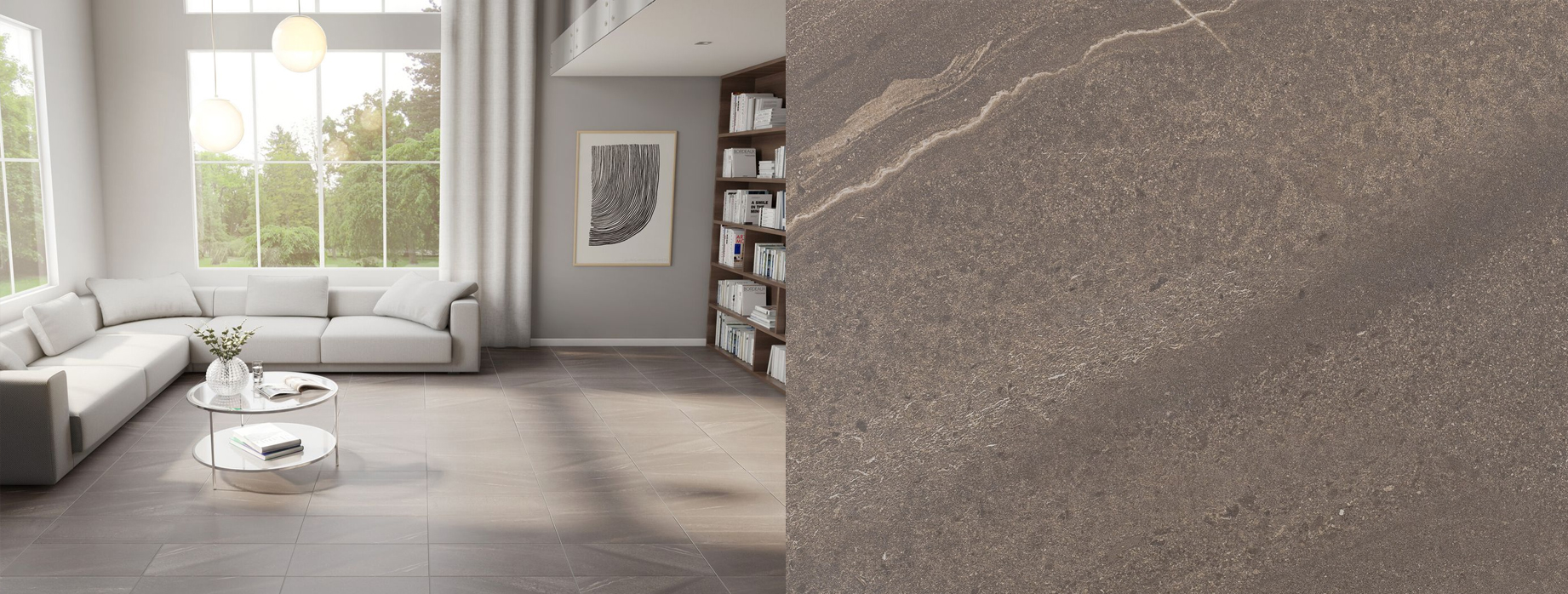
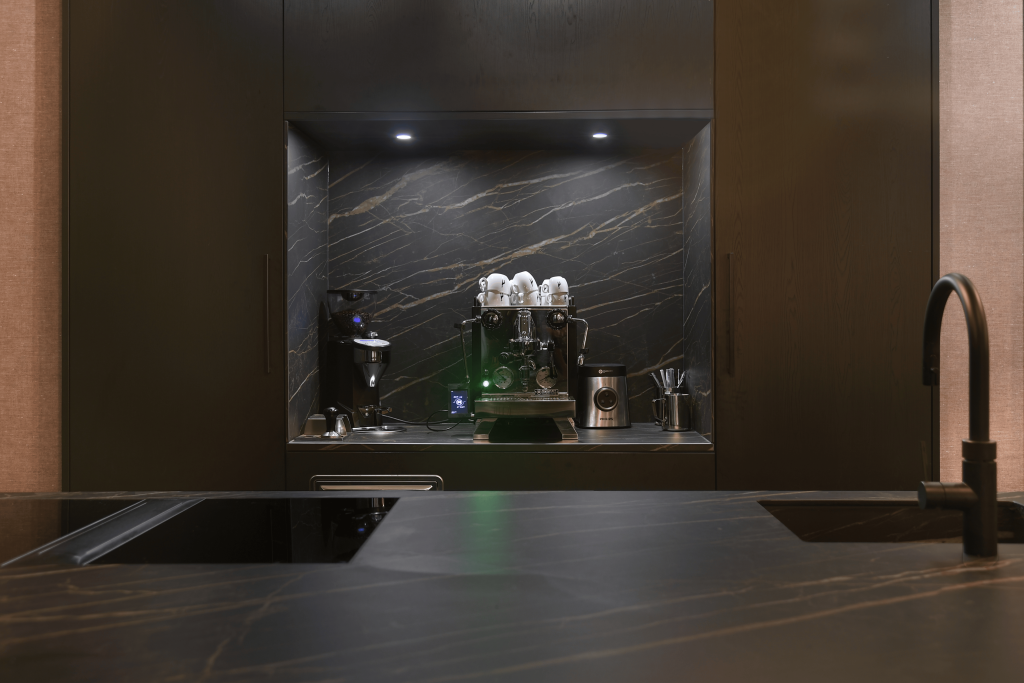
A Marble-Inspired Slab for Refined Grey
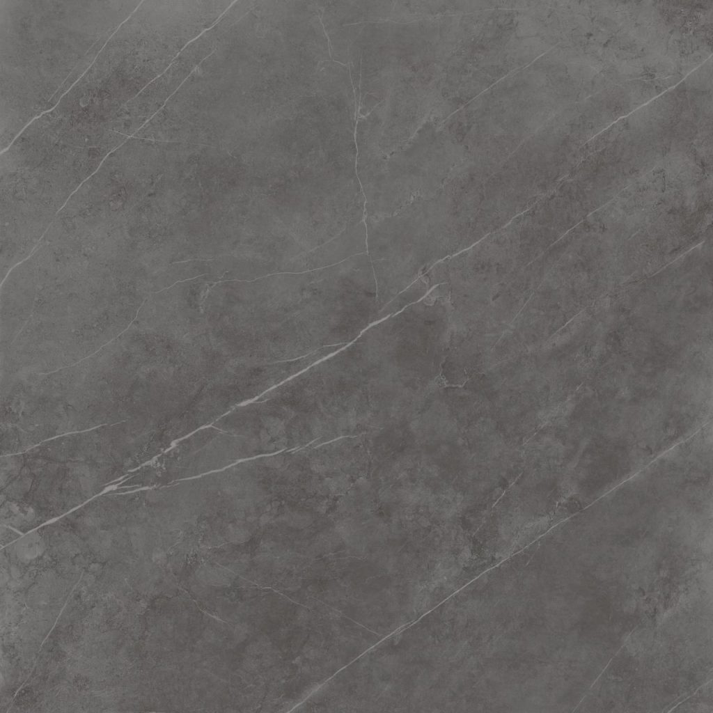
This slate-grey beauty mimics premium calcite marble with fine white veins. Choose Natural (R9 slip-resistant) or Polished for your floor, wall or outdoor cladding, in jaw-dropping large sizes up to 1620 × 3260 mm.
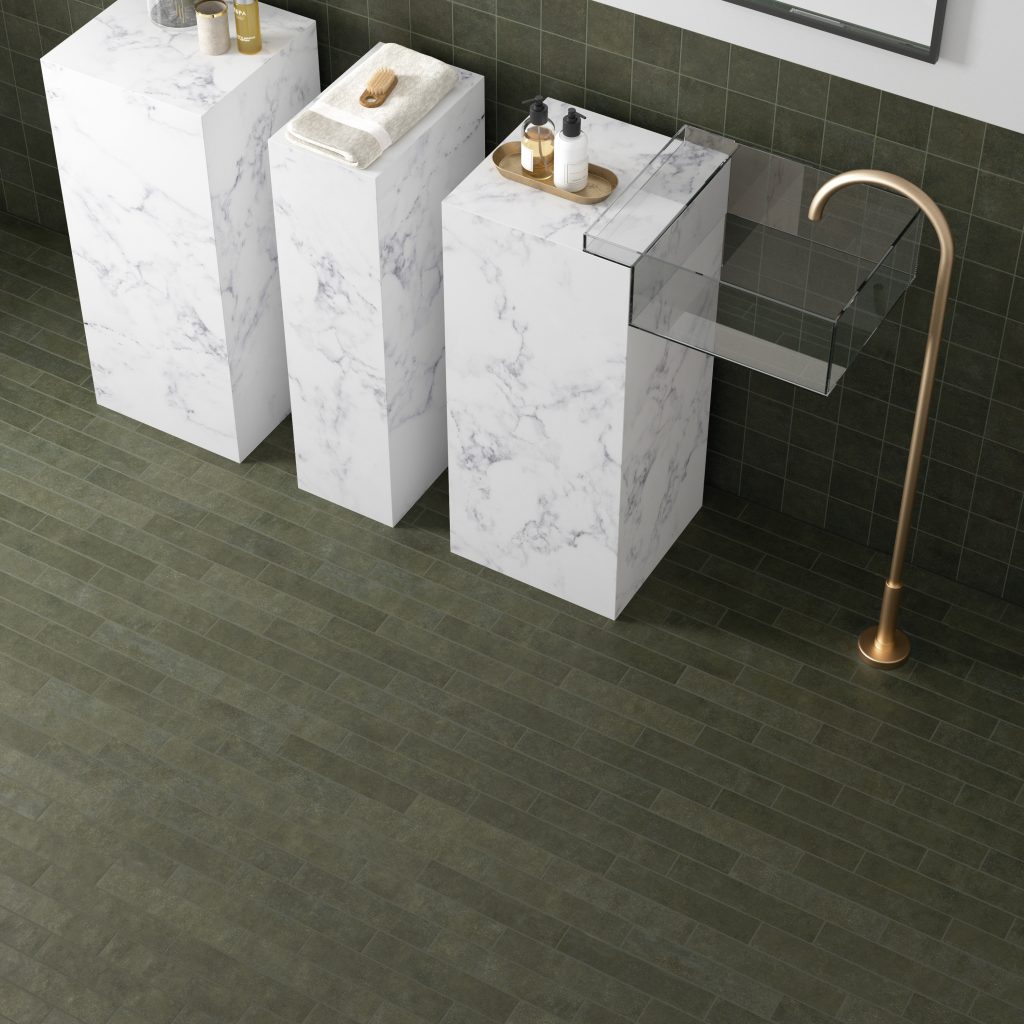
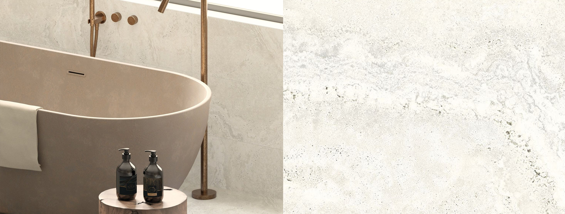
A Concrete-Chic Slab with a Soft Touch
Naturali Calacatta Michelangelo Soft Touch
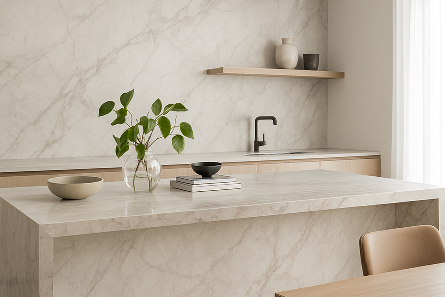
Delicate dove-grey veining on a creamy background, now available with a luxe Soft Touch finish—smooth, matte and slip-resistant. At 1000 × 3000 mm and 1620 × 3240 mm, it’s perfect for countertops, tabletops or statement walls, indoors and out.
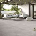
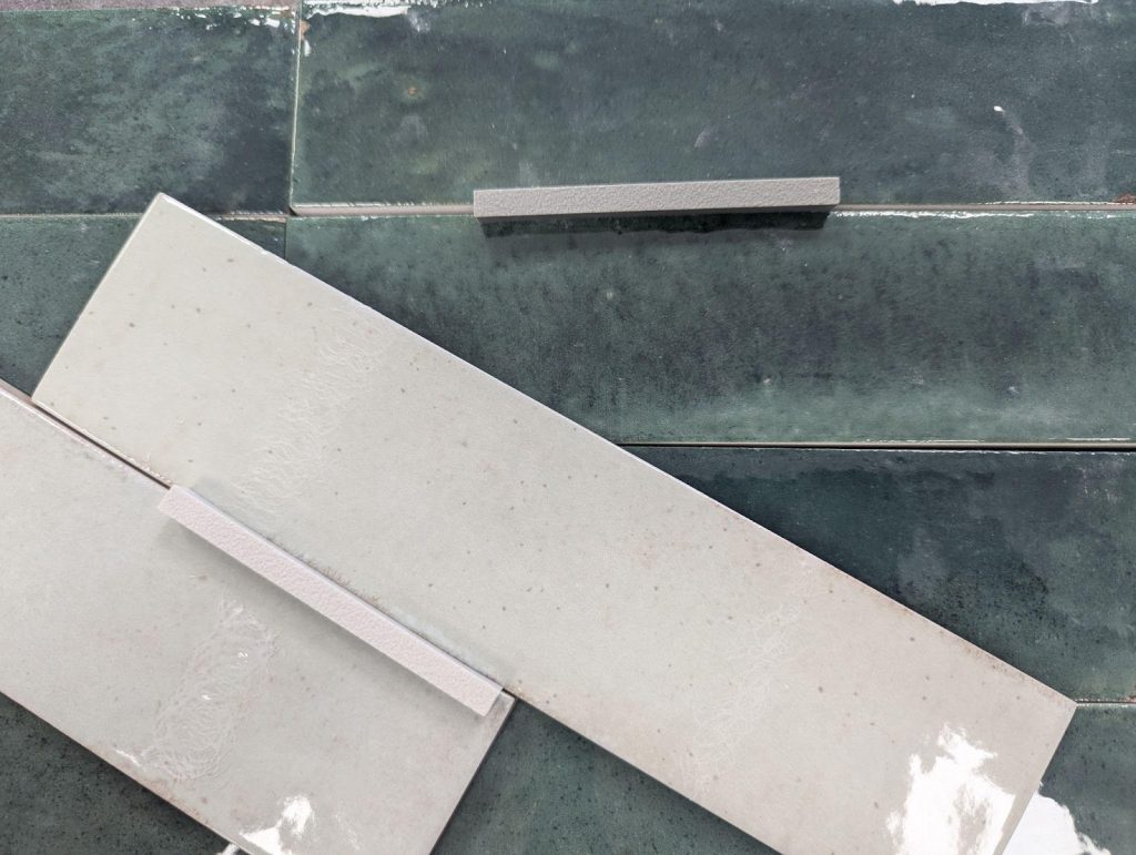
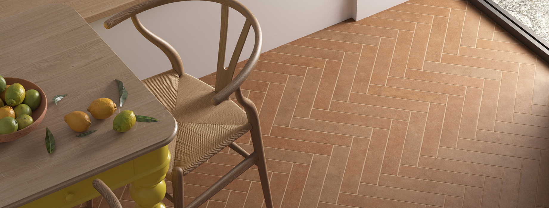
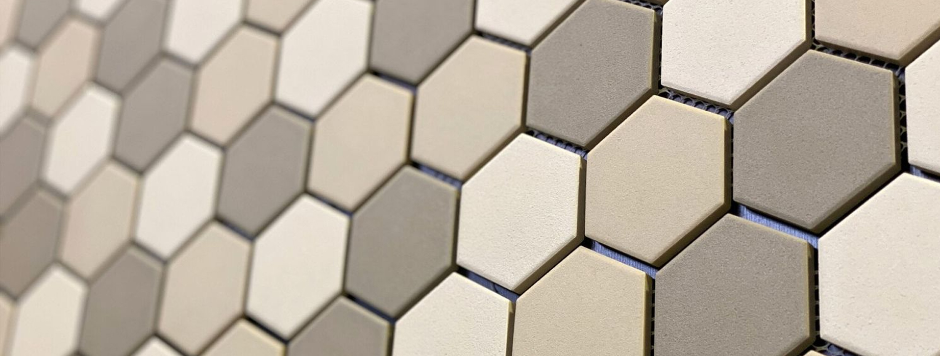
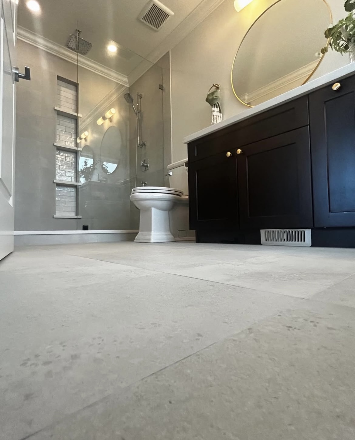
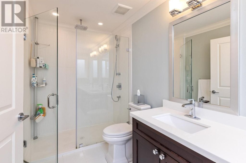
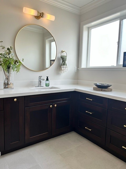
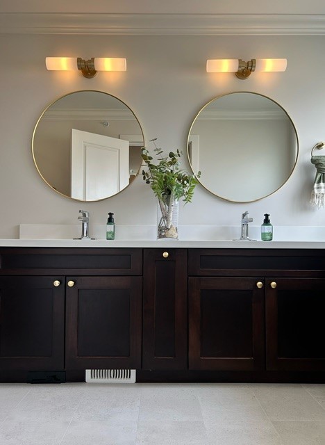
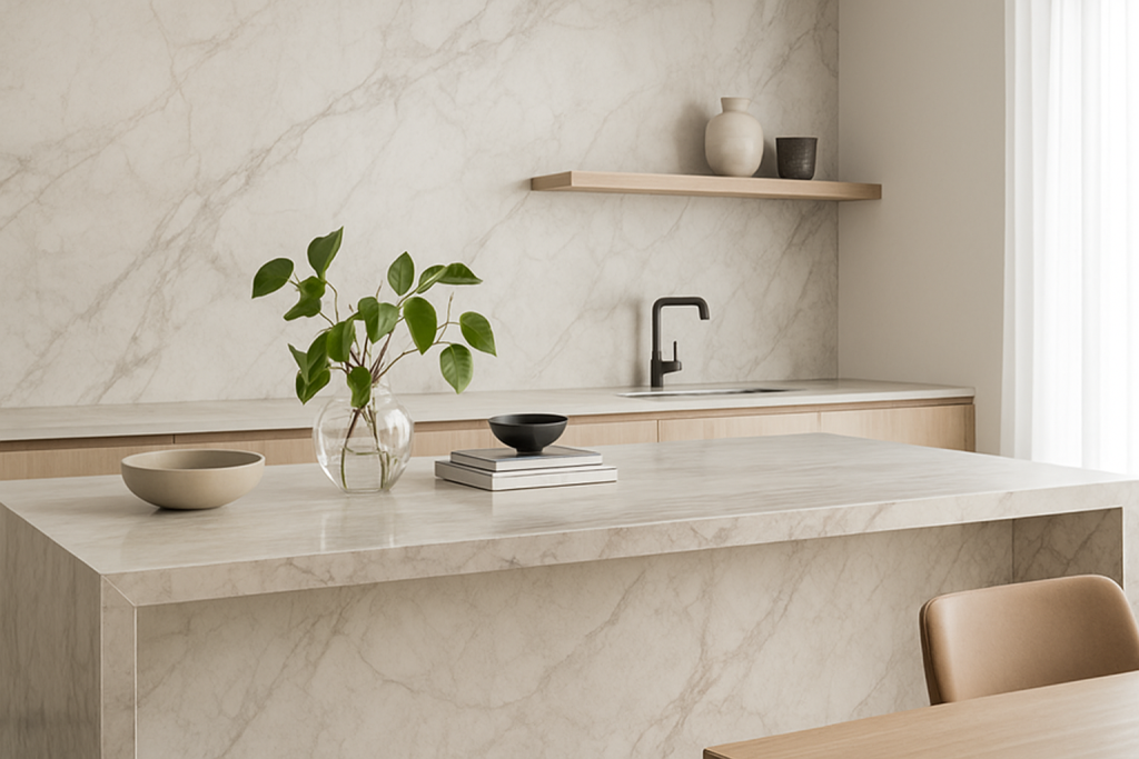
2. Seamless Style (Barely Any Grout)
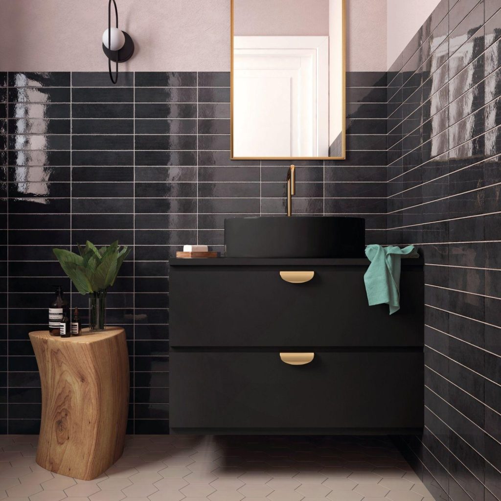
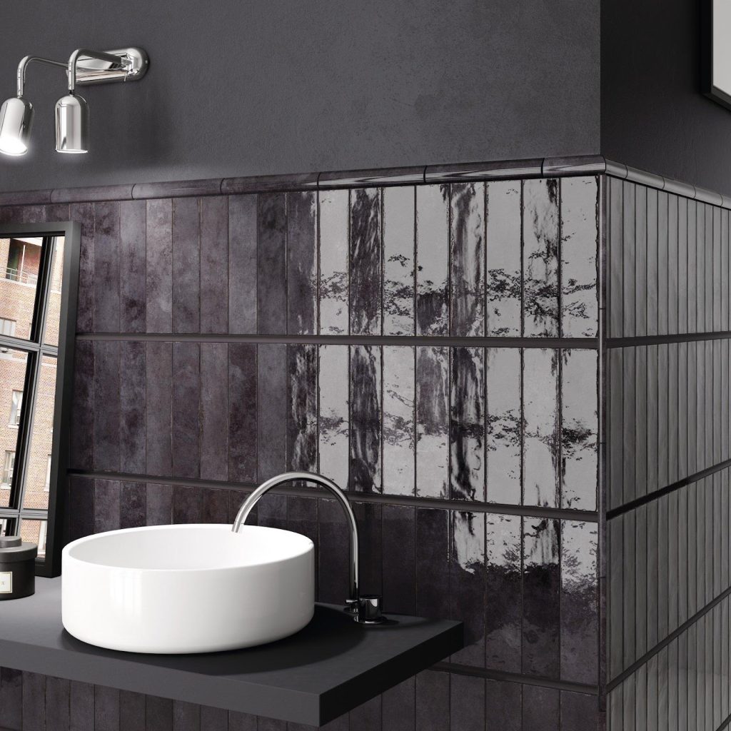
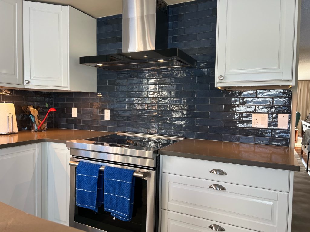
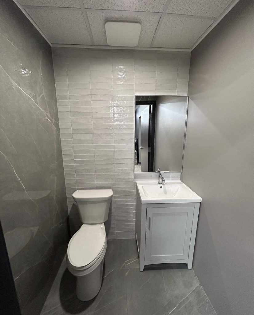
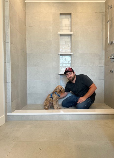
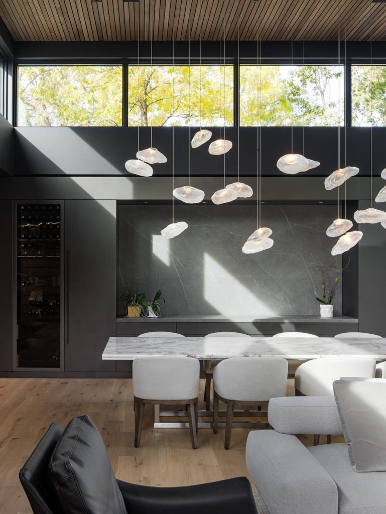
With slabs, one piece does the work of a dozen standard tiles—so you get fewer grout lines, less cleaning, and a sleek, hotel-lobby look in showers, backsplashes and fireplace surrounds.
3. Tougher Than Your Schedule
Porcelain slabs are:
- Scratch-resistant— no more knife marks on your island.
- Heat-proof— hot pans straight from the stove? No problem.
- Stain & UV-resistant—red wine spills and sunny patios don’t stand a chance.
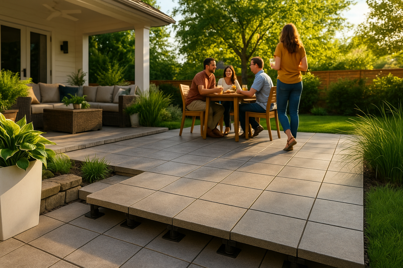
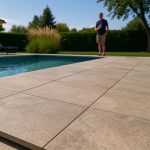
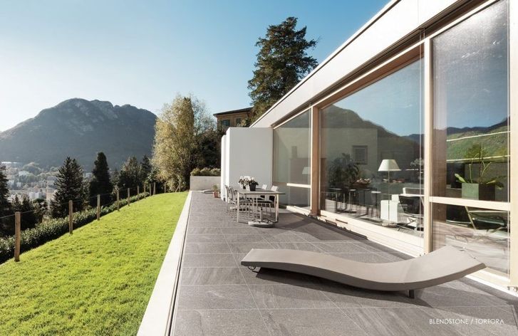
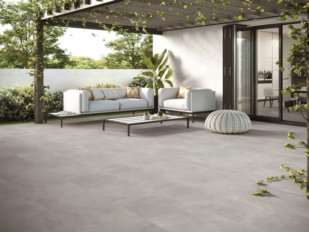
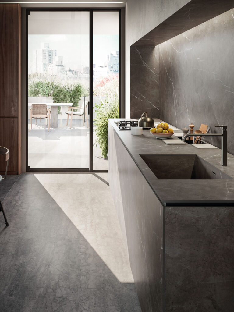
4. Indoors and Out
Freeze–thaw proof and water-resistant, slabs work just as well on your poolside bar as on your powder-room vanity. One material for a seamless indoor-outdoor flow.
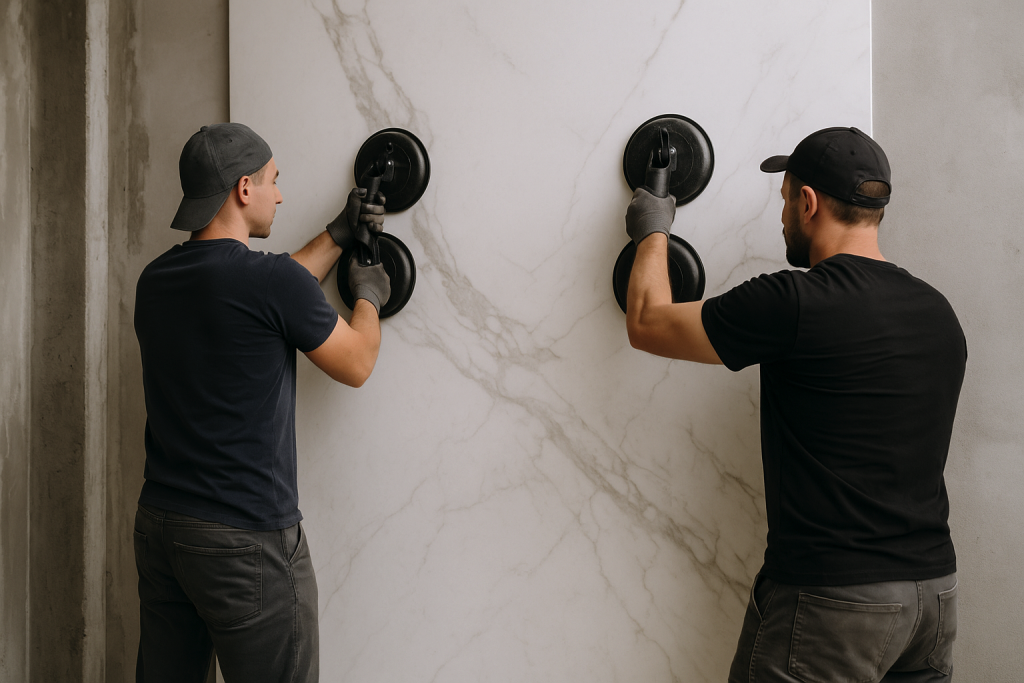
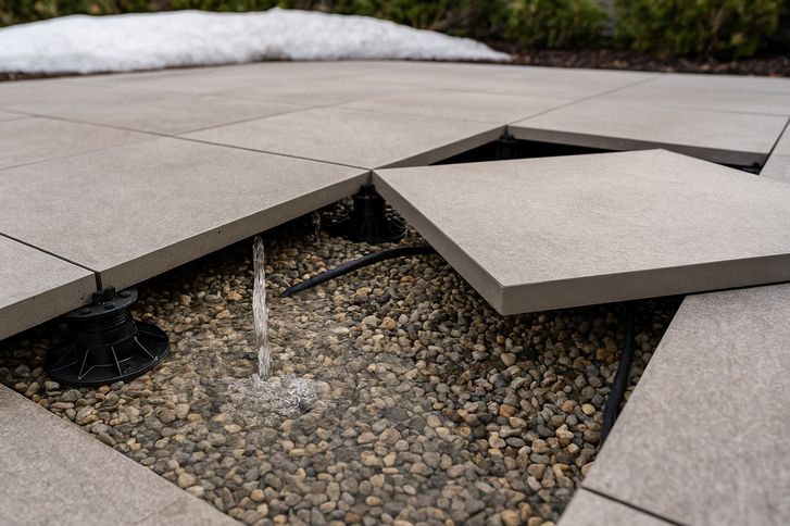
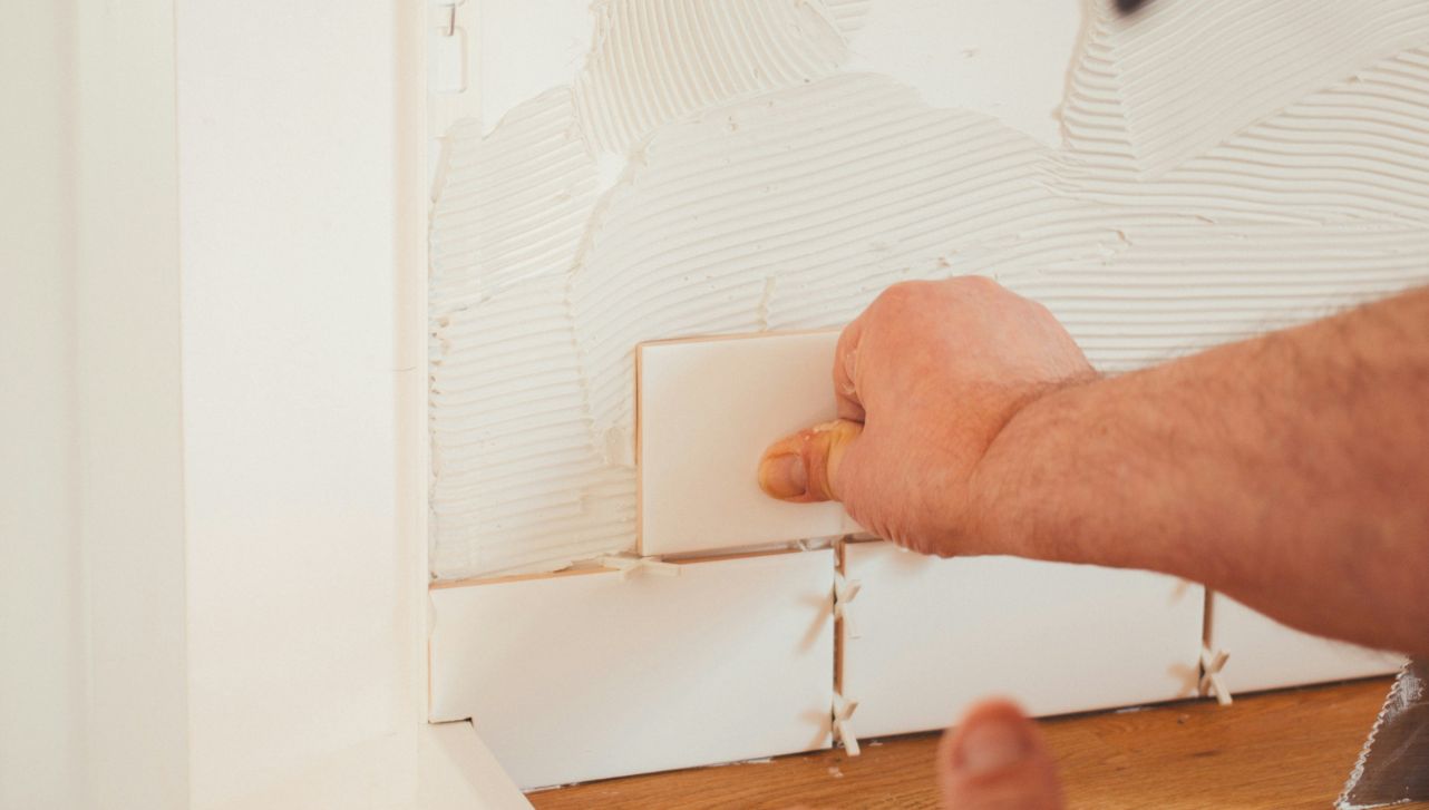
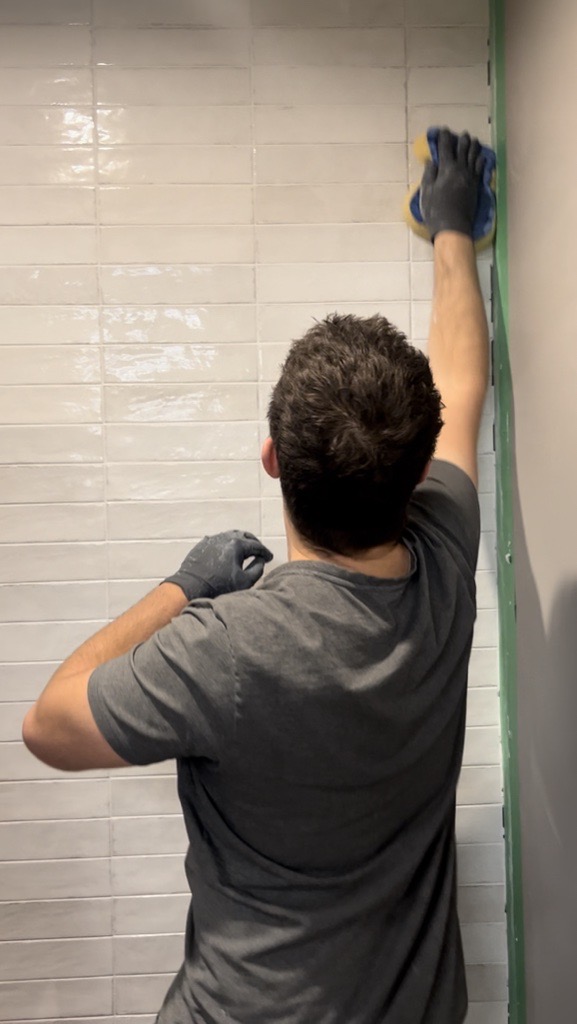
5. Faster Installs, Cleaner Look
Slim profile = lighter weight = easier handling (and lower labour costs). Plus, many slabs install directly over existing surfaces, slashing demo time and mess.
6. Easy on the Planet
Our slabs use less raw material per square foot than thick stone, cut quarry waste, are VOC-free and 100% recyclable at end of life. Eco-points, without sacrificing style.
7. Where to Use Them
| Space | Why It Works |
|---|---|
| Countertops & Islands | One seamless surface—no crumb-catching seams. |
| Shower Walls | Spa look, virtually zero grout to scrub. |
| Fireplace Surrounds | Instant floor-to-ceiling statement. |
| Outdoor Kitchens | Heat, stain & weather resistance. |
| Feature Furniture | Custom tables, desks—slab it, own it. |
Ready to Super-Size Your Surface?
- See Them In Person: Drop by any Tile Town showroom (Victoria, Richmond, Langley, Edmonton West, Edmonton South) to feel the finishes and test the toughness.
- Talk to a Pro: Our tile experts will walk you through edging options, substrate prep and “how many folks do I need to carry this?”
Big tile energy is here—let’s make it happen.
Questions? Reach out on Instagram, call your nearest Tile Town or stop by for coffee and a slab sample.