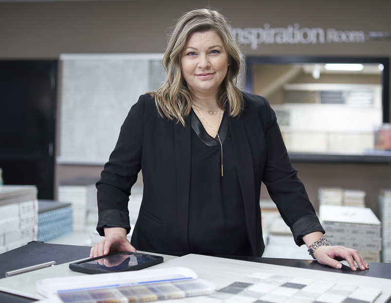
With a passion for fashion, Chevonne Woolley is a true style expert. Before Woolley joined Tile Town as a Design Consultant, she worked in retail fashion.
“Over time, I became way more interested in what homes looked like than the clothes that I was wearing,” recalls Woolley. “So I took home and interior design courses and changed my career path.”
Woolley says that her interest in fashion moved to colour.
“Since working at Tile Town, I realized the number one thing I do every day is look at colour. It’s the place to start when making changes within a home,” Woolley says.
With a desire to train her eyes and expand her colour expertise, Woolley found Maria Killam and her blog, Colour Me Happy.
“There were lots of pearls of wisdom that she had learned throughout her career that she generously shared in her writing,” says Woolley. “She offered a three-day course called Specify Colour with Confidence, training us how to identify undertones in neutral colours, and what neutrals work with each other and which don’t. I find it fascinating how the right colours together ‘sing.’ Everywhere I go now, I analyze colour.”

Customer colour preferences vary, but due to the strong connection between colours and the emotions they strike, people generally have a good sense of the colours they prefer.
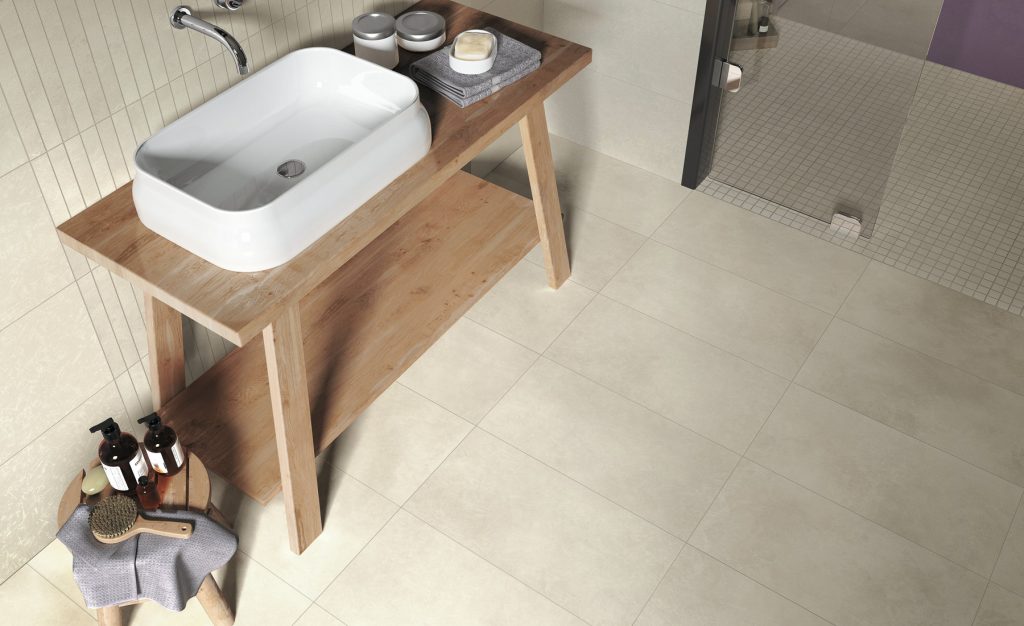
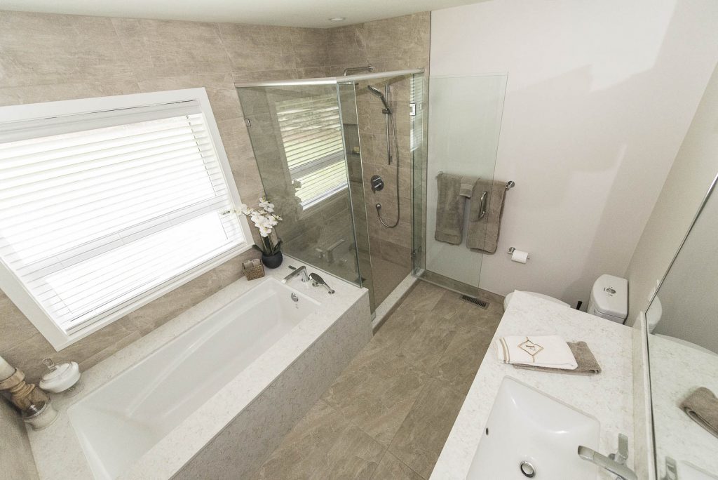
“We’ve been in the gray trend for a long time now,” explains Woolley. “Black and white is the freshest look right now, though we are seeing lots of taupes selling, as the general look has certainly warmed up since the grey trend has slowed. Sometimes people prefer more of a blue-gray with a cooler undertone, and that looks different than a shade of gray with a warmer undertone.”
Woolley advises relating colour to something else in the room as the key to a pulled-together room.
Seasonal trends
Woolley says spring and fall are the two seasons that customers consider larger renovations projects like fireplaces and outdoor patio spaces.
“I find that fireplaces become big in the fall, as people are thinking about decorating their mantles at Christmas, so they want to re-do their fireplace in time for the holidays. And then others customers look for exterior tiles for patios, so that would be more of a spring project.”
She adds that spring and fall are also peak seasons for kitchen and bathroom renovations, but lots of backsplashes and bathrooms are done any time of the year.
Emerging trends
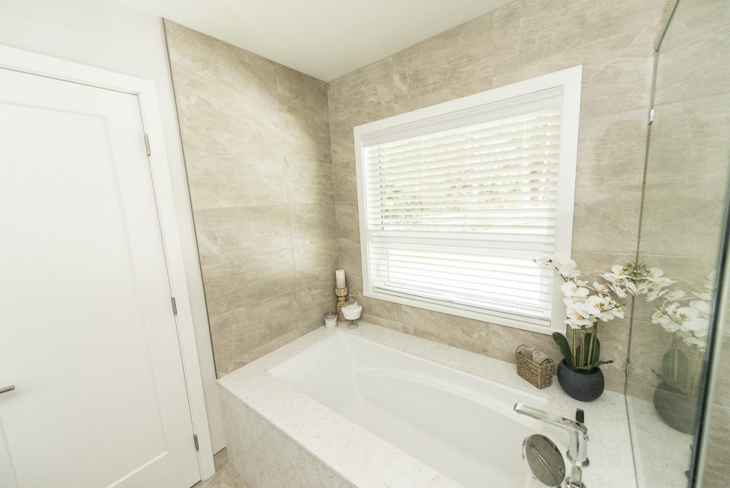
“We’re starting to see more shades of taupe in the store, like light taupes,” says Woolley. “But, the tile that sells the fastest, we’re noticing, are the lightest grays. Those seem to be the strongest sellers right now.”
When it comes to shapes, Woolley says hexagon tiles are classic.
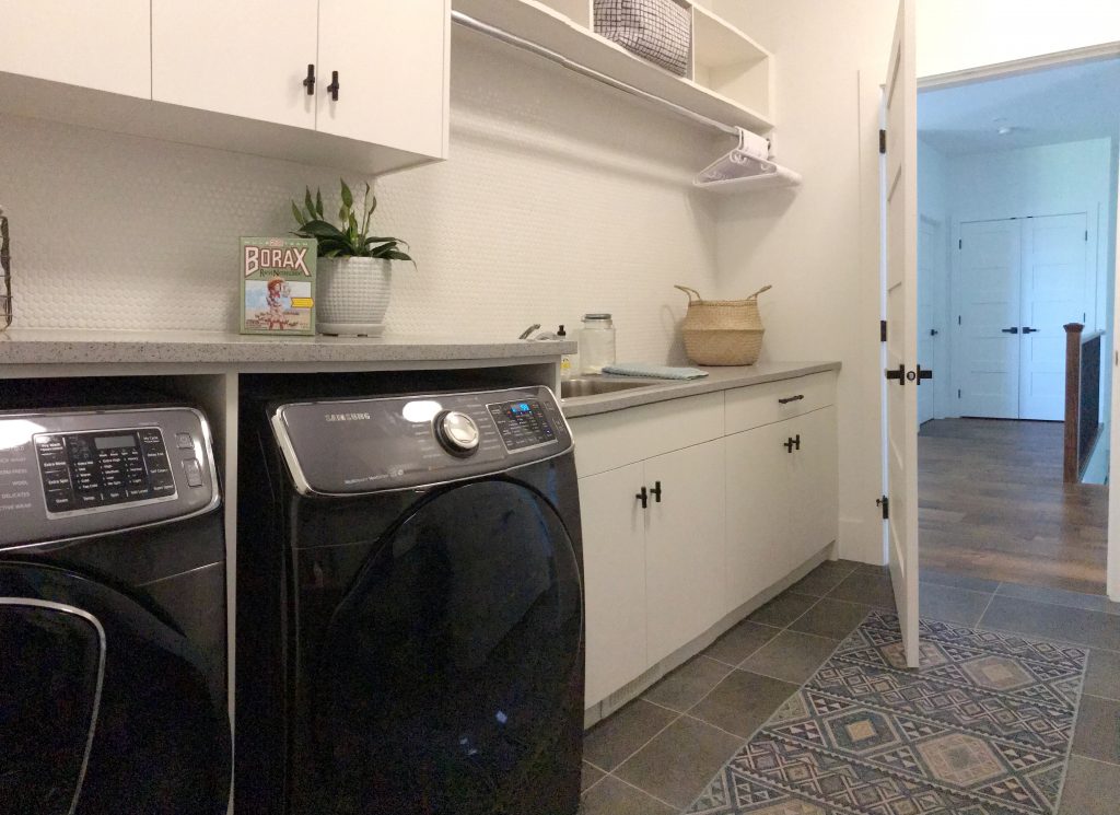
“Hexagons have been big for several years now and continue to stay big. I don’t see them fading anytime soon. There’s never going to be a time when a hexagon tile looks dated,” Woolley says.
Woolley also says the marble and concrete looks in tiles are current hot trends too.
Fading trends
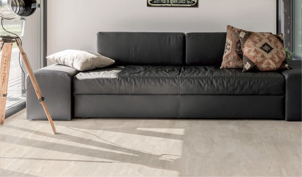
“For floors, we don’t see many 12×12 inch porcelain tiles anymore. Manufacturers make tiles based on trends, so they aren’t making 12×12 tiles. Larger sizes are trending – 12”x24” is standard now for floor tile, 24”x24” and 24”x48 are popular as well. And fewer grays with blue undertone; tile colours are warming up.”
Clashing tones
Woolley strongly suggests avoiding pink-beige and yellow-beige undertones because they clash.
“They’ll never look good together; they’ll always clash,” she warns.
Picking colours and tile style
Pick a focal point for your home first. A clear understanding of what the focal point is, will drive the direction for the rest of the space.
“If you want patterns, decide if you want to see patterns on the wall, in your shower or by the tub. Or do you want to see a pattern on your countertop? There’s lots of quartz and granites out there that are beautiful but can be busy prints. Or you might want to see the pattern on the floor,” says Woolley.
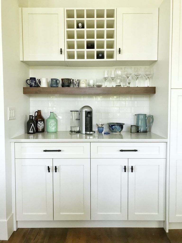
“For a classic look, I believe that there should be only one pattern in hard finishes in a room. In decorating, other patterns could be added. They are the things that are easier to change over time when you tire of them. Once you have an idea of your direction, head into Tile Town and start shopping. If you choose to go with a pattern, everything else should work with it, not fight against it.”
Correcting mistakes
Mistakes and mismatches of colours can happen, but Woolley advises disguising them with decorating if they happen.
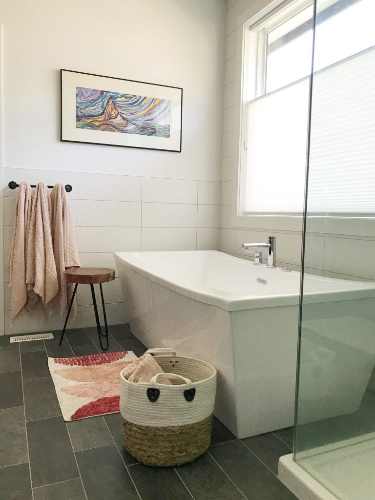
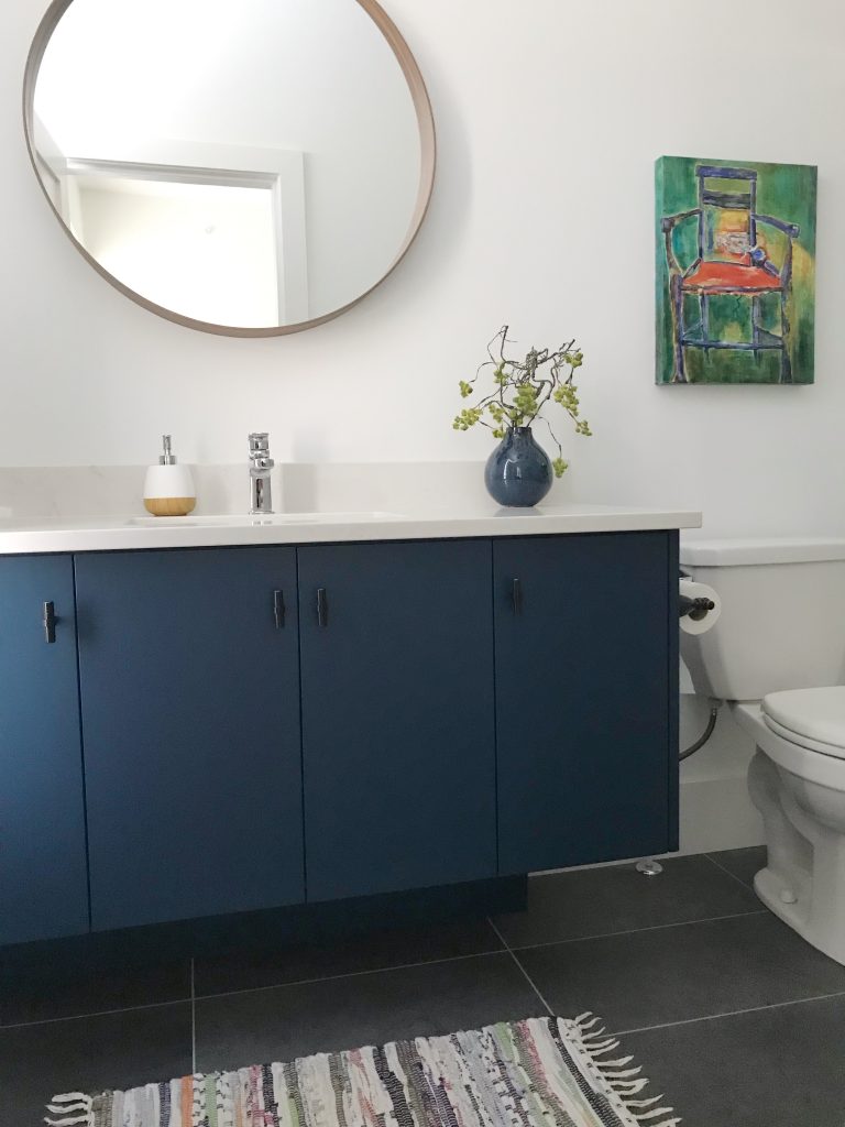
“Use a different wallpaper that draws your eye and attention to something else in the room. Or try artwork that combines all the colours that you’re using in that space,” she says.” “For example, a bathroom. If you find artwork with all your colours, you can make your design flaw look intentional.”
Test out choices
Woolley says Tile Town’s visualizer is a great tool that can be used to compare different ideas, styles and colours.
“Customers often struggle with decisions because they can’t visualize the result. Our visualizer tool’s been fantastic for assisting our customers with design decisions. It doesn’t take the place of getting samples from the store, taking them home and looking at them to make sure the colours work, but it’s a great tool to help you make decisions on tiles and colours that can work in your home.” Woolley adds.
If you’re working on a home design project and a trained pair of expert eyes in style and colour is needed, be sure to consult with Chevonne Woolley at Tile Town Surrey.
Gallery: A collection of styled rooms based on Chevonne’s tile and colour recommendations.
